
About
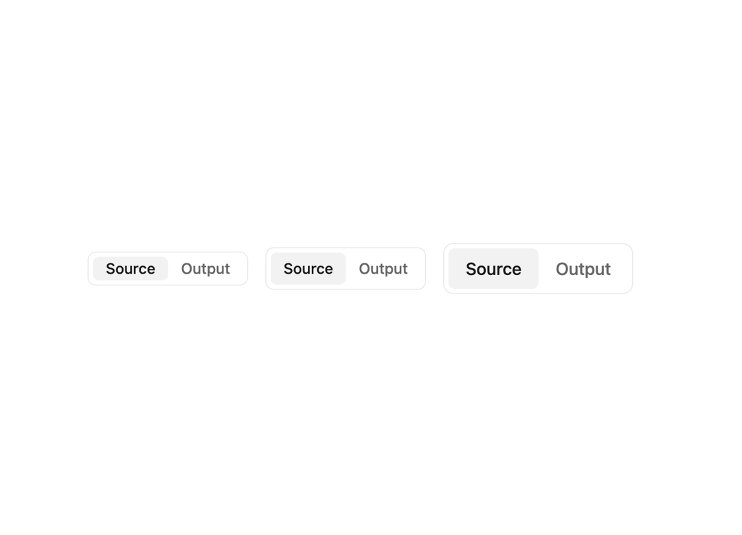
Choose between a set of options.
Built with React and Tailwind. Copy the prompt and paste it into Claude Code, Cursor or Lovable: your agent adds Switch to your project and fits it to your theme.
Code
How Switch is used: the demo's code. The component's own source comes with a free account.
Usage.tsx
import { Switch } from "@/components/ui/switch";

export default function SizesDemo() {
  return (
      <div className="flex flex-col items-start gap-2 w-3/4">
        <div className="flex items-center gap-4">
          <Switch name="sizes-small" size="small">
            <Switch.Control defaultChecked label="Source" value="source" />
            <Switch.Control label="Output" value="output" />
          </Switch>
          <Switch name="sizes-default">
            <Switch.Control defaultChecked label="Source" value="source" />
            <Switch.Control label="Output" value="output" />
          </Switch>
          <Switch name="sizes-large" size="large">
            <Switch.Control defaultChecked label="Source" value="source" />
            <Switch.Control label="Output" value="output" />
          </Switch>
        </div>
      </div>
  );
}
Dependencies
More by tigran tumasov
View all
Product Hunt Badge
1.9K
Book
178
Calendar
155
Theme Switcher
139
Snippet
125
Table
123
Toggle
94
Feedback
93
More in Buttons
View all
Texture Button
102
Button
10

Button
4
Native Button
12

Button Group
38
Button
76

HeroUI Button Group
11
Split Button
36


