
About
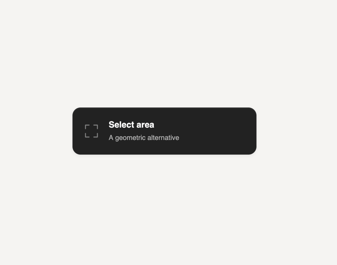
A checkbox styled with open corner brackets instead of a solid box, drawn as an animated outline that tightens around the tick when checked, for selectable list items or settings rows.
Built with React and Tailwind. Copy the prompt and paste it into Claude Code, Cursor or Lovable: your agent adds Matte Corner Checkbox to your project and fits it to your theme.
Code
How Matte Corner Checkbox is used: the demo's code. The component's own source comes with a free account.
Usage.tsx
import MatteCornerCheckbox from "@/components/ui/matte-corner-checkbox";

export default function MatteCornerCheckboxDemo() {
  return (
    <div className="flex min-h-screen w-full items-center justify-center bg-[#f5f4f2] p-10">
      <div className="w-[min(320px,100%)]">
        <MatteCornerCheckbox id="demo-corner" name="demo-corner" />
      </div>
    </div>
  );
}
More by SL
View all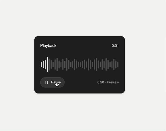

Playback Scrubber
57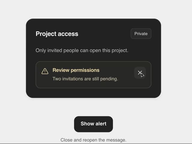
Matte Alert Feedback
44
Notification Stack
33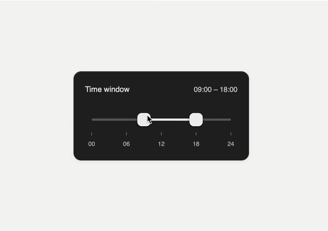
Time Window Slider
26
Matte Meter Slider
17
Commands Menu
15
Matte Opacity Slider
13
Undo Feedback
9
More in Forms
View all

Contact Card
1.1K

Book A Demo 1
87

Premium Auth
556

Login 1
61

Form
138
Authentication Card
51
Book A Demo 3
98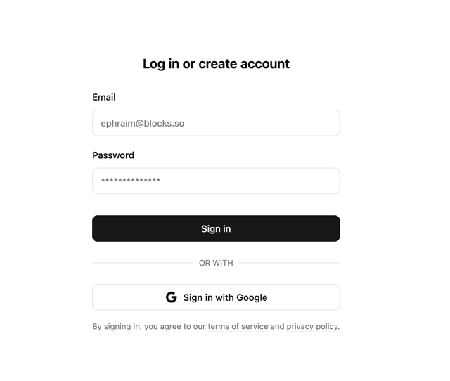

Login 2
11
