About
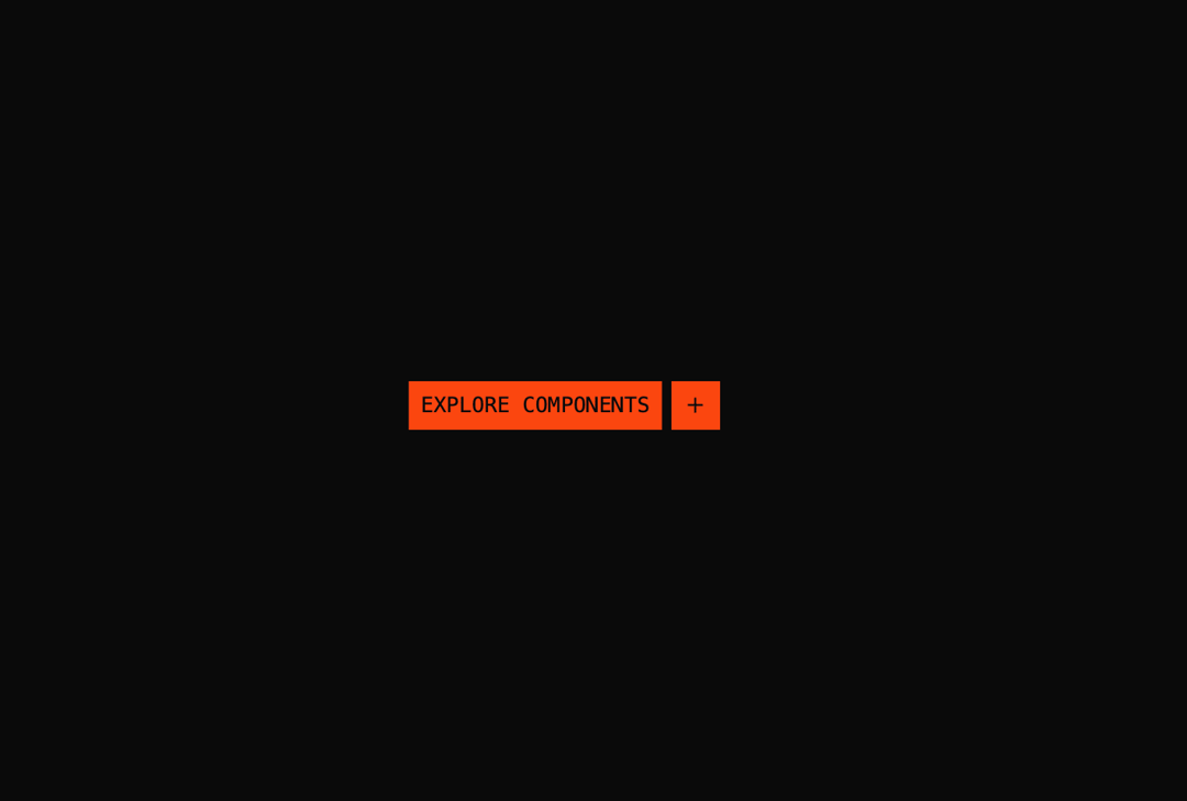
A chip-style call-to-action link with a Motion-powered sliding label and rotating icon chips that animate on hover and focus.
Built with React and Tailwind. Copy the prompt and paste it into Claude Code, Cursor or Lovable: your agent adds Section CTA to your project and fits it to your theme.
Code
How Section CTA is used: the demo's code. The component's own source comes with a free account.
Usage.tsx
import { SectionCta } from "@/components/ui/section-cta";

export default function SectionCtaDemo() {
  return (
    <div className="flex min-h-64 w-full items-center justify-center p-8">
      <SectionCta href="#" label="Explore components" />
    </div>
  );
}
Dependencies
More by soralabs
View all

Scroll Gallery
270
Dia Text Reveal
168
Dock Nav
154
Text Reveal Block
127
Pixelated Image Reveal
106
Text Roll
64
Custom Cursor
53
Cursor Bubble
37
More in CTAs
View all

Hills Landscape Footer with Call to Action
138

CTA 3
413
Call to Action
6
call to action
34

Cta 4
300

Call to Action 01
57

Responsive Hero Banner
2.1K

Call To Action
29

