
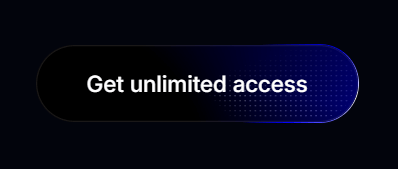
About
A mesmerizing CSS-animated button with shimmering borders, dot patterns, and hover effects. Perfect for high-emphasis call-to-action elements like subscription offers, premium features, or important conversions. Customizable with different colors and texts.
Built with React and Tailwind. Copy the prompt and paste it into Claude Code, Cursor or Lovable: your agent adds Shiny CTA Button to your project and fits it to your theme.
Code
How Shiny CTA Button is used: the demo's code. The component's own source comes with a free account.
Usage.tsx
import { Component } from "@/components/ui/shiny-cta-button";

const DemoOne = () => {
  return (
    <div className="flex w-full h-screen justify-center items-center">
      <Component />
    </div>
  );
};

export { DemoOne };
More by Tanishq
View all
Stacked Activity Cards
325
AI Swarm Visualization
98
Cyberpunk Neon Folder
51
Neomorphic Card
1
Animated Scroll Indicator
Pixel Animation Cards
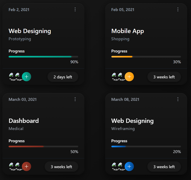
Course Progress Tracking Cards

Aurora Wallet Connect Button
More in Buttons
View all
Texture Button
106

Notification Button
115

Button
1

HeroUI Button Group

Button
12
Base Button
1

App Store Button
483
Split Button
37


