
About
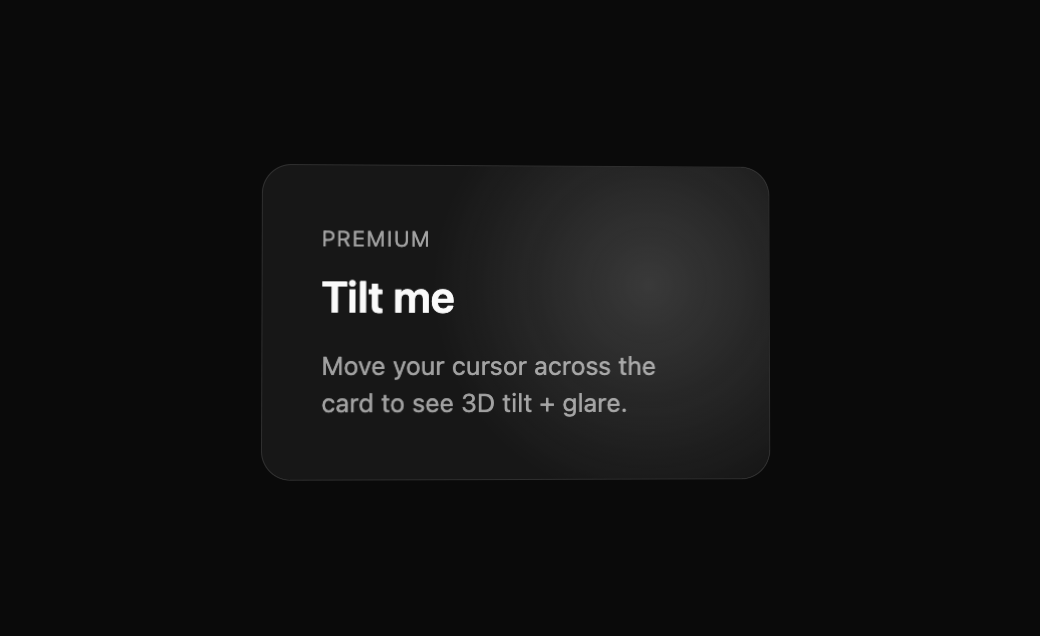
Built with React and Tailwind. Copy the prompt and paste it into Claude Code, Cursor or Lovable: your agent adds BeUI Tilt Card to your project and fits it to your theme.
Code
How BeUI Tilt Card is used: the demo's code. The component's own source comes with a free account.
Usage.tsx
"use client";

import { TiltCard } from "@/components/ui/be-ui-tilt-card";

export default function TiltCardPreview() {
  return (
    <div className="flex items-center justify-center p-6">
      <TiltCard className="w-[280px] border border-border bg-card p-8">
        <div className="text-xs uppercase tracking-wider text-muted-foreground">Premium</div>
        <h3 className="mt-2 text-2xl font-semibold text-foreground">Tilt me</h3>
        <p className="mt-3 text-sm text-muted-foreground">Move your cursor across the card to see 3D tilt + glare.</p>
      </TiltCard>
    </div>
  );
}