
About
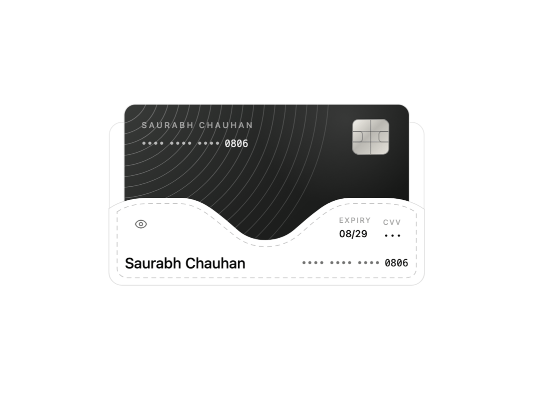
An animated payment card tucked into a folder-style pocket that lifts forward when opened, with a separate control to reveal or mask the card number and CVV.
Built with React and Tailwind. Copy the prompt and paste it into Claude Code, Cursor or Lovable: your agent adds Card Folder to your project and fits it to your theme.
Code
How Card Folder is used: the demo's code. The component's own source comes with a free account.
Usage.tsx
"use client";

import { CardFolder } from "@/components/ui/card-folder";
import { DigitSwap } from "@/components/ui/card-folder-utils/digit-swap";
import * as React from "react";

const CARD_NUMBER = "3745 6987 4096 0806";
const MASKED_CARD_NUMBER = "•••• •••• •••• 0806";
const CONTOUR_RADII = Array.from({ length: 18 }, (_, index) => 72 + index * 24);

function CardArtwork({ detailsVisible }: { detailsVisible: boolean }) {
  return (
    <span className="relative block h-full w-full overflow-hidden bg-[linear-gradient(135deg,#383a38_0%,#202120_48%,#111211_100%)] text-white">
      <svg
        aria-hidden="true"
        viewBox="0 0 640 404"
        className="absolute inset-0 h-full w-full"
      >
        {CONTOUR_RADII.map((radius, index) => (
          <circle
            key={radius}
            cx="-20"
            cy="-28"
            r={radius}
            fill="none"
            stroke="currentColor"
            strokeOpacity={0.32 - index * 0.009}
            strokeWidth="1.5"
          />
        ))}
      </svg>

      <span className="absolute inset-0 bg-[radial-gradient(circle_at_78%_8%,rgb(255_255_255/0.11),transparent_32%)]" />

      <span className="absolute left-[6%] top-[8%] flex flex-col gap-2">
        <span className="text-[10px] font-medium uppercase tracking-[0.22em] text-white/55">
          Saurabh Chauhan
        </span>
        <DigitSwap
          value={detailsVisible ? CARD_NUMBER : MASKED_CARD_NUMBER}
          animationKey={detailsVisible ? "revealed" : "masked"}
          direction={detailsVisible ? "up" : "down"}
          suffixLength={4}
          glyphClassName={detailsVisible ? "text-white/90" : "text-white/65"}
          suffixClassName="text-white/90"
          className="font-mono text-xs tracking-[0.13em]"
        />
      </span>

      <span className="absolute top-[8%] right-[7%] h-[20%] w-[13%] overflow-hidden rounded-[18%] border border-black/30 bg-[linear-gradient(135deg,#f2f0ea_0%,#b9b7b1_45%,#e4e1d9_100%)]">
        <span className="absolute inset-y-0 left-1/2 w-px -translate-x-1/2 bg-black/30" />
        <span className="absolute inset-x-0 top-1/3 h-px bg-black/30" />
        <span className="absolute inset-x-0 bottom-1/3 h-px bg-black/30" />
        <span className="absolute left-0 top-1/2 h-[34%] w-[28%] -translate-y-1/2 rounded-r-[35%] border border-l-0 border-black/30" />
        <span className="absolute right-0 top-1/2 h-[34%] w-[28%] -translate-y-1/2 rounded-l-[35%] border border-r-0 border-black/30" />
      </span>

      <span className="absolute bottom-[9%] left-[6%] flex items-center gap-2 text-lg font-semibold tracking-[-0.04em]">
        beUI{" "}
        <span className="block size-2.5 rotate-45 rounded-[2px] bg-white/85" />
      </span>

      <span className="absolute right-[7%] bottom-[10%] flex items-end gap-5">
        <span className="flex flex-col gap-1">
          <span className="text-[8px] font-medium uppercase tracking-[0.16em] text-white/40">
            Expiry
          </span>
          <span className="text-xs font-medium text-white/90 tabular-nums">
            08/29
          </span>
        </span>
        <span className="flex flex-col gap-1">
          <span className="text-[8px] font-medium uppercase tracking-[0.16em] text-white/40">
            CVV
          </span>
          <DigitSwap
            value={detailsVisible ? "123" : "•••"}
            animationKey={detailsVisible ? "revealed" : "masked"}
            direction={detailsVisible ? "up" : "down"}
            className="font-mono text-xs font-medium text-white/90"
          />
        </span>
      </span>
    </span>
  );
}

export default function CardFolderPreview() {
  const [detailsVisible, setDetailsVisible] = React.useState(false);

  return (
    <div className="flex min-h-72 w-full items-center justify-center px-6 py-9">
      <CardFolder
        title="Saurabh Chauhan"
        cardNumber={CARD_NUMBER}
        expiry="08/29"
        cvv="123"
        detailsVisible={detailsVisible}
        onDetailsVisibleChange={setDetailsVisible}
        card={<CardArtwork detailsVisible={detailsVisible} />}
      />
    </div>
  );
}
Dependencies
More by Saurabh
View all
BeUI Tilt Card
373
BeUI Expandable Tabs
347
BeUI File Upload
293
BeUI Bouncy Accordion
204
BeUI Create Menu
199
BeUI Expanable Action Bar
190
Animated Sidebar
183
Loader
180
More in Cards
View all

Statistics Card 7
294

Course Design Cards
1.1K
Statistics Card 2
267
Stats cards with links
122

Card
17
The Item one
3

Card Studio
14
Card
56
