
About
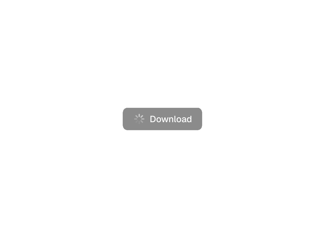
A clean, Vercel-inspired button component that shows an animated spinner when loading. Includes smooth state transitions and icon support.
Built with React and Tailwind. Copy the prompt and paste it into Claude Code, Cursor or Lovable: your agent adds Animated Vercel-like Button to your project and fits it to your theme.
Code
How Animated Vercel-like Button is used: the demo's code. The component's own source comes with a free account.
Usage.tsx
import * as React from "react"

import {
  ArrowsClockwiseIcon,
  FloppyDiskIcon,
  PencilSimpleIcon,
  ShareNetworkIcon,
  TrashIcon,
} from "@phosphor-icons/react"

import { Button } from "@/components/ui/animated-vercel-like-button";

// Without icon demo
export function WithoutIconDemo() {
  const [loading, setLoading] = React.useState(false)
  const [loadingVariant, setLoadingVariant] = React.useState<
    "default" | "destructive" | "outline" | "secondary" | "ghost"
  >("default")

  const handleLoadingTest = (variant: typeof loadingVariant) => {
    setLoadingVariant(variant)
    setLoading(true)
    setTimeout(() => setLoading(false), 2000)
  }

  return (
    <div className="min-h-screen flex items-center justify-center p-8">
      <div className="max-w-md mx-auto space-y-8 text-center">
        <div className="space-y-4">
          <Button
            className="w-full"
            loading={loading && loadingVariant === "default"}
            onClick={() => handleLoadingTest("default")}
            variant="default"
          >
            Save
          </Button>

          <Button
            className="w-full"
            loading={loading && loadingVariant === "destructive"}
            onClick={() => handleLoadingTest("destructive")}
            variant="destructive"
          >
            Delete
          </Button>

          <Button
            className="w-full"
            loading={loading && loadingVariant === "outline"}
            onClick={() => handleLoadingTest("outline")}
            variant="outline"
          >
            Refresh
          </Button>

          <Button
            className="w-full"
            loading={loading && loadingVariant === "secondary"}
            onClick={() => handleLoadingTest("secondary")}
            variant="secondary"
          >
            Edit
          </Button>
          <Button
            className="w-full"
            loading={loading && loadingVariant === "ghost"}
            onClick={() => handleLoadingTest("ghost")}
            variant="ghost"
          >
            Share
          </Button>
        </div>
      </div>
    </div>
  )
}

// With icon demo
export function WithIconDemo() {
  const [loadingStates, setLoadingStates] = React.useState<
    Record<string, boolean>
  >({})

  const handleAction = (actionId: string, duration = 2000) => {
    setLoadingStates((prev) => ({ ...prev, [actionId]: true }))
    setTimeout(() => {
      setLoadingStates((prev) => ({ ...prev, [actionId]: false }))
    }, duration)
  }

  return (
    <div className="min-h-screen flex items-center justify-center p-8">
      <div className="max-w-lg mx-auto space-y-6">
        <div className="grid gap-4 items-center justify-center">
          <Button
            icon={FloppyDiskIcon}
            loading={loadingStates.save}
            onClick={() => handleAction("save")}
            variant="default"
            className="w-full"
          >
            Save
          </Button>

          <Button
            icon={TrashIcon}
            loading={loadingStates.delete}
            onClick={() => handleAction("delete", 1500)}
            variant="destructive"
            className="w-full"
          >
            Delete
          </Button>

          <Button
            icon={ArrowsClockwiseIcon}
            loading={loadingStates.refresh}
            onClick={() => handleAction("refresh", 1000)}
            variant="outline"
            className="w-full"
          >
            Refresh
          </Button>

          <Button
            icon={PencilSimpleIcon}
            loading={loadingStates.edit}
            onClick={() => handleAction("edit")}
            variant="secondary"
            className="w-full"
          >
            Edit
          </Button>

          <Button
            icon={ShareNetworkIcon}
            loading={loadingStates.share}
            onClick={() => handleAction("share")}
            variant="ghost"
            className="w-full"
          >
            Share
          </Button>
        </div>
      </div>
    </div>
  )
}

export function Demo() {
  return <div className="flex">
  <WithIconDemo />
  <WithoutIconDemo />
  </div>
}

export default function DemoOne() {
  return <Demo />;
}
Dependencies
More by Steven Ching
View all
Unsaved changes
167
More in Buttons
View all
Texture Button
107

Notification Button
116
Button
14

HeroUI Button Group
1

Button
2
Base Button
2

App Store Button
484

Button
36

