
About
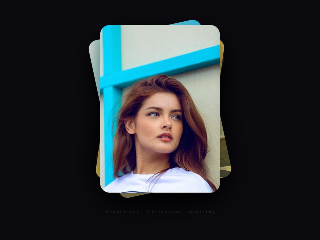
A shuffled deck of portrait cards you can drag or fling to send the top card to the back, with keyboard shortcuts, hover overlay captions, image/video support, and auto-play.
Built with React and Tailwind. Copy the prompt and paste it into Claude Code, Cursor or Lovable: your agent adds Draggable Card Stack to your project and fits it to your theme.
Code
How Draggable Card Stack is used: the demo's code. The component's own source comes with a free account.
Usage.tsx
import { DraggableCardStack } from "@/components/ui/draggable-card-stack";

export default function DraggableCardStackDemo() {
  return (
    <div className="w-full h-screen">
      <DraggableCardStack />
    </div>
  );
}
Dependencies
More by NexusUI
View all

Circular Carousel
1.3K
Images Badge
992
Chat Messages
340
Cinematic Logo Cloud
164
Infinite Moving Cards
163
Shooting Stars Grid
159
Logo Clouds
114
Image Trail
94
More in Galleries
View all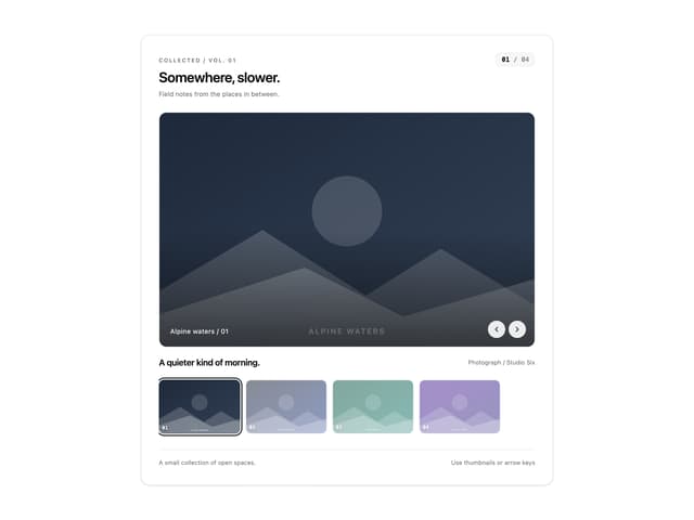
Thumbnail image viewer
77
Editorial Collage Hero
475

Animated Gallery
1.5K

Image Gallery
1.4K

Elastic Gallery
1K

Hero Section 6
927
Gallery Animation
1.1K
Layout Grid
886


