
About
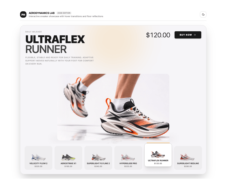
Interactive athletic sneaker product showcase with synchronized hover states, dynamic typography, and mirrored surface reflections.
Built with React and Tailwind. Copy the prompt and paste it into Claude Code, Cursor or Lovable: your agent adds Product Hover Showcase to your project and fits it to your theme.
Code
How Product Hover Showcase is used: the demo's code. The component's own source comes with a free account.
Usage.tsx
"use client";

import { useState } from "react";
import {
  ProductHoverShowcase,
  DEFAULT_PRODUCTS,
  type ProductItem,
} from "@/components/ui/product-hover-showcase";
import {
  Sparkles,
  Play,
  Pause,
  Sun,
  Moon,
  RotateCcw,
  Layers,
  Activity,
  Check,
} from "lucide-react";

export default function ProductHoverShowcaseDemo() {
  const [autoplay, setAutoplay] = useState<boolean>(false);
  const [enableReflection, setEnableReflection] = useState<boolean>(true);
  const [enableGlow, setEnableGlow] = useState<boolean>(true);
  const [enableFloatingMotion, setEnableFloatingMotion] = useState<boolean>(true);
  const [selectedIndex, setSelectedIndex] = useState<number>(2);
  const [isDark, setIsDark] = useState<boolean>(() => {
    if (typeof document !== "undefined") {
      return document.documentElement.classList.contains("dark");
    }
    return true;
  });
  const [lastAction, setLastAction] = useState<string | null>(null);

  const toggleTheme = () => {
    const nextDark = !isDark;
    setIsDark(nextDark);
    if (typeof document !== "undefined") {
      if (nextDark) {
        document.documentElement.classList.add("dark");
      } else {
        document.documentElement.classList.remove("dark");
      }
    }
  };

  const handleBuy = (product: ProductItem) => {
    setLastAction(`Added ${product.name} (${product.price}) to cart.`);
    setTimeout(() => setLastAction(null), 3000);
  };

  return (
    <div className="flex min-h-screen w-full flex-col items-center justify-center p-4 sm:p-6 lg:p-8 bg-background text-foreground transition-colors duration-300">
      <div className="w-full max-w-5xl space-y-6">
        {/* Top Navigation & Brand Header */}
        <div className="flex flex-col gap-4 sm:flex-row sm:items-center sm:justify-between border-b border-border pb-4">
          <div className="flex items-center gap-3">
            <div className="flex h-9 w-9 items-center justify-center rounded-xl bg-primary text-primary-foreground font-black text-sm">
              PH
            </div>
            <div>
              <div className="flex items-center gap-2">
                <h2 className="text-sm font-bold tracking-tight text-foreground uppercase">
                  AERODYNAMICS LAB
                </h2>
                <span className="rounded-full bg-muted px-2 py-0.5 text-[10px] font-semibold text-muted-foreground">
                  2026 EDITION
                </span>
              </div>
              <p className="text-xs text-muted-foreground">
                Interactive sneaker showcase with hover transitions and floor reflections
              </p>
            </div>
          </div>

          {/* Quick Actions Header */}
          <div className="flex items-center gap-2">
            {lastAction && (
              <span className="inline-flex items-center gap-1.5 rounded-lg bg-emerald-500/10 border border-emerald-500/20 px-3 py-1 text-xs font-medium text-emerald-600 dark:text-emerald-400 animate-in fade-in">
                <Check className="h-3.5 w-3.5" />
                {lastAction}
              </span>
            )}

            <button
              type="button"
              onClick={toggleTheme}
              className="inline-flex h-9 w-9 items-center justify-center rounded-xl border border-border bg-card text-foreground hover:bg-muted transition-colors"
              aria-label="Toggle theme"
            >
              {isDark ? (
                <Sun className="h-4 w-4" />
              ) : (
                <Moon className="h-4 w-4" />
              )}
            </button>
          </div>
        </div>

        {/* The Reusable Component */}
        <div className="w-full">
          <ProductHoverShowcase
            products={DEFAULT_PRODUCTS}
            selectedIndex={selectedIndex}
            onSelect={(idx) => setSelectedIndex(idx)}
            autoplay={autoplay}
            autoplayInterval={3500}
            enableReflection={enableReflection}
            enableGlow={enableGlow}
            enableFloatingMotion={enableFloatingMotion}
            onBuyClick={handleBuy}
          />
        </div>

        {/* Demo Controls Bar */}
        <div className="rounded-2xl border border-border bg-card p-4 sm:p-5 shadow-sm space-y-4">
          <div className="flex flex-col gap-3 sm:flex-row sm:items-center sm:justify-between">
            <div className="flex items-center gap-2 text-xs font-semibold uppercase tracking-wider text-muted-foreground">
              <Activity className="h-4 w-4" />
              <span>Interactive Controls</span>
            </div>

            <div className="flex flex-wrap items-center gap-2">
              <button
                type="button"
                onClick={() => setAutoplay(!autoplay)}
                className={`inline-flex items-center gap-2 rounded-xl px-3 py-1.5 text-xs font-medium border transition-colors ${
                  autoplay
                    ? "border-primary bg-primary text-primary-foreground"
                    : "border-border bg-muted/50 text-foreground hover:bg-muted"
                }`}
              >
                {autoplay ? (
                  <>
                    <Pause className="h-3.5 w-3.5" />
                    <span>Autoplay Active</span>
                  </>
                ) : (
                  <>
                    <Play className="h-3.5 w-3.5 text-muted-foreground" />
                    <span>Enable Autoplay</span>
                  </>
                )}
              </button>

              <button
                type="button"
                onClick={() => setEnableReflection(!enableReflection)}
                className={`inline-flex items-center gap-1.5 rounded-xl px-3 py-1.5 text-xs font-medium border transition-colors ${
                  enableReflection
                    ? "border-border bg-card text-foreground shadow-sm"
                    : "border-border/60 bg-muted/30 text-muted-foreground line-through"
                }`}
              >
                <Layers className="h-3.5 w-3.5" />
                <span>Reflection</span>
              </button>

              <button
                type="button"
                onClick={() => setEnableGlow(!enableGlow)}
                className={`inline-flex items-center gap-1.5 rounded-xl px-3 py-1.5 text-xs font-medium border transition-colors ${
                  enableGlow
                    ? "border-border bg-card text-foreground shadow-sm"
                    : "border-border/60 bg-muted/30 text-muted-foreground line-through"
                }`}
              >
                <Sparkles className="h-3.5 w-3.5" />
                <span>Ambient Glow</span>
              </button>

              <button
                type="button"
                onClick={() => {
                  setAutoplay(false);
                  setEnableReflection(true);
                  setEnableGlow(true);
                  setEnableFloatingMotion(true);
                  setSelectedIndex(2);
                }}
                className="inline-flex items-center gap-1.5 rounded-xl border border-border bg-card px-3 py-1.5 text-xs font-medium text-muted-foreground hover:text-foreground hover:bg-muted transition-colors"
              >
                <RotateCcw className="h-3.5 w-3.5" />
                <span>Reset</span>
              </button>
            </div>
          </div>

          {/* Direct Product Quick Switcher */}
          <div className="space-y-1.5 pt-1">
            <span className="text-[11px] font-medium uppercase tracking-wider text-muted-foreground">
              Direct Variant Select
            </span>
            <div className="grid grid-cols-2 sm:grid-cols-6 gap-2">
              {DEFAULT_PRODUCTS.map((p, idx) => (
                <button
                  key={p.id}
                  type="button"
                  onClick={() => setSelectedIndex(idx)}
                  className={`flex flex-col items-start rounded-xl border p-2.5 text-left transition-colors ${
                    selectedIndex === idx
                      ? "border-primary bg-primary/10 shadow-sm"
                      : "border-border bg-muted/30 hover:bg-muted/60"
                  }`}
                >
                  <span className="text-[11px] font-bold uppercase tracking-tight text-foreground truncate w-full">
                    {p.name}
                  </span>
                  <span className="text-[10px] text-muted-foreground tabular-nums">
                    {p.price}
                  </span>
                </button>
              ))}
            </div>
          </div>
        </div>
      </div>
    </div>
  );
}
Dependencies
More by WRAPCODERS
View all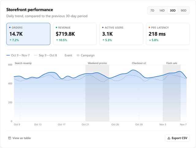

Metric Trend Chart
31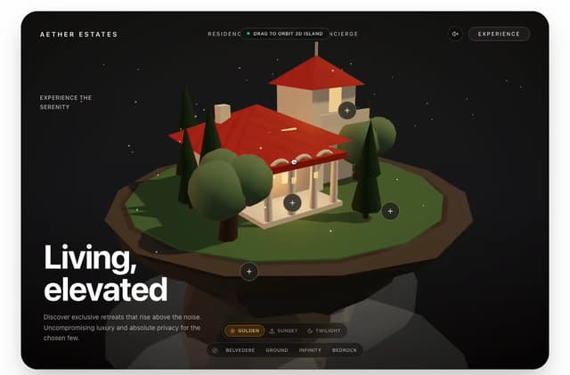
Real Estate 3D Hero
29
Portfolio Projects Showcase
5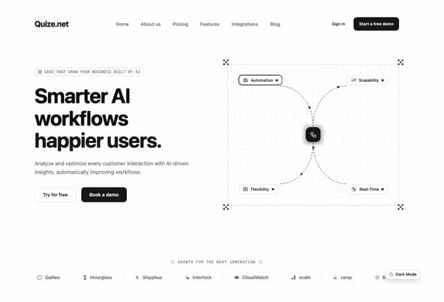
AI SaaS Workflow Hero
3
Executive Pricing Plan
2
Minimal Pricing Plan
2
Interactive 3D Hero Header
2
App Integration Celestial Hero
1
More in Galleries
View all

Scattered About
20
Photo Deck
8

Animated Gallery
1.5K

Gallery Component
6
Editorial Collage Hero
507

Elastic Gallery
1.1K

Image Gallery
130
Folded Card
42
