
About
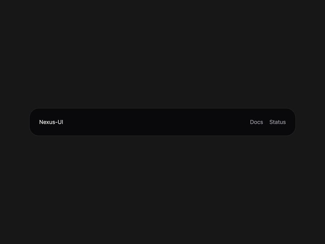
Compact dark footer with a brand name and inline developer links like docs and status.
Built with React and Tailwind. Copy the prompt and paste it into Claude Code, Cursor or Lovable: your agent adds Orbit Footer to your project and fits it to your theme.
Code
How Orbit Footer is used: the demo's code. The component's own source comes with a free account.
Usage.tsx
import OrbitFooter from "@/components/ui/orbit-footer";

export default function Demo() {
  return (
    <div className="w-full max-w-2xl p-6">
      <OrbitFooter />
    </div>
  );
}
More by NexusUI
View all
Circular Carousel
1.3K
Images Badge
990
Chat Messages
337
Cinematic Logo Cloud
164
Infinite Moving Cards
161
Shooting Stars Grid
159
Logo Clouds
110
Image Trail
94
More in Footers
View all
Footer section
1.9K

Footer 7
585
Footer column
445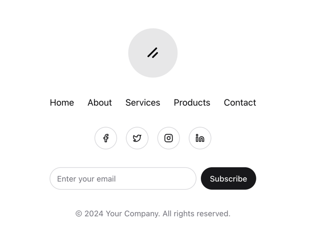
Stacked Circular Footer
440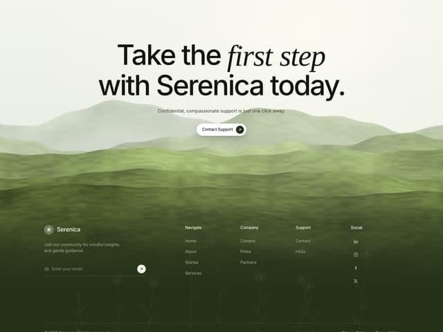

Hills Landscape Footer with Call to Action
62

Ruixen Footer 03
70

Footer 2
218

Footer
17

