
About
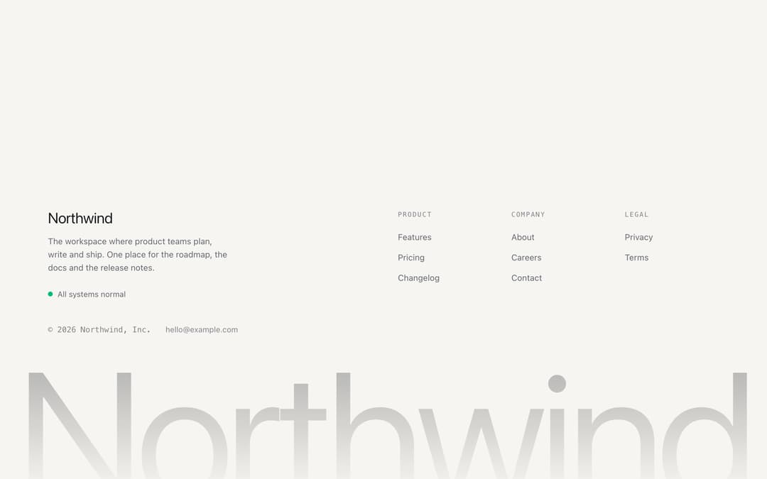
A footer with a short description, a status line, link columns that fold on phones, and the product name set large, fading into the background. From the Midnight Lite template (MIT).
Built with React and Tailwind. Copy the prompt and paste it into Claude Code, Cursor or Lovable: your agent adds Footer with Big Wordmark to your project and fits it to your theme.
Code
How Footer with Big Wordmark is used: the demo's code. The component's own source comes with a free account.
Usage.tsx
import type { CSSProperties } from "react"

import { WordmarkFooter } from "@/components/ui/wordmark-footer"

const sans = "ui-sans-serif, system-ui, -apple-system, 'Segoe UI', sans-serif"

const settings = {
  name: "Northwind",
  background: "#f6f5f1",
  card: "#ffffff",
  text: "#16171b",
  muted: "#63666f",
  primary: "#16171b",
}

// a daylight palette as theme tokens; the component itself only reads the tokens
function daylight(s: typeof settings) {
  const t: Record<string, string> = {
    background: s.background,
    foreground: s.text,
    card: s.card,
    primary: s.primary,
    "muted-foreground": s.muted,
  }
  return Object.fromEntries(Object.entries(t).flatMap(([k, v]) => [[`--${k}`, v], [`--color-${k}`, v]])) as CSSProperties
}

export default function Demo(props: Partial<typeof settings>) {
  const s = { ...settings, ...props }
  return (
    <div
      className="flex min-h-svh w-full flex-col justify-end"
      style={{ ...daylight(s), "--font-display": sans, fontFamily: sans, background: s.background } as CSSProperties}
    >
      <WordmarkFooter
        name={s.name}
        legalName={`${s.name}, Inc.`}
        year={2026}
        description="The workspace where product teams plan, write and ship. One place for the roadmap, the docs and the release notes."
        status="All systems normal"
        email="hello@example.com"
        columns={[
          { title: "Product", links: [{ label: "Features", href: "#" }, { label: "Pricing", href: "#" }, { label: "Changelog", href: "#" }] },
          { title: "Company", links: [{ label: "About", href: "#" }, { label: "Careers", href: "#" }, { label: "Contact", href: "#" }] },
          { title: "Legal", links: [{ label: "Privacy", href: "#" }, { label: "Terms", href: "#" }] },
        ]}
      />
    </div>
  )
}
Dependencies
More by Vilqor
View all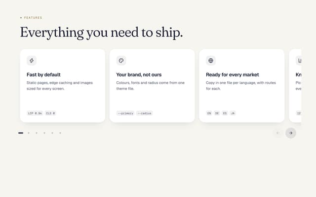

Card Carousel to Grid
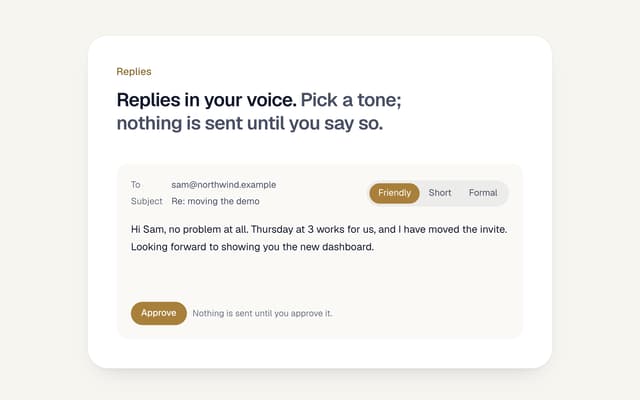
AI Email Reply with Tones
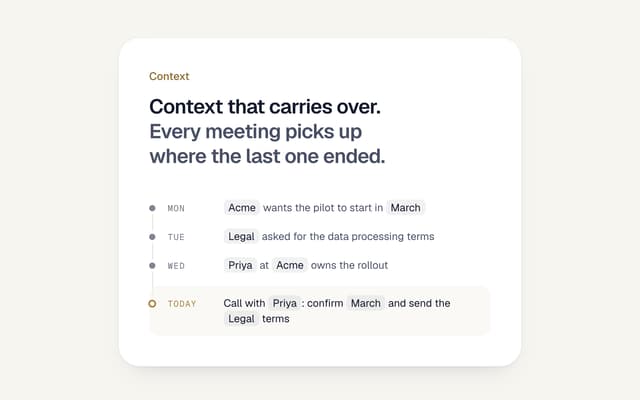
AI Memory Timeline
Use Cases Tabs Section
Pricing Section with Toggle
Logo Cloud Marquee
Testimonials Marquee
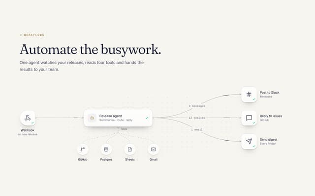
AI Agent Workflow Diagram
More in Navigation
View all

Sidebar
366

Pagination
40

Oversized 404 Numeral
73
Navbar
8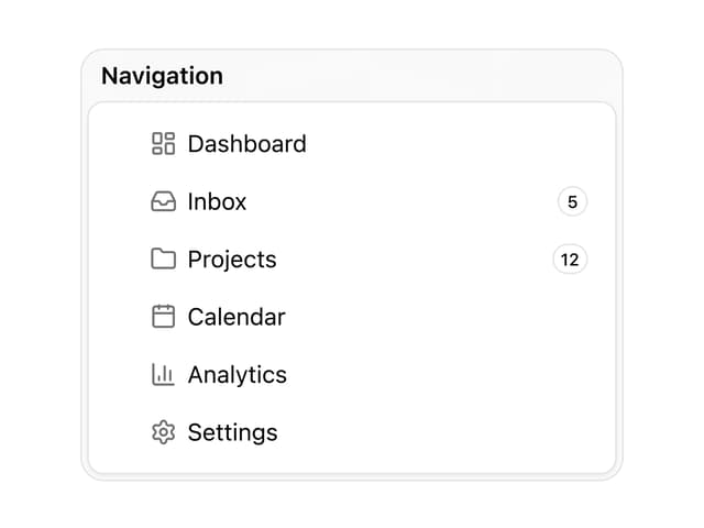

Sortable Sidebar Navigation
76

Pagination
105
Footer
457

Footer
86

