About
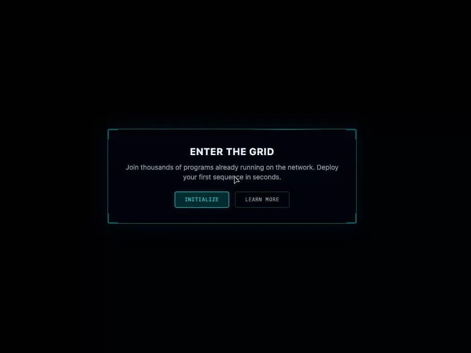
A Tron-styled call-to-action banner with animated glow, scanline overlay, corner decorations, and primary/secondary action buttons.
Built with React and Tailwind. Copy the prompt and paste it into Claude Code, Cursor or Lovable: your agent adds CTA Banner to your project and fits it to your theme.
Code
How CTA Banner is used: the demo's code. The component's own source comes with a free account.
Usage.tsx
import { CTABanner } from "@/components/ui/cta-banner"

export default function Default() {
  return (
    <div className="flex min-h-[320px] w-full items-center justify-center bg-background p-8">
      <CTABanner
        className="w-full max-w-lg"
        variant="highlight"
        title="Enter The Grid"
        description="Join thousands of programs already running on the network. Deploy your first sequence in seconds."
        primaryAction={{ label: "Initialize" }}
        secondaryAction={{ label: "Learn More" }}
      />
    </div>
  )
}
More by thegridcn
View all
Energy Meter
86
Waveform
59
Data Stream
56
Video Player
25
Terminal
16
3D Tron Grid Background
8
Pagination
7
Testimonial Card
6
More in Buttons
View all

Button
4

Button Group
38
Texture Button
102
Button
10
Native Button
12
Button
75
Split Button
36

HeroUI Button Group
11


