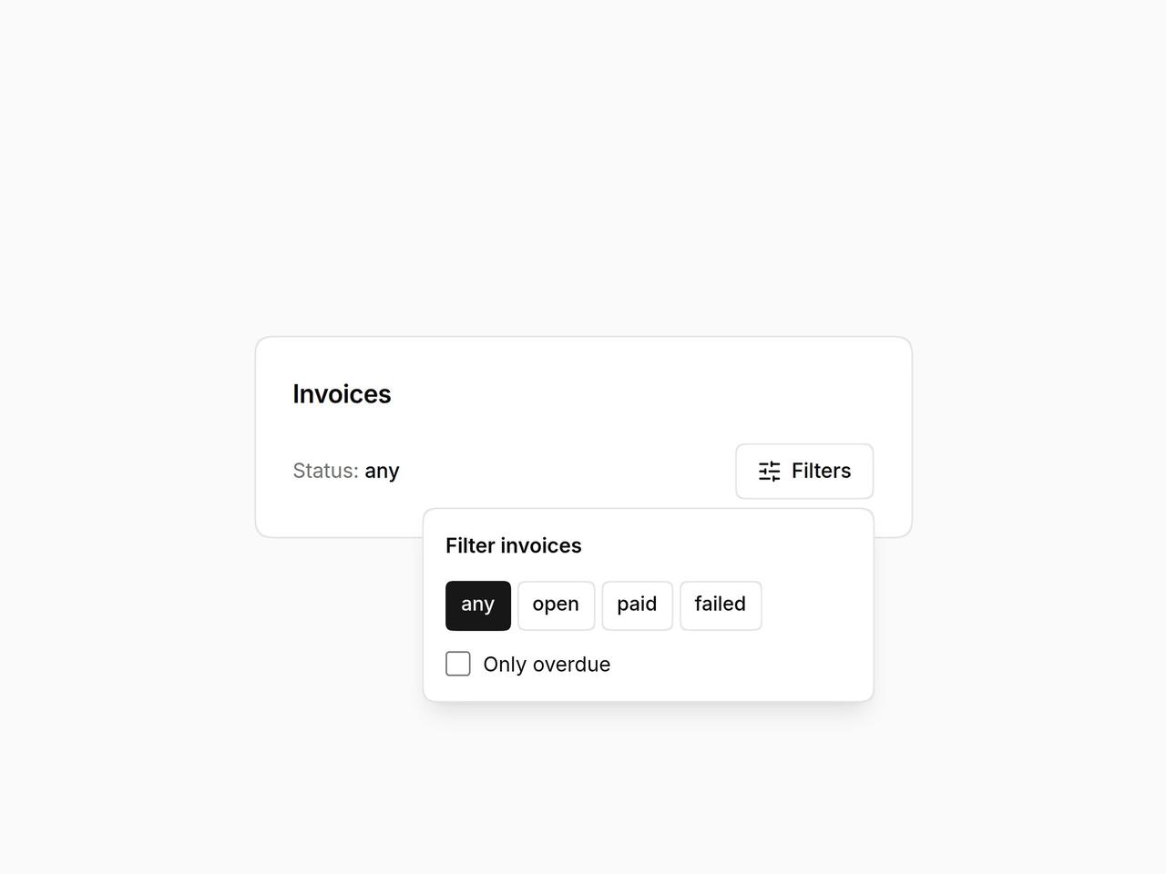
import * as React from "react";
import { Popover, PopoverContent, PopoverTrigger } from "@/components/ui/layro-popover";
import { SlidersHorizontal } from "lucide-react";

/* A floating panel anchored to its trigger, for filters and small forms.
   It flips when there is no room, closes on Escape and outside click, and
   hands focus back to the button that opened it. */

export default function PopoverDemo() {
  const [status, setStatus] = React.useState("any");
  const [overdue, setOverdue] = React.useState(false);
  return (
    <div className="flex min-h-screen w-full items-center justify-center bg-background p-6">
      <div className="w-full min-w-0 rounded-[18px] [corner-shape:squircle] bg-card p-6 text-card-foreground ring-1 ring-border" style={{ maxWidth: 420 }}>
        <h2 className="text-[16px] font-semibold tracking-[-0.01em]">Invoices</h2>
        <div className="mb-5" />
        <div className="flex items-center justify-between gap-3">
          <p className="text-[13px] text-muted-foreground">Status: <span className="font-medium text-foreground">{status}</span>{overdue ? " · overdue only" : ""}</p>
          <Popover>
            <PopoverTrigger asChild>
              <button type="button" className="inline-flex h-9 items-center gap-1.5 rounded-[10px] [corner-shape:squircle] bg-background px-3.5 text-[13px] font-medium ring-1 ring-inset ring-border outline-none hover:bg-accent focus-visible:ring-2 focus-visible:ring-ring"><SlidersHorizontal className="size-4" /> Filters</button>
            </PopoverTrigger>
            <PopoverContent align="end" aria-label="Filter invoices" className="grid gap-3">
              <p className="text-[13px] font-semibold">Filter invoices</p>
              <div className="flex flex-wrap gap-1" role="group" aria-label="Status">
                {["any", "open", "paid", "failed"].map((s) => (
                  <button key={s} type="button" aria-pressed={status === s} onClick={() => setStatus(s)} className={`h-8 rounded-[8px] [corner-shape:squircle] px-2.5 text-[12.5px] font-medium ring-1 ring-inset outline-none focus-visible:ring-2 focus-visible:ring-ring ${status === s ? "bg-primary text-primary-foreground ring-primary" : "ring-border hover:bg-accent"}`}>{s}</button>
                ))}
              </div>
              <label className="flex items-center gap-2 text-[13px]"><input type="checkbox" checked={overdue} onChange={(e) => setOverdue(e.target.checked)} className="size-4 accent-primary" /> Only overdue</label>
            </PopoverContent>
          </Popover>
        </div>
      </div>
    </div>
  );
}