import * as React from "react";
import { Stepper } from "@/components/ui/layro-stepper";

/* Progress through a setup or a signing flow. Finished steps can be
   revisited, optional ones say so, and an error is written out, not only
   coloured red. */

export default function StepperDemo() {
  const [step, setStep] = React.useState(1);
  return (
    <div className="flex min-h-screen w-full items-center justify-center bg-background p-6">
      <div className="w-full min-w-0 rounded-[18px] [corner-shape:squircle] bg-card p-6 text-card-foreground ring-1 ring-border" style={{ maxWidth: 480 }}>
        <h2 className="text-[16px] font-semibold tracking-[-0.01em]">Set up your workspace</h2>
        <div className="mb-5" />
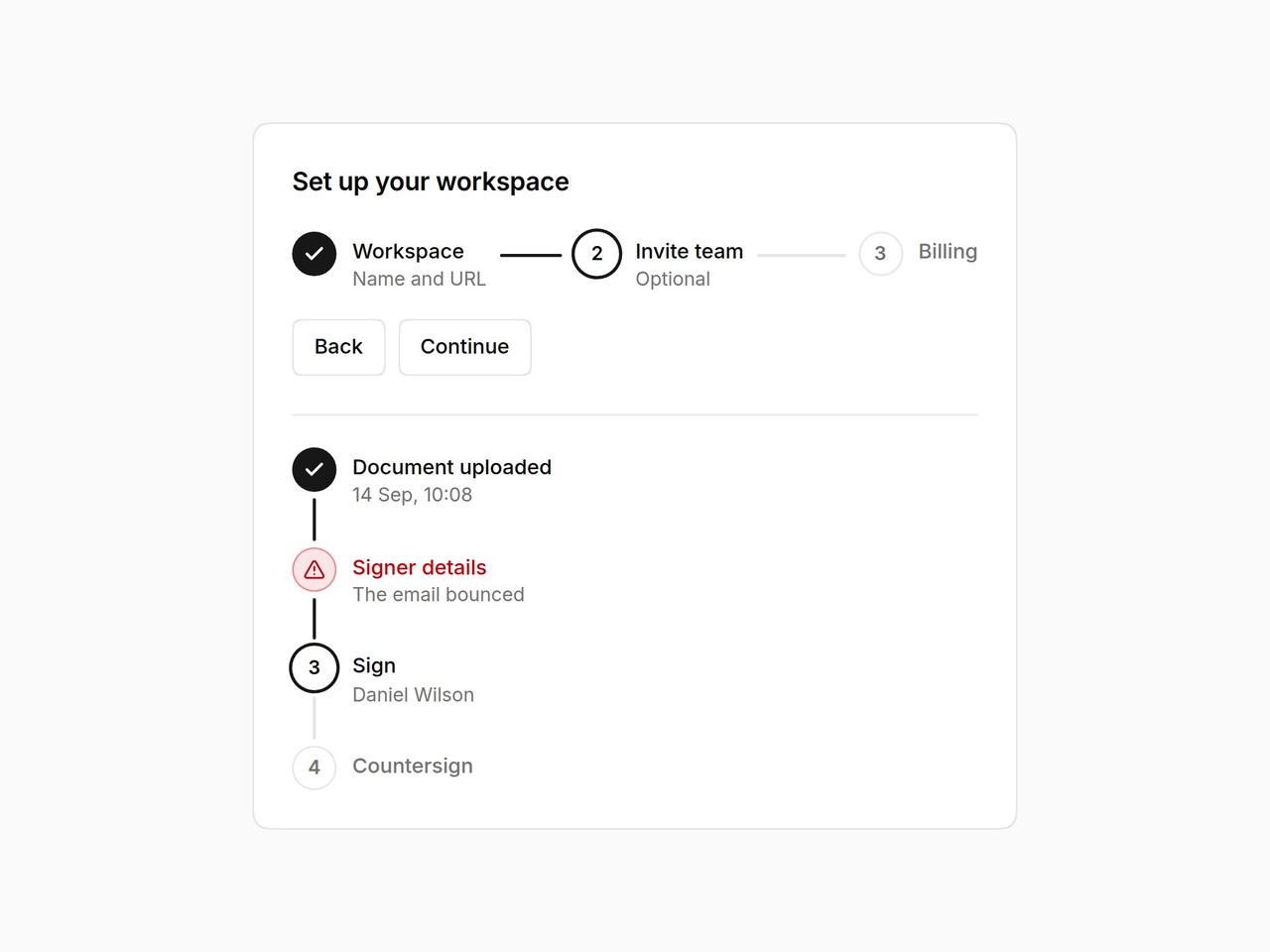
        <Stepper current={step} onStepClick={setStep} steps={[{ title: "Workspace", description: "Name and URL" }, { title: "Invite team", optional: true }, { title: "Billing" }]} />
        <div className="mt-4 flex gap-2">
          <button type="button" className="inline-flex h-9 items-center gap-1.5 rounded-[10px] [corner-shape:squircle] bg-background px-3.5 text-[13px] font-medium ring-1 ring-inset ring-border outline-none hover:bg-accent focus-visible:ring-2 focus-visible:ring-ring" onClick={() => setStep((s) => Math.max(0, s - 1))}>Back</button>
          <button type="button" className="inline-flex h-9 items-center gap-1.5 rounded-[10px] [corner-shape:squircle] bg-background px-3.5 text-[13px] font-medium ring-1 ring-inset ring-border outline-none hover:bg-accent focus-visible:ring-2 focus-visible:ring-ring" onClick={() => setStep((s) => Math.min(3, s + 1))}>Continue</button>
        </div>
        <div className="mt-6 border-t border-border pt-5">
          <Stepper orientation="vertical" current={2} steps={[{ title: "Document uploaded", description: "14 Sep, 10:08" }, { title: "Signer details", description: "The email bounced", error: true }, { title: "Sign", description: "Daniel Wilson" }, { title: "Countersign" }]} />
        </div>
      </div>
    </div>
  );
}