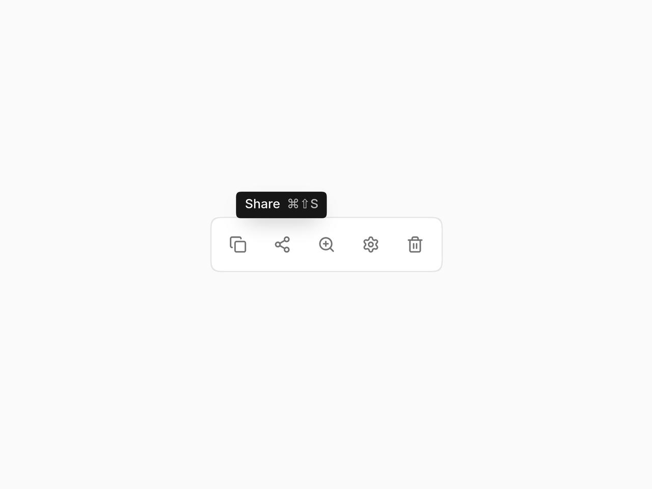
import * as React from "react";
import { Tooltip, TooltipProvider } from "@/components/ui/layro-tooltip";
import { Copy, Settings, Trash2, ZoomIn, Share2 } from "lucide-react";

/* Short labels for icon buttons, with the shortcut beside them. Inside a
   TooltipProvider, moving along the toolbar skips the delay, and focus
   opens a tooltip as well as hover. */

export default function TooltipDemo() {
  return (
    <div className="flex min-h-screen w-full items-center justify-center bg-background p-6">
      <TooltipProvider>
        <div role="toolbar" aria-label="Document" className="flex items-center gap-1 rounded-[14px] [corner-shape:squircle] bg-card p-1.5 ring-1 ring-border">
          {[["Duplicate", "⌘D", Copy], ["Share", "⌘⇧S", Share2], ["Zoom in", "⌘+", ZoomIn], ["Settings", "⌘,", Settings], ["Delete", undefined, Trash2]].map(([label, keys, I]: any) => (
            <Tooltip key={label} label={label} keys={keys}>
              <button type="button" aria-label={label} className="grid size-9 place-items-center rounded-[10px] [corner-shape:squircle] text-muted-foreground outline-none hover:bg-accent hover:text-foreground focus-visible:ring-2 focus-visible:ring-ring">
                <I className="size-4" />
              </button>
            </Tooltip>
          ))}
        </div>
      </TooltipProvider>
    </div>
  );
}