
About
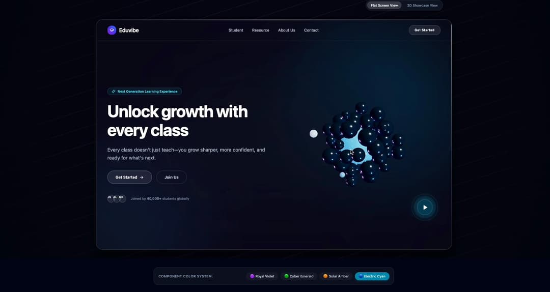
Photorealistic 3D interactive hero header featuring WebGL sphere cluster with orbiting satellites, dynamic perspective card tilt, customizable navigation, and pulsing sonar video trigger.
Built with React and Tailwind. Copy the prompt and paste it into Claude Code, Cursor or Lovable: your agent adds Interactive 3D Hero Header to your project and fits it to your theme.
Code
How Interactive 3D Hero Header is used: the demo's code. The component's own source comes with a free account.
Usage.tsx
"use client"

import * as React from "react"
import {
  Hero3DHeader,
  type NavItem,
  type HeroTheme,
} from "@/components/ui/interactive-3d-hero"
import { Sparkles, ArrowRight, GraduationCap } from "lucide-react"

/* -------------------------------------------------------------------------- */
/*                               Demo Navigation                              */
/* -------------------------------------------------------------------------- */

const DEMO_NAV_ITEMS: NavItem[] = [
  { label: "Student", href: "#student", active: false },
  { label: "Resource", href: "#resource", active: false },
  { label: "About Us", href: "#about", active: false },
  { label: "Contact", href: "#contact", active: false },
]

export default function Hero3DDemo() {
  const [activeTheme, setActiveTheme] = React.useState<HeroTheme>("violet")

  const handleNavClick = (label: string) => {
    console.log(`Navigated to: ${label}`)
  }

  return (
    <div className="relative w-full overflow-hidden bg-slate-950 font-sans">
      {/* 3D Hero Section with Unified Theme Integration */}
      <Hero3DHeader
        theme={activeTheme}
        brand={{
          name: "Eduvibe",
          logo: (
            <div className="flex h-8 w-8 items-center justify-center rounded-xl bg-gradient-to-tr from-purple-600 via-indigo-600 to-blue-500 shadow-md">
              <GraduationCap className="h-4 w-4 text-white" />
            </div>
          ),
          href: "#",
        }}
        navItems={DEMO_NAV_ITEMS}
        navCta={{
          label: "Get Started",
          onClick: () => handleNavClick("Nav Get Started"),
        }}
        badge={{
          text: "Next Generation Learning Experience",
          icon: <Sparkles className="h-3.5 w-3.5" />,
        }}
        title="Unlock growth with every class"
        subtitle="Every class doesn't just teach—you grow sharper, more confident, and ready for what's next."
        primaryCta={{
          label: "Get Started",
          onClick: () => handleNavClick("Primary Get Started"),
          icon: <ArrowRight className="h-4 w-4" />,
        }}
        secondaryCta={{
          label: "Join Us",
          onClick: () => handleNavClick("Secondary Join Us"),
        }}
        videoTrigger={{
          label: "Watch Eduvibe Interactive Class Tour",
        }}
        initialMode="flat" // Flat screen view as default
        allowModeToggle={true}
        backgroundVariant="ribbed"
      />

      {/* Palette customizer bar */}
      <section
        aria-label="Component Preset Selector"
        className="relative z-20 mx-auto max-w-4xl px-4 py-8"
      >
        <div className="flex flex-col sm:flex-row items-center justify-between gap-4 rounded-2xl border border-white/10 bg-slate-900/60 p-4 backdrop-blur-md">
          <div className="flex items-center gap-2">
            <span className="text-xs font-semibold uppercase tracking-wider text-slate-400">
              Component Color System:
            </span>
          </div>

          <div className="flex items-center flex-wrap gap-2">
            <button
              type="button"
              onClick={() => setActiveTheme("violet")}
              className={`rounded-full px-3.5 py-1.5 text-xs font-medium transition-colors ${
                activeTheme === "violet"
                  ? "bg-purple-600 text-white shadow-md shadow-purple-600/30"
                  : "bg-white/5 text-slate-300 hover:bg-white/10"
              }`}
            >
              🟣 Royal Violet
            </button>
            <button
              type="button"
              onClick={() => setActiveTheme("emerald")}
              className={`rounded-full px-3.5 py-1.5 text-xs font-medium transition-colors ${
                activeTheme === "emerald"
                  ? "bg-emerald-600 text-white shadow-md shadow-emerald-600/30"
                  : "bg-white/5 text-slate-300 hover:bg-white/10"
              }`}
            >
              🟢 Cyber Emerald
            </button>
            <button
              type="button"
              onClick={() => setActiveTheme("amber")}
              className={`rounded-full px-3.5 py-1.5 text-xs font-medium transition-colors ${
                activeTheme === "amber"
                  ? "bg-amber-600 text-white shadow-md shadow-amber-600/30"
                  : "bg-white/5 text-slate-300 hover:bg-white/10"
              }`}
            >
              🟠 Solar Amber
            </button>
            <button
              type="button"
              onClick={() => setActiveTheme("cyan")}
              className={`rounded-full px-3.5 py-1.5 text-xs font-medium transition-colors ${
                activeTheme === "cyan"
                  ? "bg-cyan-600 text-white shadow-md shadow-cyan-600/30"
                  : "bg-white/5 text-slate-300 hover:bg-white/10"
              }`}
            >
              🔵 Electric Cyan
            </button>
          </div>
        </div>
      </section>
    </div>
  )
}
Dependencies
More by WRAPCODERS
View all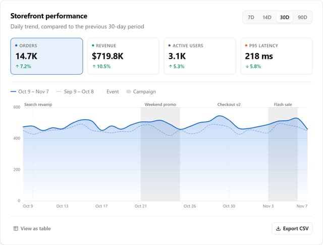

Metric Trend Chart
31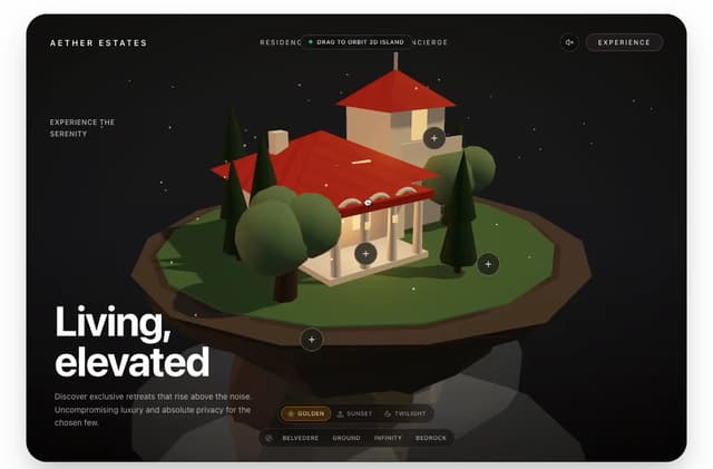
Real Estate 3D Hero
7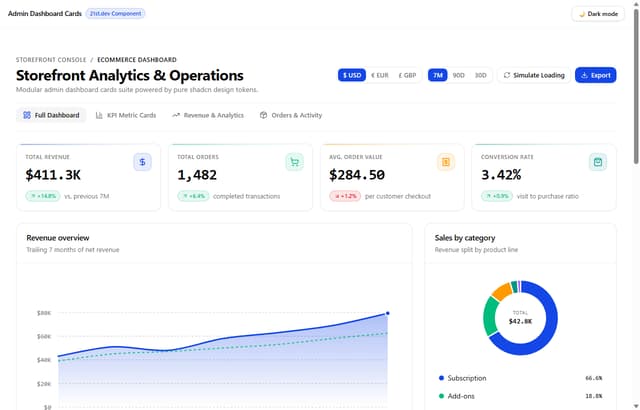
Admin Dashboard Cards
More in Heroes
View all

SaaS Template
2.7K

Responsive Hero Banner
2.2K
Editorial Collage Hero
504
Centered Hero with Image Fan
1.1K

Hero
1.3K

Aero Hero-3
617

Hero 03
375
Hero with group of images, text and two buttons
442
