About
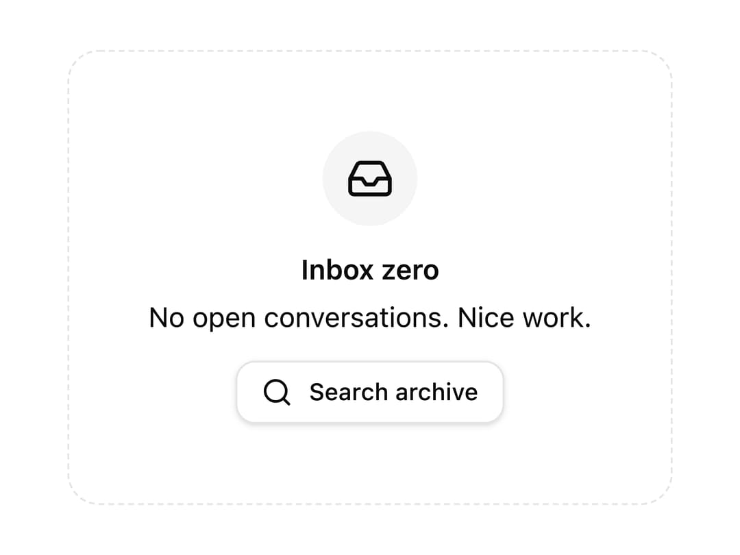
A placeholder block with an icon, title, description and action for when a list, table or search has no results to show.
Built with React and Tailwind. Copy the prompt and paste it into Claude Code, Cursor or Lovable: your agent adds Empty State to your project and fits it to your theme.
Code
How Empty State is used: the demo's code. The component's own source comes with a free account.
Usage.tsx
import { EmptyState } from "@/components/ui/empty-state";
import { Button } from "@/components/ui/button";
import { Inbox, Search } from "lucide-react";

export default function EmptyStateInboxZeroDemo() {
  return (
    <div className="flex w-full max-w-md items-center justify-center p-6">
      <EmptyState
        icon={<Inbox />}
        title="Inbox zero"
        description="No open conversations. Nice work."
        action={
          <Button size="sm" variant="outline">
            <Search /> Search archive
          </Button>
        }
      />
    </div>
  );
}
Dependencies
More by wunder-ui
View all

Popover