About
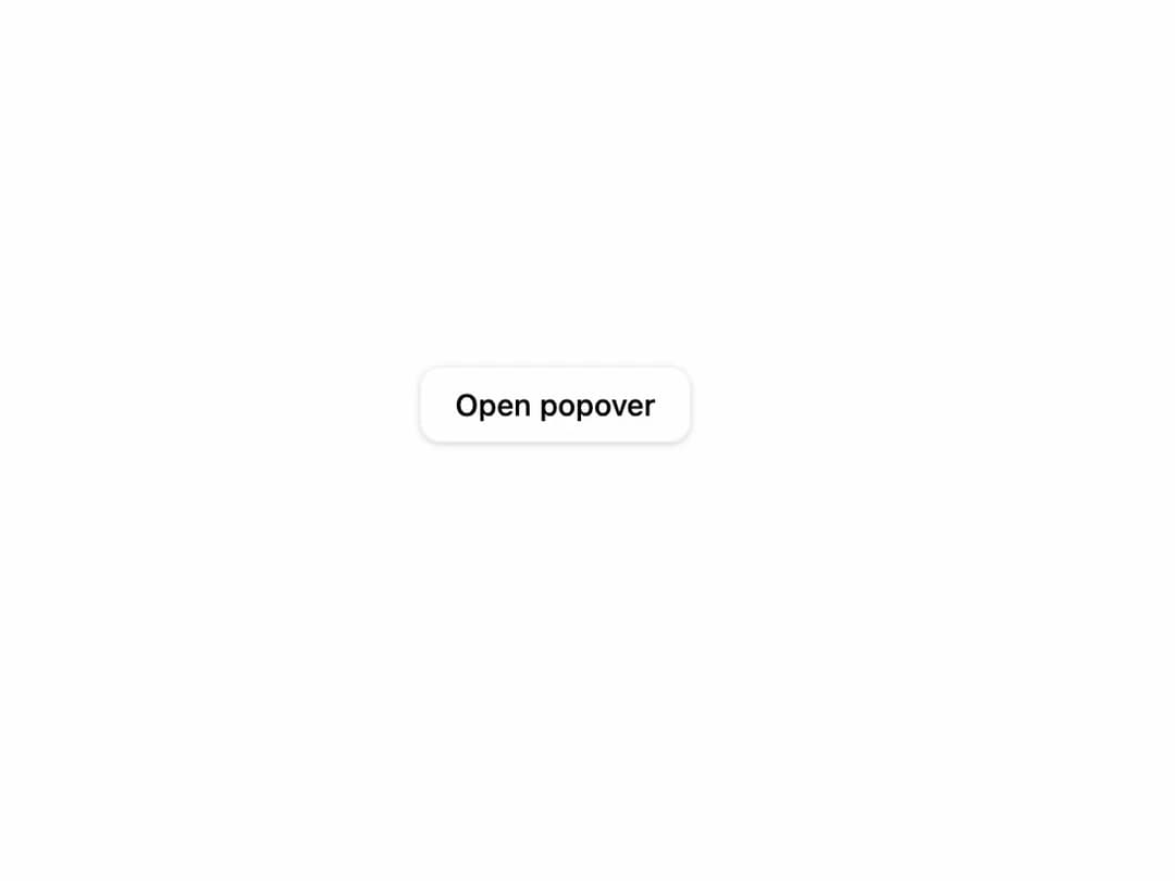
A floating panel anchored to a trigger element, used for small contextual content like settings, filters, or a short form.
Built with React and Tailwind. Copy the prompt and paste it into Claude Code, Cursor or Lovable: your agent adds Popover to your project and fits it to your theme.
Code
How Popover is used: the demo's code. The component's own source comes with a free account.
Usage.tsx
"use client";

import {
  Popover,
  PopoverClose,
  PopoverContent,
  PopoverTrigger,
} from "@/components/ui/popover";

export default function PopoverDemo() {
  return (
    <div className="flex h-screen w-full items-center justify-center bg-background">
      <Popover>
        <PopoverTrigger className="inline-flex h-9 items-center justify-center rounded-md border border-border bg-background px-4 text-sm font-medium text-foreground shadow-sm transition-colors hover:bg-muted">
          Open popover
        </PopoverTrigger>
        <PopoverContent className="w-72">
          <div className="flex flex-col gap-3">
            <div className="flex flex-col gap-1">
              <h4 className="text-sm font-semibold text-popover-foreground">
                Appearance
              </h4>
              <p className="text-sm text-muted-foreground">
                Choose how the interface looks on this device.
              </p>
            </div>
            <div className="flex justify-end gap-2">
              <PopoverClose className="inline-flex h-8 items-center justify-center rounded-md px-3 text-sm font-medium text-foreground hover:bg-muted">
                Cancel
              </PopoverClose>
              <PopoverClose className="inline-flex h-8 items-center justify-center rounded-md bg-primary px-3 text-sm font-medium text-primary-foreground hover:opacity-90">
                Save
              </PopoverClose>
            </div>
          </div>
        </PopoverContent>
      </Popover>
    </div>
  );
}
Dependencies
More by wunder-ui
View all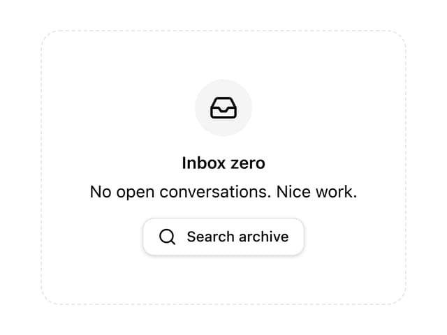

Empty State
More in Forms
View all

Premium Auth
527

Contact Card
1K
Login Card
28

Book A Demo 1
76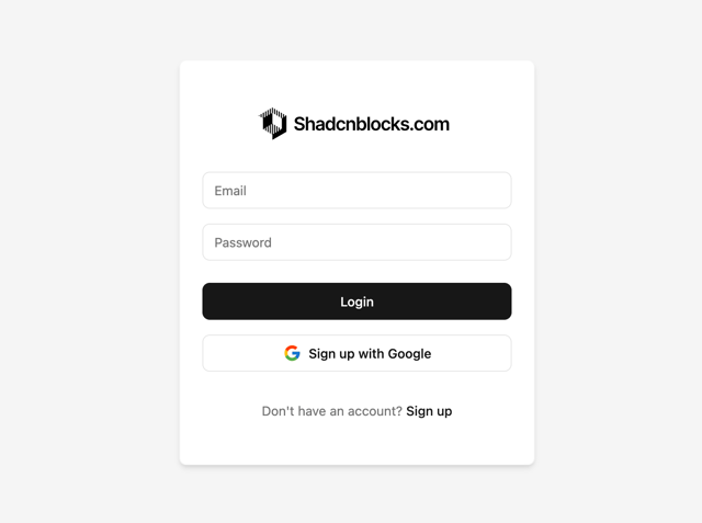

Login 1
54

Login Card
33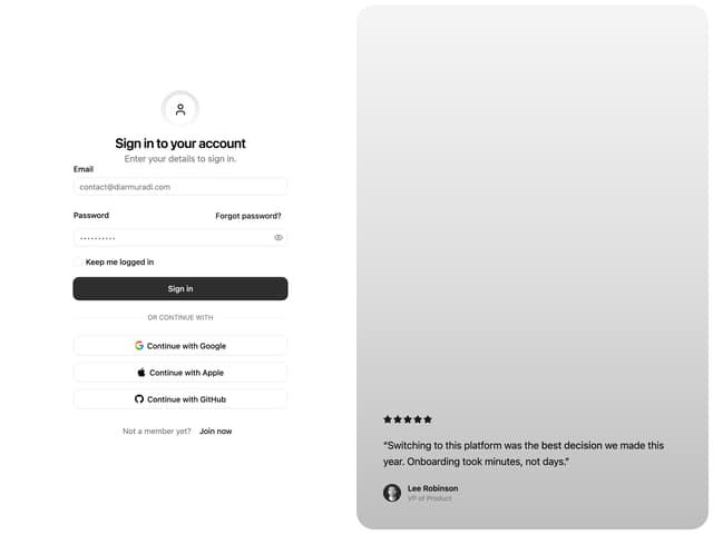

Split Sign In Form
63
Price Range Slider
226

