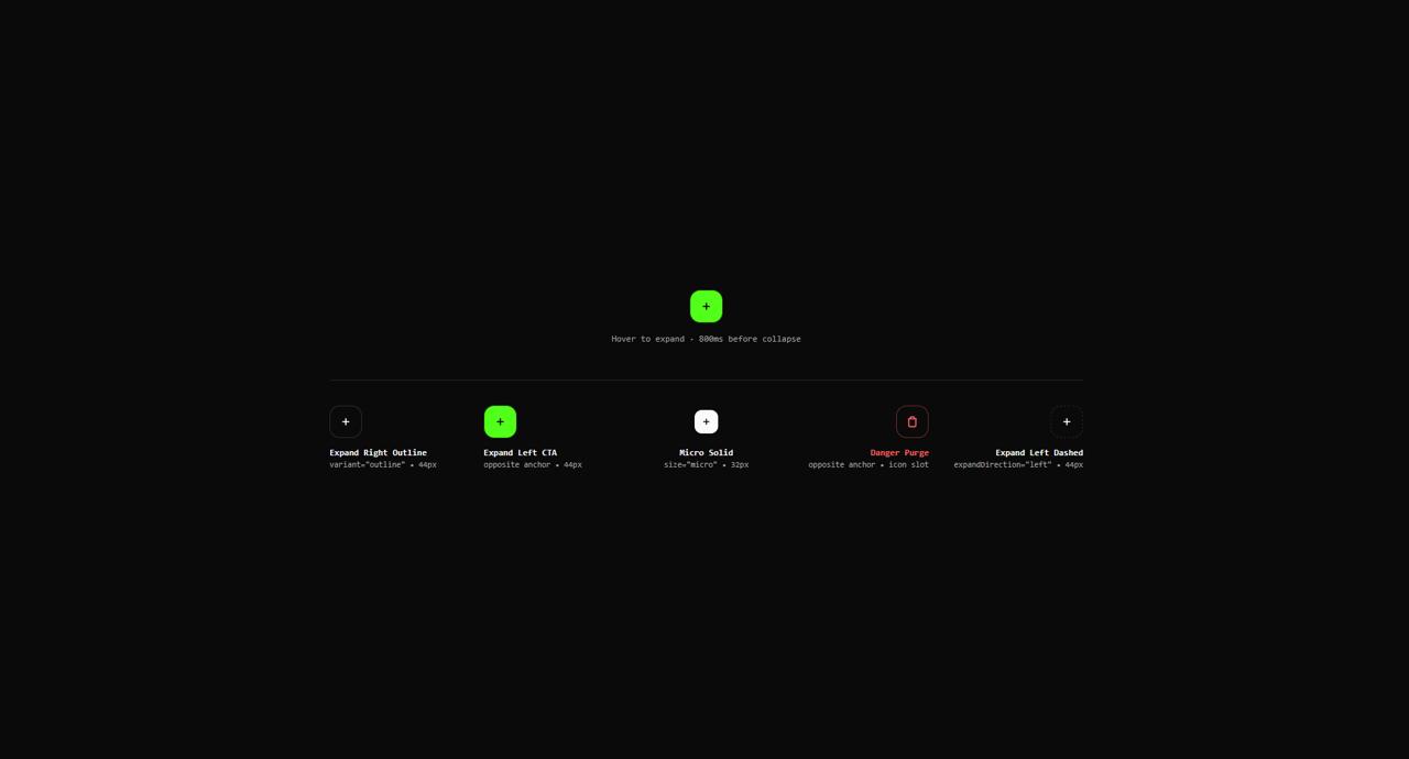
import { HoverExpandButton } from "@/components/ui/hover-expand-button-lucis";

export const settings = {
  label: 'ADDE NOVUM',
  variant: 'cta',
  size: 'md',
  expandDirection: 'right',
  rotateIcon: true,
  disabled: false,
};

export default function Demo(props: Partial<typeof settings>) {
  const current = { ...settings, ...props };

  return (
    <div className="flex min-h-[420px] w-full flex-col items-center justify-center gap-12 font-sans p-6 sm:p-10 bg-background text-foreground">
      {/* Primary Interactive Specimen connected to Controls */}
      <div className="flex flex-col items-center gap-3">
        <div className="flex items-center justify-center min-w-[220px] h-12">
          <HoverExpandButton
            label={current.label}
            variant={current.variant as any}
            size={current.size as any}
            expandDirection={current.expandDirection as any}
            rotateIcon={current.rotateIcon as any}
            disabled={current.disabled}
          />
        </div>
        <span className="font-mono text-xs text-neutral-400">
          Hover to expand · 800ms before collapse
        </span>
      </div>

      {/* 5-Column Preset Showcase with Balanced Symmetrical Spacing */}
      <div className="grid grid-cols-2 sm:grid-cols-3 lg:grid-cols-5 gap-6 w-full max-w-5xl pt-8 border-t border-neutral-200 dark:border-neutral-800">
        {/* 01: Expand Right Outline (Standard left-anchor, outlined and not filled) */}
        <div className="flex flex-col gap-2.5 min-w-[130px]">
          <div className="flex items-center justify-start h-12">
            <HoverExpandButton
              label="FILTRA TABULAM"
              variant="outline"
              size="md"
              expandDirection="right"
            />
          </div>
          <div className="flex flex-col text-left">
            <span className="font-mono text-xs font-semibold text-foreground">
              Expand Right Outline
            </span>
            <span className="font-mono text-[11px] text-muted-foreground">
              variant="outline" • 44px
            </span>
          </div>
        </div>

        {/* 02: Default Expand CTA (Opposite: left-anchored while expanding left) */}
        <div className="flex flex-col gap-2.5 min-w-[130px]">
          <div className="flex items-center justify-start h-12">
            <HoverExpandButton
              label="APPARATUS"
              variant="cta"
              size="md"
              expandDirection="left"
            />
          </div>
          <div className="flex flex-col text-left">
            <span className="font-mono text-xs font-semibold text-foreground">
              Expand Left CTA
            </span>
            <span className="font-mono text-[11px] text-muted-foreground">
              opposite anchor • 44px
            </span>
          </div>
        </div>

        {/* 03: Micro Solid (Balanced Center) */}
        <div className="flex flex-col gap-2.5 min-w-[110px]">
          <div className="flex items-center justify-center h-12">
            <HoverExpandButton
              label="CLAUSUS"
              variant="solid"
              size="micro"
              expandDirection="right"
            />
          </div>
          <div className="flex flex-col text-center">
            <span className="font-mono text-xs font-semibold text-foreground">
              Micro Solid
            </span>
            <span className="font-mono text-[11px] text-muted-foreground">
              size="micro" • 32px
            </span>
          </div>
        </div>

        {/* 04: Danger Purge (Opposite: right-anchored while expanding right) */}
        <div className="flex flex-col gap-2.5 min-w-[130px]">
          <div className="flex items-center justify-end h-12">
            <HoverExpandButton
              label="PURGA OMNIA"
              variant="danger"
              size="md"
              rotateIcon={false}
              icon={
                <svg className="w-4 h-4" viewBox="0 0 24 24" fill="none" stroke="currentColor" strokeWidth="2.5">
                  <path d="M3 6h18m-2 0v14c0 1-1 2-2 2H7c-1 0-2-1-2-2V6m3 0V4c0-1 1-2 2-2h4c1 0 2 1 2 2v2" />
                </svg>
              }
            />
          </div>
          <div className="flex flex-col text-right">
            <span className="font-mono text-xs font-semibold text-destructive">
              Danger Purge
            </span>
            <span className="font-mono text-[11px] text-muted-foreground">
              opposite anchor • icon slot
            </span>
          </div>
        </div>

        {/* 05: Expand Left Dashed (Standard right-anchor) */}
        <div className="flex flex-col gap-2.5 min-w-[130px]">
          <div className="flex items-center justify-end h-12">
            <HoverExpandButton
              label="ADDE NOVUM"
              variant="dashed"
              size="md"
              expandDirection="left"
            />
          </div>
          <div className="flex flex-col text-right">
            <span className="font-mono text-xs font-semibold text-foreground">
              Expand Left Dashed
            </span>
            <span className="font-mono text-[11px] text-muted-foreground">
              expandDirection="left" • 44px
            </span>
          </div>
        </div>
      </div>
    </div>
  );
}