
About
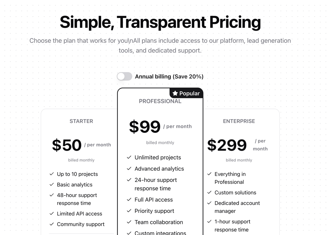
A dynamic pricing section with animated cards, confetti effects, and monthly/yearly toggle. Features: • Animated pricing cards using Framer Motion • Interactive monthly/yearly pricing toggle with a confetti effect • Responsive design using a mobile-first approach • Dynamic price updates with NumberFlow animations • Industry-specific content customization • Popular plan highlighting • Dark mode compatibility
Built with React and Tailwind. Copy the prompt and paste it into Claude Code, Cursor or Lovable: your agent adds Pricing to your project and fits it to your theme.
Code
How Pricing is used: the demo's code. The component's own source comes with a free account.
Usage.tsx
"use client";

import { Pricing } from "@/components/blocks/pricing";

const demoPlans = [
  {
    name: "STARTER",
    price: "50",
    yearlyPrice: "40",
    period: "per month",
    features: [
      "Up to 10 projects",
      "Basic analytics",
      "48-hour support response time",
      "Limited API access",
      "Community support",
    ],
    description: "Perfect for individuals and small projects",
    buttonText: "Start Free Trial",
    href: "/sign-up",
    isPopular: false,
  },
  {
    name: "PROFESSIONAL",
    price: "99",
    yearlyPrice: "79",
    period: "per month",
    features: [
      "Unlimited projects",
      "Advanced analytics",
      "24-hour support response time",
      "Full API access",
      "Priority support",
      "Team collaboration",
      "Custom integrations",
    ],
    description: "Ideal for growing teams and businesses",
    buttonText: "Get Started",
    href: "/sign-up",
    isPopular: true,
  },
  {
    name: "ENTERPRISE",
    price: "299",
    yearlyPrice: "239",
    period: "per month",
    features: [
      "Everything in Professional",
      "Custom solutions",
      "Dedicated account manager",
      "1-hour support response time",
      "SSO Authentication",
      "Advanced security",
      "Custom contracts",
      "SLA agreement",
    ],
    description: "For large organizations with specific needs",
    buttonText: "Contact Sales",
    href: "/contact",
    isPopular: false,
  },
];

function PricingBasic() {
  return (
    <div className="h-[800px] overflow-y-auto rounded-lg">
      <Pricing
        plans={demoPlans}
        title="Simple, Transparent Pricing"
        description="Choose the plan that works for you\nAll plans include access to our platform, lead generation tools, and dedicated support."
      />
    </div>
  );
}

export { PricingBasic };
Dependencies
More by Prism UI
View all
Display Cards
5.4K
Expandable Card
340
Floating Action Panel
198
Hero Badge
158
useExpandable
135
Logo Carousel
132
Icons
127
Popover
104
More in Pricing
View all
Pricing Section
572

Pricing Section
173

Pricing Cards
16

Pricing Card
532
pricing section
157
Colorful-Pricing
84
Single Pricing Card
792
Login Card
5


