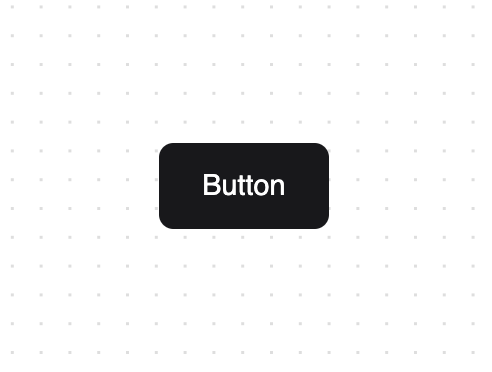
About
An animated button component to enhance your app's user experience and interactivity. This example was made with Tailwind CSS and Framer Motion.
Built with React and Tailwind. Copy the prompt and paste it into Claude Code, Cursor or Lovable: your agent adds Animated Shadcn Button to your project and fits it to your theme.
Code
How Animated Shadcn Button is used: the demo's code. The component's own source comes with a free account.
Usage.tsx
import { Button } from "@/components/ui/button";

function ButtonExample() {
  return (
    <>
      <Button type="button">Button</Button>
    </>
  );
}

export { ButtonExample };
Dependencies
More by Bundui.io
View all

Fluid particles background
796
Floating paths
672
Text Gradient Scroll
625
Stars
553
Image Comparison
429
Magnetic Button
406
Marquee Effect
329
Wavy
210
More in Buttons
View all

Button
1
Button
6

App Store Button
471

Button
34
Native Button
2
Figma File Button
33

Button
53
Button
74


