
About
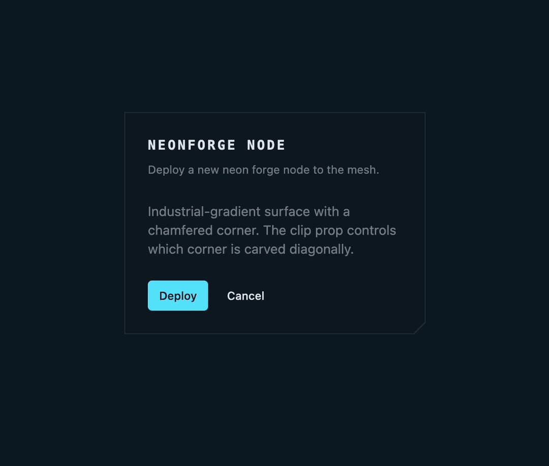
A glass-panel card container with an optional diagonally-chamfered (cut) corner, built for cyberpunk/industrial-themed UIs, used to group a header, content and footer in one surface.
Built with React and Tailwind. Copy the prompt and paste it into Claude Code, Cursor or Lovable: your agent adds Chamfered Glass Card to your project and fits it to your theme.
Code
How Chamfered Glass Card is used: the demo's code. The component's own source comes with a free account.
Usage.tsx
"use client";

import { Button } from "@/components/ui/button";
import {
  Card,
  CardContent,
  CardDescription,
  CardFooter,
  CardHeader,
  CardTitle,
} from "@/components/ui/card";

export default function CardDemo() {
  return (
    <div className="flex min-h-screen w-full items-center justify-center p-8">
      <Card clip="br" className="w-80">
        <CardHeader>
          <CardTitle className="font-mono text-sm font-bold uppercase tracking-[0.15em]">
            NeonForge Node
          </CardTitle>
          <CardDescription className="text-xs leading-5">
            Deploy a new neon forge node to the mesh.
          </CardDescription>
        </CardHeader>
        <CardContent className="text-sm text-muted-foreground">
          Industrial-gradient surface with a chamfered corner. The clip prop
          controls which corner is carved diagonally.
        </CardContent>
        <CardFooter className="flex gap-2">
          <Button size="sm">Deploy</Button>
          <Button size="sm" variant="ghost">
            Cancel
          </Button>
        </CardFooter>
      </Card>
    </div>
  );
}
More in Cards
View all

Course Design Cards
1.2K
Stats cards with links
128

Interactive Tech Stack Bento Grid with Hover Effects
397

Statistics Card 2
291

Card Studio
14
Statistics Card 10
281
The Item one
3
Card
70
