
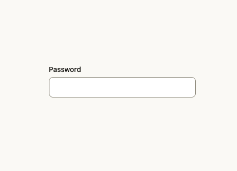
About
An accessible labeled text input with support text and validation error messaging, built on React Aria for forms.
Built with React and Tailwind. Copy the prompt and paste it into Claude Code, Cursor or Lovable: your agent adds Text Field to your project and fits it to your theme.
Code
How Text Field is used: the demo's code. The component's own source comes with a free account.
Usage.tsx
import { TextField } from "@/components/ui/text-field";

export default function TextFieldPasswordDemo() {
  return (
    <div className="flex min-h-[400px] w-full items-center justify-center bg-bg p-8">
      <TextField
        label="Password"
        type="password"
        placeholder=""
        className="w-72"
      />
    </div>
  );
}
Dependencies
More by jdavisson87
View all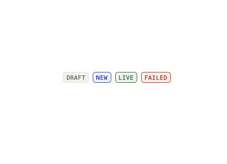
Status Badge
1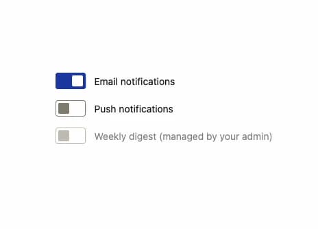
Switch
More in Forms
View all

Premium Auth
548

Contact Card
1.1K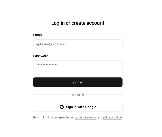

Login 2
10

Form
17

Card Studio
46

Form
20

Login 1
59
SignInPage
719
