About
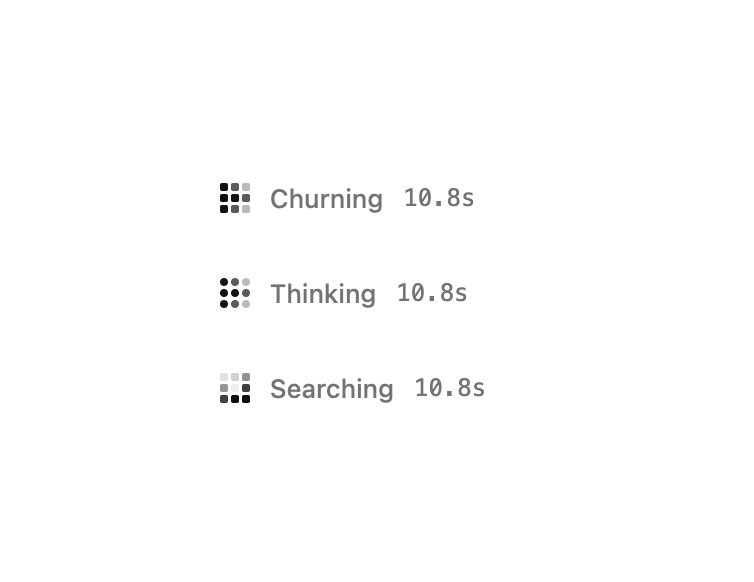
A compact pixel-grid loader with an animated wavefront, a shimmering status label, and a live elapsed timer for long-running or agent tasks.
Built with React and Tailwind. Copy the prompt and paste it into Claude Code, Cursor or Lovable: your agent adds Loading State to your project and fits it to your theme.
Code
How Loading State is used: the demo's code. The component's own source comes with a free account.
Usage.tsx
import LoadingState from "@/components/ui/loading-state";

export default function LoadingStateDemo() {
  return (
    <div className="flex min-h-[280px] w-full items-center justify-center bg-background p-8">
      <div className="flex flex-col gap-7">
        <LoadingState label="Churning" variant="Drive" />
        <LoadingState label="Thinking" variant="Dots" />
        <LoadingState label="Searching" variant="Orbit" />
      </div>
    </div>
  );
}
More by theshanelevine
View all
Streaming Text
484
Thinking
157
Records Table
111
Approval Card
74
Chat Panel
39
Recommendation Card
4
Filter Table
2
Code Block
1