
About
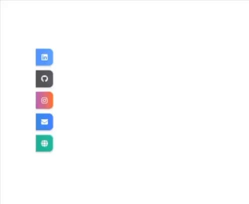
A fully responsive and theme-aware social media links component that displays a vertical sidebar on desktop and a floating expandable dock on mobile. Each link is styled with platform-specific gradients and consistent white icons for both light and dark themes. The floating dock includes an interactive toggle button that adapts its icon color based on theme mode.
Built with React and Tailwind. Copy the prompt and paste it into Claude Code, Cursor or Lovable: your agent adds Social Links to your project and fits it to your theme.
Code
How Social Links is used: the demo's code. The component's own source comes with a free account.
Usage.tsx
import * as React from "react";
import { SocialLinks } from "@/components/ui/social-links";

export default function SocialLinksDemo() {
  return (
    <div className="min-h-screen flex items-center justify-center bg-[hsl(var(--background))]">
      <SocialLinks
        links={[
          { platform: "linkedin", href: "https://linkedin.com" },
          { platform: "github", href: "https://github.com" },
          { platform: "instagram", href: "https://instagram.com" },
          { platform: "mail", href: "mailto:test@example.com" },
          { platform: "website", href: "https://example.com" },
        ]}
        floatingButtonColor="bg-slate-700"
      />
    </div>
  );
}
Dependencies
More by Wasif Bin Nasir
View all

PreLoader
4
More in Buttons
View all
Texture Button
96

Button
5

Button Group


Eclipse Button
39
Button
4

App Store Button
458

HeroUI Button Group

Base Button
4

