
About
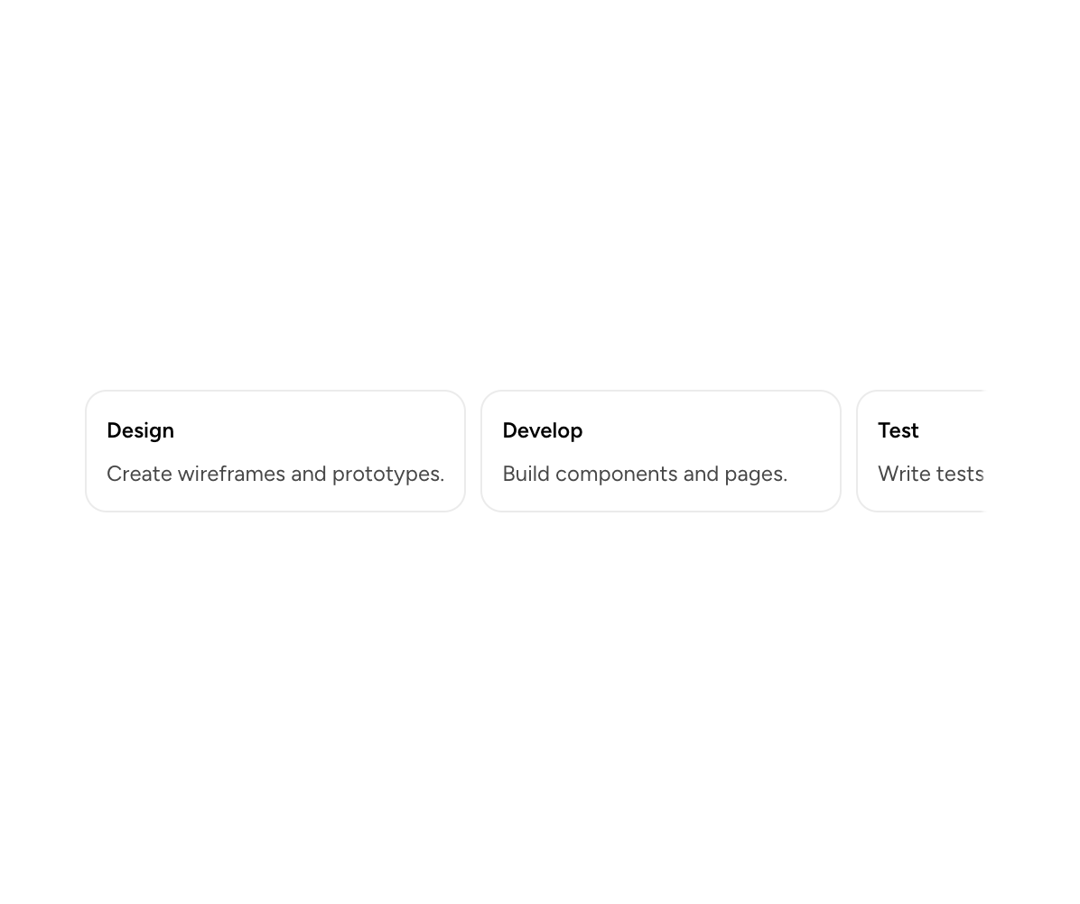
An Astryx horizontal carousel for browsing overflowing card grids, image galleries, product lists, and related items.
Built with React and Tailwind. Copy the prompt and paste it into Claude Code, Cursor or Lovable: your agent adds Astryx Carousel to your project and fits it to your theme.
Code
How Astryx Carousel is used: the demo's code. The component's own source comes with a free account.
Usage.tsx
'use client';

import {Carousel} from '@/components/ui/astryx-carousel';
import {Card} from '@astryxdesign/core/Card';
import {Stack} from '@astryxdesign/core/Layout';
import {Text, Heading} from '@astryxdesign/core/Text';

const ITEMS = [
  {title: 'Design', body: 'Create wireframes and prototypes.'},
  {title: 'Develop', body: 'Build components and pages.'},
  {title: 'Test', body: 'Write tests and fix bugs.'},
  {title: 'Deploy', body: 'Ship to production.'},
  {title: 'Monitor', body: 'Track performance and errors.'},
];

export default function CarouselShowcase() {
  return (
    <div
      data-astryx-theme="neutral"
      data-theme="light"
      style={{colorScheme: 'light', display: 'contents'}}>
      <Carousel
        gap={2}
        hasSnap
        hasButtons={false}
        aria-label="Workflow steps"
        style={{maxWidth: 500}}>
        {ITEMS.map(item => (
          <Card key={item.title} padding={3} style={{minWidth: 200}}>
            <Stack direction="vertical" gap={1}>
              <Heading level={5}>{item.title}</Heading>
              <Text type="supporting" color="secondary">
                {item.body}
              </Text>
            </Stack>
          </Card>
        ))}
      </Carousel>
    </div>
  );
}
Dependencies
More by Astryx
View all

Astryx Banner
56
Astryx Avatar
28
Astryx Aspect Ratio
27
Astryx Badge
25
Astryx Button Group
23
Astryx Toggle Button
16
Astryx Avatar Group
8
Astryx Button
4
More in Navigation
View all

Sidebar
354

Oversized 404 Numeral
71
Astryx Clickable Card

Pagination Ant
3
Navbar with Theme Toggle
57

Breadcramb
93
Navbar
8
Footer
454


