
About
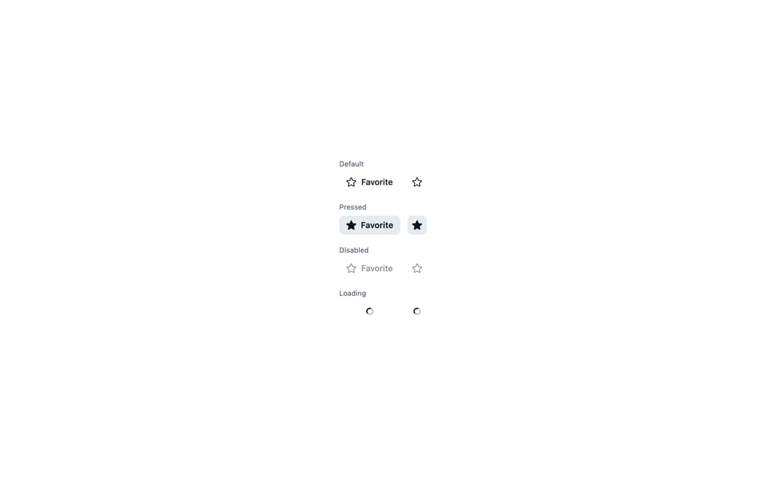
Astryx (Meta) ToggleButton — pressed/unpressed control with outline/solid icon swap: favorite, bookmark and notifications.
Built with React and Tailwind. Copy the prompt and paste it into Claude Code, Cursor or Lovable: your agent adds Astryx Toggle Button to your project and fits it to your theme.
Code
How Astryx Toggle Button is used: the demo's code. The component's own source comes with a free account.
Usage.tsx
// Copyright (c) Meta Platforms, Inc. and affiliates.

'use client';

import {ToggleButton} from '@/components/ui/astryx-toggle-button';
import {Stack} from '@astryxdesign/core/Layout';
import {Text} from '@astryxdesign/core/Text';
import {Icon} from '@astryxdesign/core/Icon';
import {StarIcon as StarOutline} from '@heroicons/react/24/outline';
import {StarIcon as StarSolid} from '@heroicons/react/24/solid';

// Standalone setup (matches apps/example-vite): the Theme provider sets
// data-astryx-theme and injects the neutral theme tokens the @scope'd CSS needs.
import {Theme} from '@astryxdesign/core/theme';
import {neutralTheme} from '@astryxdesign/theme-neutral/built';

export default function ToggleButtonStates() {
  return (
    <Theme theme={neutralTheme}>
    <div data-astryx-theme="neutral">
    <Stack direction="vertical" gap={4}>
      <Stack direction="vertical" gap={1}>
        <Text type="supporting" color="secondary">
          Default
        </Text>
        <Stack direction="horizontal" gap={3} vAlign="center">
          <ToggleButton
            label="Favorite"
            icon={<Icon icon={StarOutline} />}
            pressedIcon={<Icon icon={StarSolid} />}
            isPressed={false}
            onPressedChange={() => {}}
          />
          <ToggleButton
            label="Favorite"
            icon={<Icon icon={StarOutline} />}
            pressedIcon={<Icon icon={StarSolid} />}
            isPressed={false}
            onPressedChange={() => {}}
            isIconOnly
          />
        </Stack>
      </Stack>
      <Stack direction="vertical" gap={1}>
        <Text type="supporting" color="secondary">
          Pressed
        </Text>
        <Stack direction="horizontal" gap={3} vAlign="center">
          <ToggleButton
            label="Favorite"
            icon={<Icon icon={StarOutline} />}
            pressedIcon={<Icon icon={StarSolid} />}
            isPressed={true}
            onPressedChange={() => {}}
          />
          <ToggleButton
            label="Favorite"
            icon={<Icon icon={StarOutline} />}
            pressedIcon={<Icon icon={StarSolid} />}
            isPressed={true}
            onPressedChange={() => {}}
            isIconOnly
          />
        </Stack>
      </Stack>
      <Stack direction="vertical" gap={1}>
        <Text type="supporting" color="secondary">
          Disabled
        </Text>
        <Stack direction="horizontal" gap={3} vAlign="center">
          <ToggleButton
            label="Favorite"
            icon={<Icon icon={StarOutline} />}
            isPressed={false}
            onPressedChange={() => {}}
            isDisabled
          />
          <ToggleButton
            label="Favorite"
            icon={<Icon icon={StarOutline} />}
            isPressed={false}
            onPressedChange={() => {}}
            isIconOnly
            isDisabled
          />
        </Stack>
      </Stack>
      <Stack direction="vertical" gap={1}>
        <Text type="supporting" color="secondary">
          Loading
        </Text>
        <Stack direction="horizontal" gap={3} vAlign="center">
          <ToggleButton
            label="Favorite"
            icon={<Icon icon={StarOutline} />}
            isPressed={false}
            onPressedChange={() => {}}
            isLoading
          />
          <ToggleButton
            label="Favorite"
            icon={<Icon icon={StarOutline} />}
            isPressed={false}
            onPressedChange={() => {}}
            isIconOnly
            isLoading
          />
        </Stack>
      </Stack>
    </Stack>
    </div>
    </Theme>
  );
}
Dependencies
More by Meta
View all

Astryx Banner
54
Astryx Avatar
26
Astryx Aspect Ratio
26
Astryx Button Group
22
Astryx Badge
22
Astryx Avatar Group
7
Astryx Button
4
Astryx Blockquote
3
More in Buttons
View all

Button
4

App Store Button
453
Button
47

Eclipse Button
39

Button
4
Texture Button
92
Split Button
14

Button
32

