
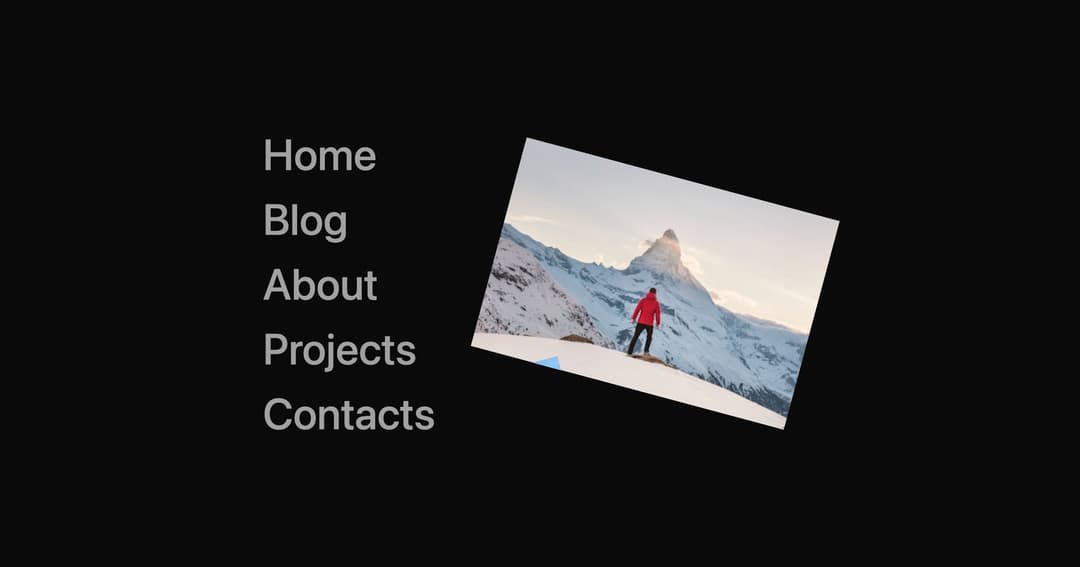
About
Navigation links with creative hover animations powered by GSAP.
Built with React and Tailwind. Copy the prompt and paste it into Claude Code, Cursor or Lovable: your agent adds Link Hover to your project and fits it to your theme.
Code
How Link Hover is used: the demo's code. The component's own source comes with a free account.
Usage.tsx
import ImageHover from "../components/ui/link-hover";
export default function Demo() {
  return (
    <div className="flex items-center justify-center min-h-screen bg-background">
      <ImageHover />
    </div>
  );
}
Dependencies
More by Shatlyk1011
View all
Motion Button
908
3D Marquee
738
Hover Border Gradient
636
Team Member Card
601
Interactive Hover Button
291
Typing Effect
274
Animated Dropdown
243
Gradient Borders Button
232
More in Navigation
View all

Liquid Glass Expandable Sidebar
41

Footer with Big Wordmark
32

Sidebar
389

Oversized 404 Numeral
77

Pagination
108

Footer
89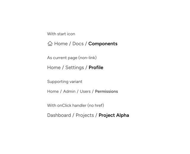

Astryx Breadcrumb Item
3
Menu
23
