
About
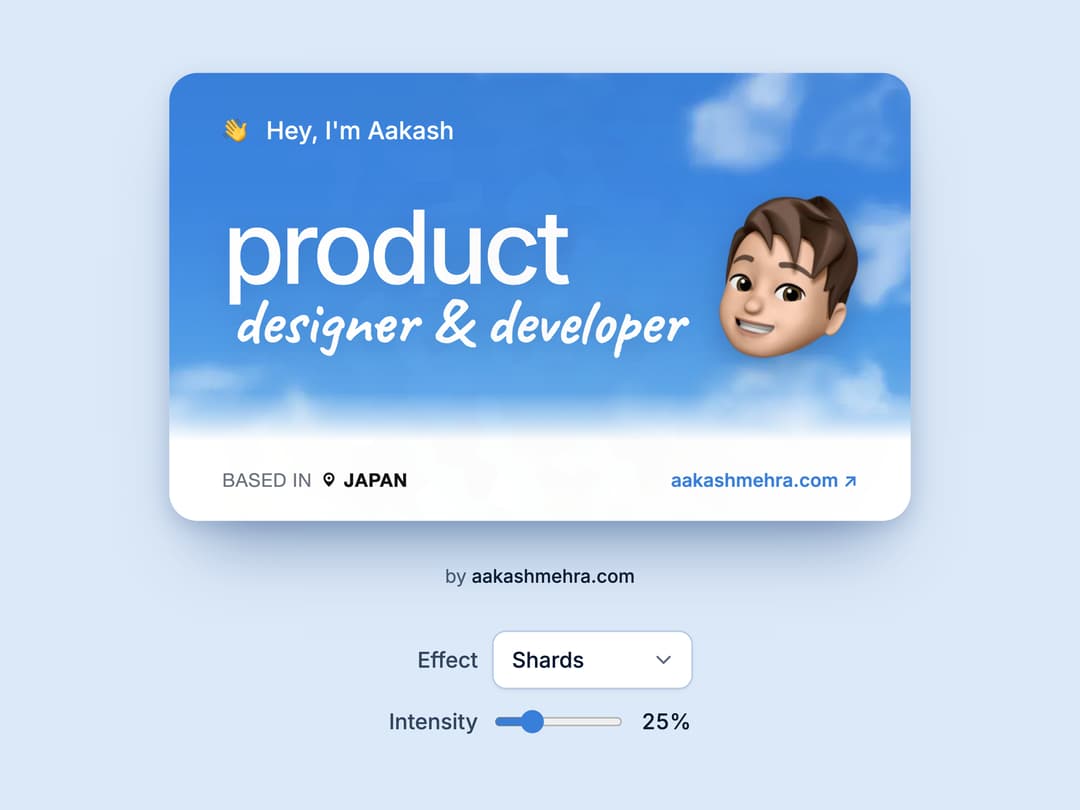
An interactive business card that tilts toward your pointer, lifts on hover and flips on click, with nine holographic foils (Shards, Rainbow, Stars, Cosmos, Hearts, Shapes, Gold, Silver, Aurora) and an intensity slider.
Built with React and Tailwind. Copy the prompt and paste it into Claude Code, Cursor or Lovable: your agent adds Holographic Business Card to your project and fits it to your theme.
Code
How Holographic Business Card is used: the demo's code. The component's own source comes with a free account.
Usage.tsx
"use client";

import BusinessCard, {
  CARD_EFFECTS,
  type CardEffect,
} from "@/components/ui/holographic-business-card";
import { ChevronDown } from "lucide-react";
import { useState } from "react";

export default function BusinessCardDemo() {
  const [effect, setEffect] = useState<CardEffect>("shards");
  const [intensity, setIntensity] = useState(25);

  return (
    // Pale, flat blue from the card's sky family.
    // Card, byline, then the controls, stacked and centred.
    <main className="bc-root flex min-h-screen w-full flex-col items-center justify-center bg-[#DCE9F8] px-4 py-16">
      <div className="flex flex-col items-center gap-7">
        <BusinessCard effect={effect} intensity={intensity / 100} />
        <p className="text-xs text-[#4A5D78]">
          by{" "}
          <a
            href="https://aakashmehra.com/ref/businesscard"
            target="_blank"
            rel="noopener noreferrer"
            className="font-medium text-[#0B1B33] underline-offset-4 hover:underline"
          >
            aakashmehra.com
          </a>
        </p>
        <div className="flex flex-col items-end gap-3 text-sm font-medium text-[#33465F]">
          <label className="flex items-center gap-2.5">
            Effect
            <span className="relative">
              <select
                value={effect}
                onChange={(e) => setEffect(e.target.value as CardEffect)}
                className="w-32 cursor-pointer appearance-none rounded-md bg-white py-2 pl-3 pr-8 text-sm text-[#0B1B33] shadow-sm ring-1 ring-[#B7CBE6] outline-none hover:ring-[#8FAED6] focus-visible:ring-2 focus-visible:ring-[#387FD9]"
              >
                {CARD_EFFECTS.map((e) => (
                  <option
                    key={e.id}
                    value={e.id}
                    className="bg-white text-[#0B1B33]"
                  >
                    {e.label}
                  </option>
                ))}
              </select>
              <ChevronDown
                aria-hidden
                className="pointer-events-none absolute right-2.5 top-1/2 h-4 w-4 -translate-y-1/2 text-[#5B6B82]"
              />
            </span>
          </label>
          <label className="flex items-center gap-2.5">
            Intensity
            <span className="flex w-32 items-center gap-2">
              <input
                type="range"
                min={0}
                max={100}
                step={5}
                value={intensity}
                onChange={(e) => setIntensity(Number(e.target.value))}
                aria-valuetext={`${intensity}%`}
                className="h-1.5 min-w-0 flex-1 cursor-pointer accent-[#387FD9] focus-visible:outline-2 focus-visible:outline-offset-4 focus-visible:outline-[#387FD9]"
              />
              <output className="w-9 text-right tabular-nums text-[#0B1B33]">
                {intensity}%
              </output>
            </span>
          </label>
        </div>
      </div>
    </main>
  );
}
Dependencies
More by Aakash
View all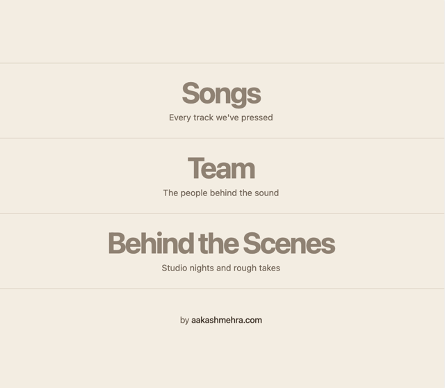
Disc Reveal List
3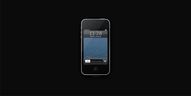
Slide to Unlock
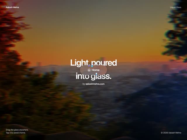
Liquid Glass Button
More in Cards
View all

Course Design Cards
1.1K

Interactive Tech Stack Bento Grid with Hover Effects
227
Stats cards with links
84

Statistics Card 7
301

Card Studio
10
Statistics Card 2
276

Weather Card
59
Card
56
