
About
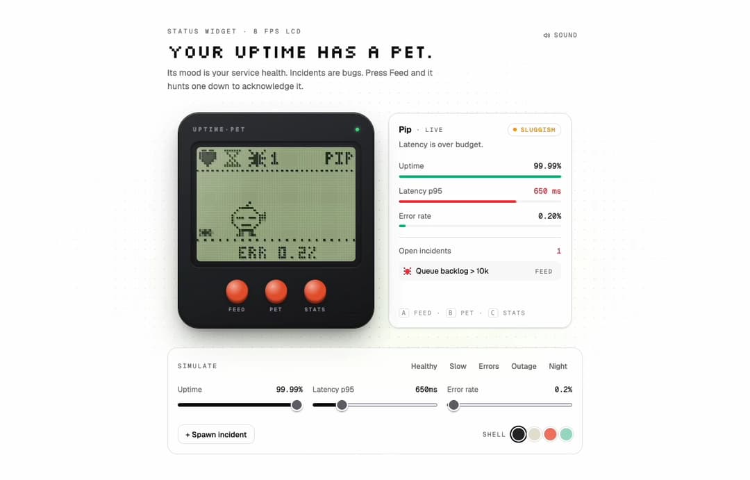
Pixel LCD pet whose mood mirrors your uptime, latency and error rate. Incidents are bugs it eats.
Built with React and Tailwind. Copy the prompt and paste it into Claude Code, Cursor or Lovable: your agent adds Uptime Pet to your project and fits it to your theme.
Code
How Uptime Pet is used: the demo's code. The component's own source comes with a free account.
Usage.tsx
"use client";

import * as React from "react";
import { UptimePet, type PetIncident, type PetShell } from "@/components/ui/uptime-pet";

const FONTS = `
@import url('https://fonts.googleapis.com/css2?family=Geist:wght@400;500;600&family=Geist+Mono:wght@400;500;600;700&family=Silkscreen&display=swap');
.pet-demo{font-family:'Geist',ui-sans-serif,system-ui,sans-serif}
.pet-demo .font-mono{font-family:'Geist Mono',ui-monospace,SFMono-Regular,Menlo,monospace}
.pet-demo .font-pixel{font-family:'Silkscreen',ui-monospace,monospace;font-weight:400}
`;

const PRESETS = {
  Healthy: { uptime: 99.99, latency: 142, errorRate: 0.2, asleep: false },
  Slow: { uptime: 99.7, latency: 860, errorRate: 0.8, asleep: false },
  Errors: { uptime: 98.9, latency: 310, errorRate: 9.4, asleep: false },
  Outage: { uptime: 91.2, latency: 2400, errorRate: 38, asleep: false },
  Night: { uptime: 99.99, latency: 120, errorRate: 0.1, asleep: true },
};
type PresetName = keyof typeof PRESETS;

const INCIDENTS = [
  "502s on /checkout", "Queue backlog > 10k", "TLS cert expires in 3d", "db-2 disk at 91%",
  "p95 spike in eu-west", "Webhook retries failing", "Cron job missed run",
];

function Slider({ label, value, min, max, step, unit, onChange }: { label: string; value: number; min: number; max: number; step: number; unit: string; onChange: (v: number) => void }) {
  return (
    <label className="block">
      <span className="flex items-baseline justify-between text-[12px] text-muted-foreground">
        {label}
        <span className="font-mono tabular-nums text-foreground">{value}{unit}</span>
      </span>
      <input
        type="range" min={min} max={max} step={step} value={value}
        onChange={(e) => onChange(Number(e.target.value))}
        className="mt-1.5 w-full accent-foreground"
      />
    </label>
  );
}

export default function UptimePetDemo() {
  const [m, setM] = React.useState(PRESETS.Healthy);
  const [preset, setPreset] = React.useState("Healthy" as PresetName | "Custom");
  const [incidents, setIncidents] = React.useState([
    { id: "inc-1", label: INCIDENTS[0] },
    { id: "inc-2", label: INCIDENTS[1] },
  ] as PetIncident[]);
  const [shell, setShell] = React.useState("graphite" as PetShell);
  const [sound, setSound] = React.useState(true);
  const n = React.useRef(3);

  const set = (patch: { uptime?: number; latency?: number; errorRate?: number }) => { setM((x) => ({ ...x, ...patch })); setPreset("Custom"); };

  return (
    <div className="pet-demo relative flex min-h-[820px] w-full items-center justify-center overflow-hidden bg-background px-5 py-14">
      <style>{FONTS}</style>
      <div aria-hidden className="pointer-events-none absolute inset-0 [background-image:radial-gradient(rgb(128_128_128/0.22)_1px,transparent_1px)] [background-size:16px_16px] [mask-image:radial-gradient(ellipse_at_center,black_15%,transparent_70%)]" />
      <div aria-hidden className="pointer-events-none absolute left-1/2 top-[40%] h-72 w-[40rem] -translate-x-1/2 rounded-full bg-lime-300/[0.07] blur-3xl" />

      <div className="relative w-full max-w-[680px]">
        <div className="mb-8 flex items-start justify-between gap-4">
          <div>
            <p className="font-mono text-[10.5px] uppercase tracking-[0.24em] text-muted-foreground">Status widget · 8 fps LCD</p>
            <h2 className="font-pixel mt-2 text-[30px] leading-[1.05] text-foreground">Your uptime has a pet.</h2>
            <p className="mt-2 max-w-md text-[14px] leading-relaxed text-muted-foreground">
              Its mood is your service health. Incidents are bugs. Press Feed and it hunts one down to acknowledge it.
            </p>
          </div>
          <button
            type="button"
            onClick={() => setSound((s) => !s)}
            aria-pressed={sound}
            className="mt-0.5 inline-flex shrink-0 items-center gap-1.5 rounded-md px-2 py-1 font-mono text-[10.5px] uppercase tracking-[0.14em] text-muted-foreground transition-colors hover:bg-muted hover:text-foreground"
          >
            <svg viewBox="0 0 16 16" className="size-3" fill="none" stroke="currentColor" strokeWidth="1.5" strokeLinecap="round" strokeLinejoin="round" aria-hidden>
              <path d="M2.5 6h2l3-2.5v9L4.5 10h-2z" />
              {sound ? <path d="M10.5 5.5a3.5 3.5 0 0 1 0 5M12.5 3.5a6.3 6.3 0 0 1 0 9" /> : <path d="m10.5 6 4 4m0-4-4 4" />}
            </svg>
            {sound ? "Sound" : "Muted"}
          </button>
        </div>

        <UptimePet
          name="Pip"
          {...m}
          incidents={incidents}
          onAcknowledge={(id) => setIncidents((xs) => xs.filter((x) => x.id !== id))}
          shell={shell}
          sound={sound}
        />

        {/* simulator */}
        <div className="mt-8 rounded-2xl border bg-background/60 p-4 backdrop-blur">
          <div className="flex flex-wrap items-center justify-between gap-2">
            <span className="font-mono text-[10.5px] uppercase tracking-[0.18em] text-muted-foreground">Simulate</span>
            <div className="flex flex-wrap gap-1">
              {(Object.keys(PRESETS) as PresetName[]).map((k) => (
                <button
                  key={k}
                  type="button"
                  onClick={() => { setM(PRESETS[k]); setPreset(k); }}
                  className={
                    "rounded-md px-2 py-1 text-[12px] font-medium transition-colors " +
                    (preset === k ? "bg-foreground text-background" : "text-muted-foreground hover:bg-muted hover:text-foreground")
                  }
                >
                  {k}
                </button>
              ))}
            </div>
          </div>
          <div className="mt-4 grid gap-4 sm:grid-cols-3">
            <Slider label="Uptime" value={m.uptime} min={85} max={100} step={0.01} unit="%" onChange={(v) => set({ uptime: v })} />
            <Slider label="Latency p95" value={m.latency} min={40} max={3000} step={10} unit="ms" onChange={(v) => set({ latency: v })} />
            <Slider label="Error rate" value={m.errorRate} min={0} max={40} step={0.1} unit="%" onChange={(v) => set({ errorRate: v })} />
          </div>
          <div className="mt-4 flex flex-wrap items-center justify-between gap-3">
            <button
              type="button"
              onClick={() => {
                const id = `inc-${n.current++}`;
                setIncidents((xs) => [...xs, { id, label: INCIDENTS[(n.current - 2) % INCIDENTS.length] }]);
              }}
              className="inline-flex h-8 items-center gap-2 rounded-lg border px-3 text-[12.5px] font-medium text-foreground transition-colors hover:bg-muted"
            >
              + Spawn incident
            </button>
            <div className="flex items-center gap-1.5">
              <span className="mr-1 font-mono text-[10.5px] uppercase tracking-[0.14em] text-muted-foreground">Shell</span>
              {(["graphite", "bone", "coral", "mint"] as PetShell[]).map((s) => (
                <button
                  key={s}
                  type="button"
                  aria-label={`${s} shell`}
                  aria-pressed={shell === s}
                  onClick={() => setShell(s)}
                  className={"size-5 rounded-full ring-offset-2 ring-offset-background transition " + (shell === s ? "ring-2 ring-foreground" : "ring-1 ring-border")}
                  style={{ background: { graphite: "#26282c", bone: "#e7e1d3", coral: "#f27a66", mint: "#9fdcc6" }[s] }}
                />
              ))}
            </div>
          </div>
        </div>
      </div>
    </div>
  );
}
More by Aashir Zayd
View all
Contribution Heatmap
11
Punch Card Input
4
Tumbler Password
More in Dashboards
View all
Dashboard with Collapsible Sidebar
2.6K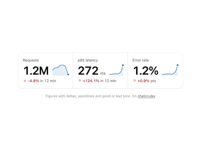
Stat Card
44

Sidebar
390

SaaS Template
2.7K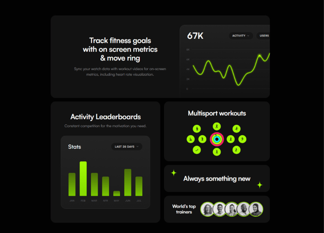

Fitness Bento Grid
40
Stats Bento
1.2K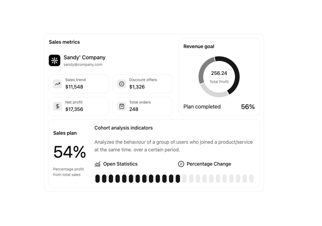

Chart Component
8

Course Design Cards
1.3K


