
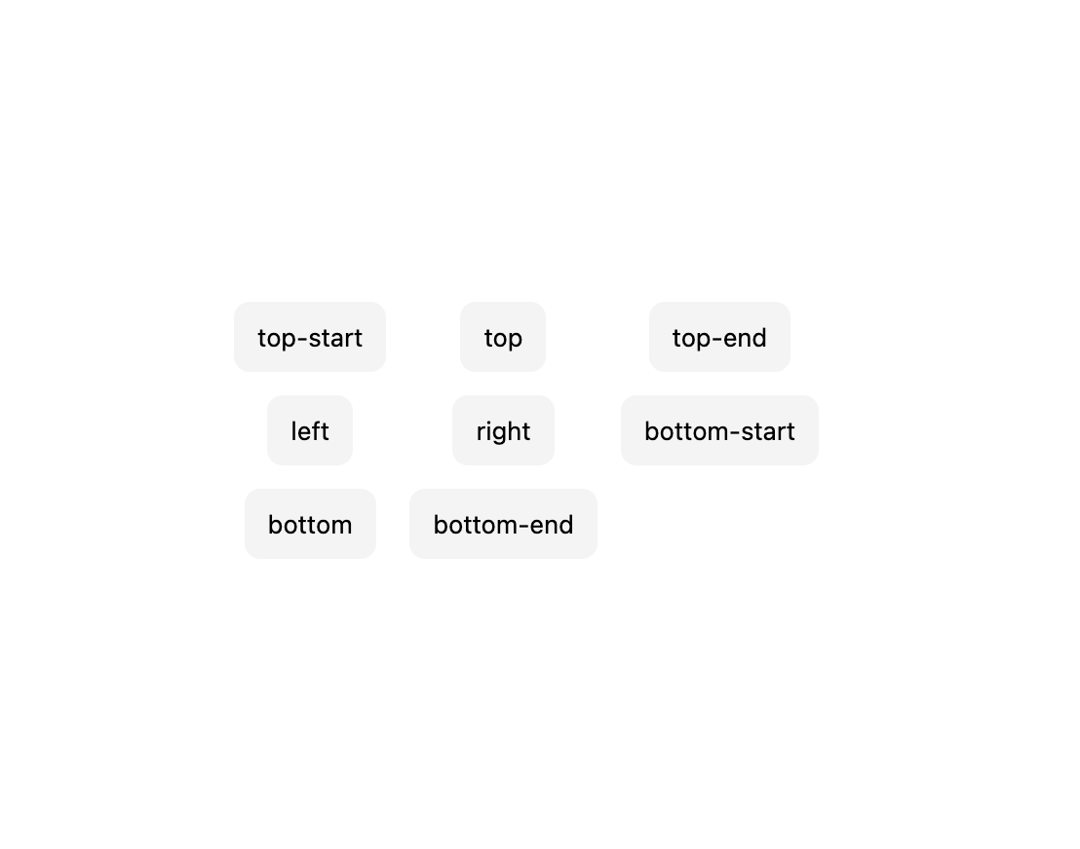
About
An anchored floating panel that opens from a trigger button, auto-flips and shifts to stay inside the viewport, and dismisses on outside press, Escape, or focus leaving it.
Built with React and Tailwind. Copy the prompt and paste it into Claude Code, Cursor or Lovable: your agent adds Popover to your project and fits it to your theme.
Code
How Popover is used: the demo's code. The component's own source comes with a free account.
Usage.tsx
"use client";

import Popover from "@/components/ui/popover";
import type { PopoverPlacement } from "@/components/ui/popover";

const placements: PopoverPlacement[] = [
  "top-start",
  "top",
  "top-end",
  "left",
  "right",
  "bottom-start",
  "bottom",
  "bottom-end",
];

export default function PopoverPlacementsDemo() {
  return (
    <div
      style={{
        display: "grid",
        gridTemplateColumns: "repeat(3, auto)",
        gap: "var(--may-space-3)",
        placeItems: "center",
        padding: "var(--may-space-16)",
        background: "var(--may-color-bg, var(--background))",
      }}
    >
      {placements.map((placement) => (
        <Popover
          key={placement}
          placement={placement}
          aria-label={placement}
          trigger={
            <button
              type="button"
              style={{
                display: "inline-flex",
                alignItems: "center",
                justifyContent: "center",
                height: "var(--may-control-h-sm)",
                padding: "0 var(--may-space-3)",
                borderRadius: "var(--may-radius-sm)",
                border: 0,
                background: "var(--may-color-fill-quaternary)",
                color: "var(--may-color-text)",
                fontSize: "var(--may-text-footnote)",
                cursor: "pointer",
              }}
            >
              {placement}
            </button>
          }
        >
          <span
            style={{
              whiteSpace: "nowrap",
              fontSize: "var(--may-text-subheadline)",
              color: "var(--may-color-text)",
            }}
          >
            Anchored {placement}
          </span>
        </Popover>
      ))}
    </div>
  );
}
More by adit-firdaus
View all
Steps
6
Adaptive Card

Box
Pagination