
About
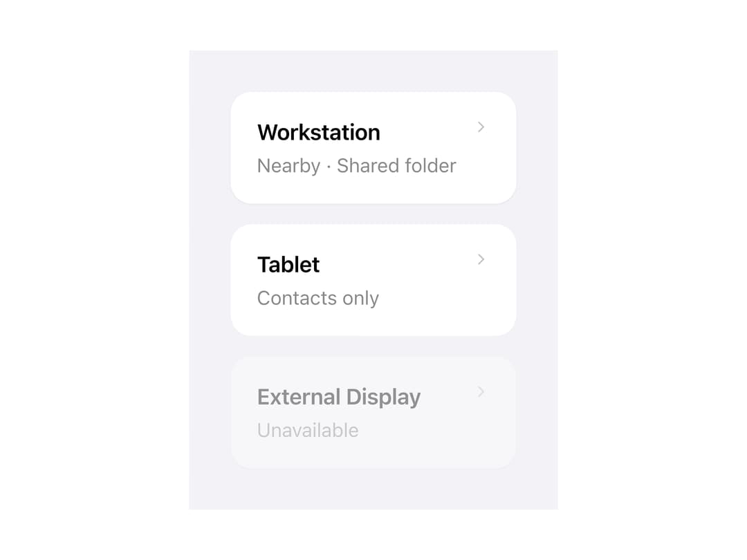
A surface container with header, title, description, body and footer slots for grouping related content, supporting elevated, grouped, nested and plain variants plus an optional interactive button mode.
Built with React and Tailwind. Copy the prompt and paste it into Claude Code, Cursor or Lovable: your agent adds Adaptive Card to your project and fits it to your theme.
Code
How Adaptive Card is used: the demo's code. The component's own source comes with a free account.
Usage.tsx
import Card, {
  CardHeader,
  CardTitle,
  CardDescription,
} from "@/components/ui/card";

function Chevron() {
  return (
    <svg
      aria-hidden
      viewBox="0 0 24 24"
      width={14}
      height={14}
      style={{ color: "var(--may-color-text-tertiary)" }}
    >
      <path
        d="M9 6l6 6-6 6"
        fill="none"
        stroke="currentColor"
        strokeWidth={2}
        strokeLinecap="round"
        strokeLinejoin="round"
      />
    </svg>
  );
}

export default function CardInteractiveDemo() {
  return (
    <div className="may-root" style={{ padding: 32 }}>
      <div
        style={{
          display: "flex",
          flexDirection: "column",
          gap: "var(--may-space-4)",
          maxWidth: 420,
        }}
      >
        <Card onClick={() => {}}>
          <CardHeader accessory={<Chevron />}>
            <CardTitle>Workstation</CardTitle>
            <CardDescription>Nearby · Shared folder</CardDescription>
          </CardHeader>
        </Card>
        <Card onClick={() => {}} variant="grouped">
          <CardHeader accessory={<Chevron />}>
            <CardTitle>Tablet</CardTitle>
            <CardDescription>Contacts only</CardDescription>
          </CardHeader>
        </Card>
        <Card onClick={() => {}} disabled>
          <CardHeader accessory={<Chevron />}>
            <CardTitle>External Display</CardTitle>
            <CardDescription>Unavailable</CardDescription>
          </CardHeader>
        </Card>
      </div>
    </div>
  );
}
More by adit-firdaus
View all
Box
Pagination
More in Buttons
View all
Texture Button
100

Button
8

HeroUI Button Group
2
Base Button

Button
71

Button
6

App Store Button
466

Eclipse Button
7

