
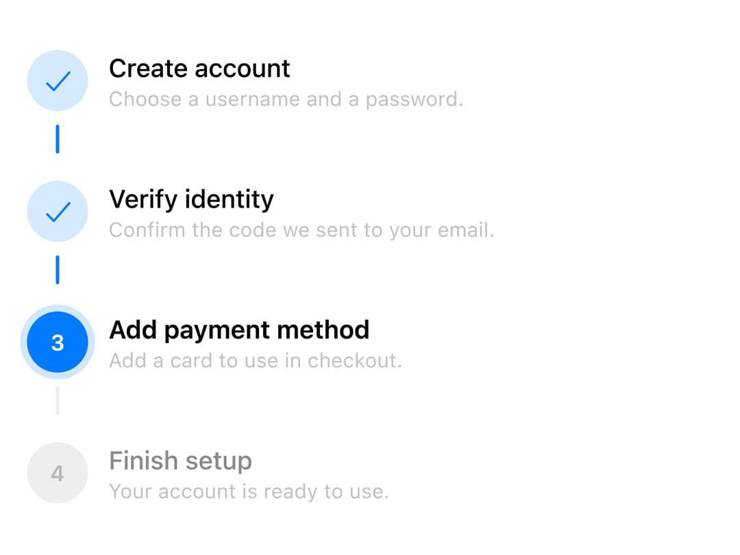
About
A numbered progress stepper for walking a user through a multi-step sequence like checkout or device setup, with horizontal/vertical layouts, per-step status (complete/current/upcoming/error), and an optional clickable mode with a sliding selection thumb.
Built with React and Tailwind. Copy the prompt and paste it into Claude Code, Cursor or Lovable: your agent adds Steps to your project and fits it to your theme.
Code
How Steps is used: the demo's code. The component's own source comes with a free account.
Usage.tsx
import { Steps } from "@/components/ui/steps";

const SETUP = [
  { title: "Create account", description: "Choose a username and a password." },
  {
    title: "Verify identity",
    description: "Confirm the code we sent to your email.",
  },
  {
    title: "Add payment method",
    description: "Add a card to use in checkout.",
  },
  { title: "Finish setup", description: "Your account is ready to use." },
];

export default function StepsVerticalDemo() {
  return (
    <div style={{ maxWidth: 420, width: "100%" }}>
      <Steps items={SETUP} orientation="vertical" current={2} />
    </div>
  );
}
Dependencies
More by adit-firdaus
View all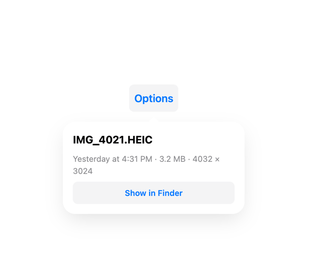
Popover
1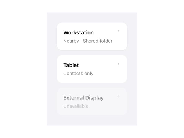
Adaptive Card

Box
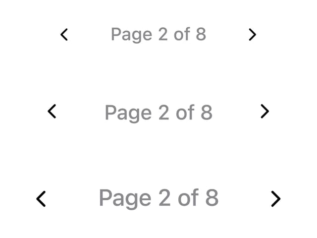
Pagination