
About
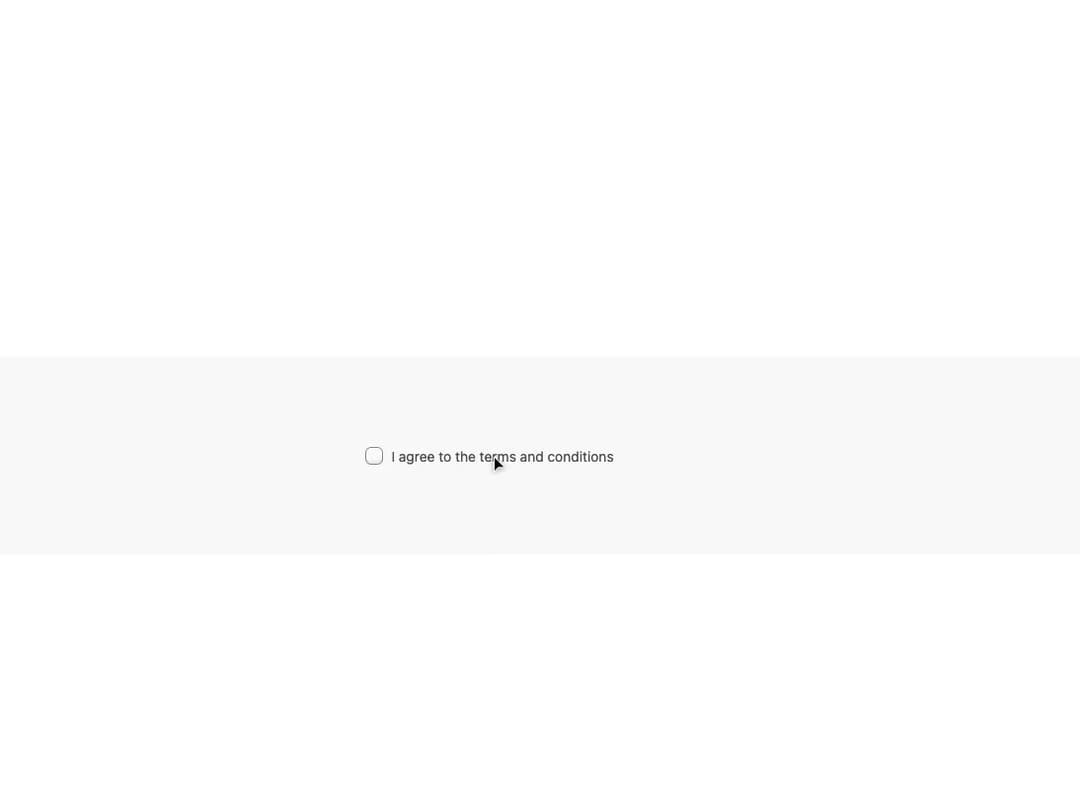
An accessible checkbox styled with pure CSS data-attribute selectors, built on React Aria Components, supporting selected, indeterminate, invalid and disabled states.
Built with React and Tailwind. Copy the prompt and paste it into Claude Code, Cursor or Lovable: your agent adds CSS Checkbox to your project and fits it to your theme.
Code
How CSS Checkbox is used: the demo's code. The component's own source comes with a free account.
Usage.tsx
import { Checkbox } from "@/components/ui/css-checkbox";

export default function CheckboxDemo() {
  return (
    <div className="flex min-h-[200px] w-full items-center justify-center bg-[var(--background-color)] p-10">
      <Checkbox>I agree to the terms and conditions</Checkbox>
    </div>
  );
}
Dependencies
More by py_ets
View all
Alert Dialog
13
React Aria CheckboxGroup
9
Command Palette
7
Progress Bar
7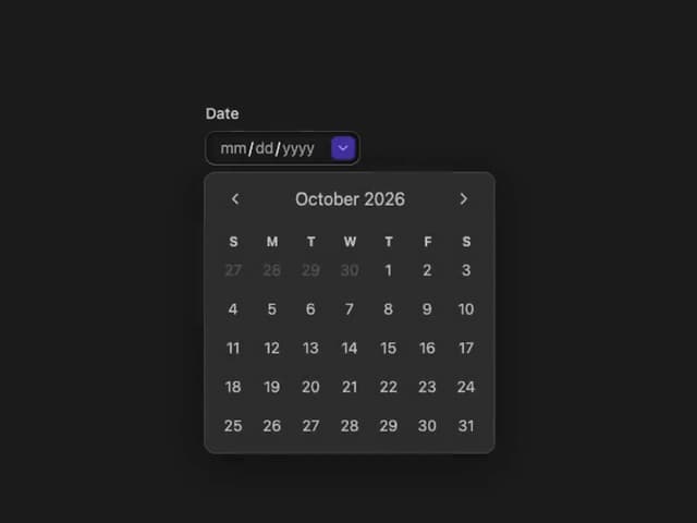
React Aria DatePicker
6
Segmented Control
4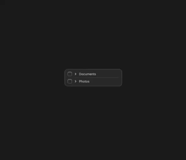
React Aria Tree
4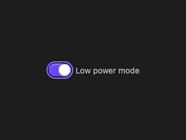
React Aria Switch
4
More in Forms
View all

Premium Auth
544

Form
137

Contact Card
1.1K

Login 1
59

Card Studio
46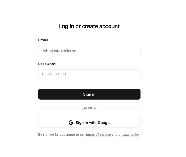

Login 2
10

Book A Demo 1
83
SignInPage
713
