

About
A monochrome checkbox for e-ink/low-refresh displays that supports standalone controlled/uncontrolled use, binding to a form, and grouping multiple checkboxes into one multi-select field.
Built with React and Tailwind. Copy the prompt and paste it into Claude Code, Cursor or Lovable: your agent adds Checkbox to your project and fits it to your theme.
Code
How Checkbox is used: the demo's code. The component's own source comes with a free account.
Usage.tsx
import { Checkbox } from "@/components/ui/checkbox";
import { useState } from "react";

export default function CheckboxDemo() {
  const [checked, setChecked] = useState(false);

  return (
    <div
      className="flex flex-col gap-3 p-6"
      style={{
        background: "var(--eink-color-secondary)",
        color: "var(--eink-color-primary)",
        fontFamily: "var(--eink-font-family-main)",
      }}
    >
      <Checkbox checked={checked} onChange={setChecked}>
        Accept terms
      </Checkbox>
      <span>Value: {checked ? "true" : "false"}</span>
    </div>
  );
}
More by alexisroe
View all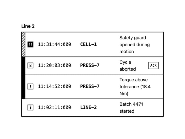
Log
4
Number Stepper
1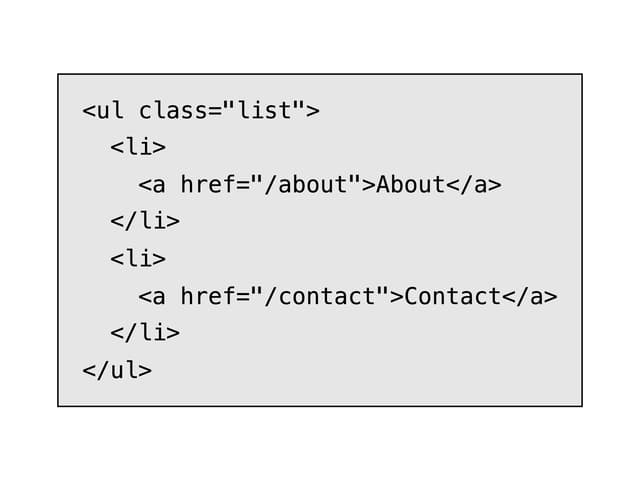
E-Ink Code
QR Code
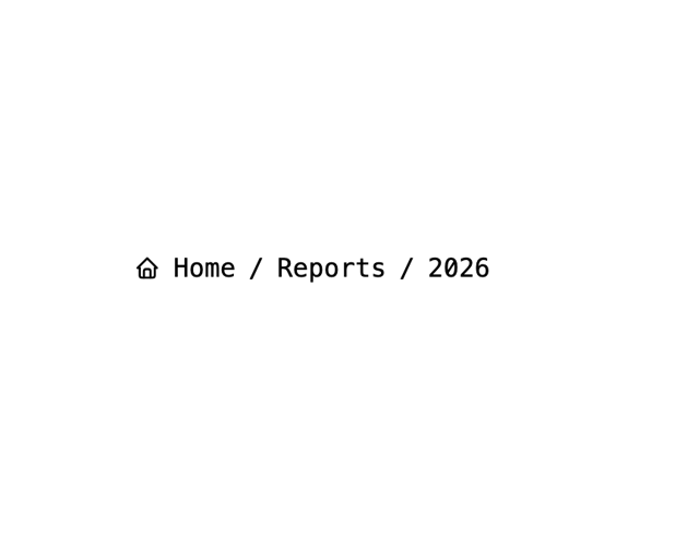
Breadcrumbs
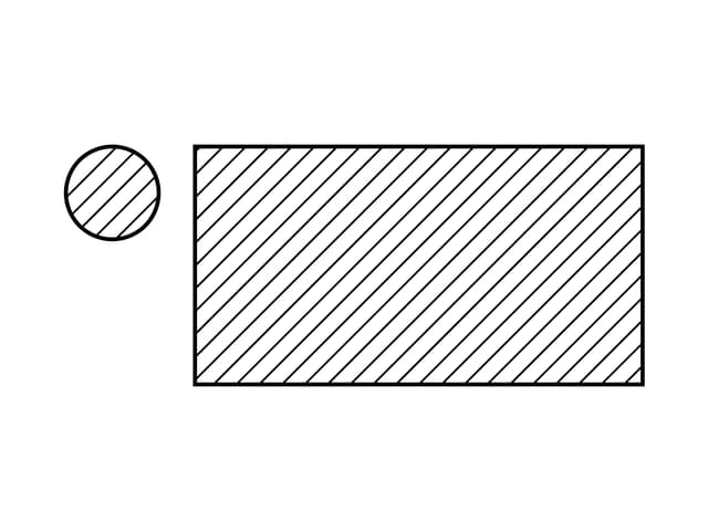
Skeleton
Container
E-Ink Progress Bar
More in Forms
View all

Contact Card
1.1K

Premium Auth
551

Login 1
60

Form
17

Form
16

Book A Demo 1
84

Card Studio
46

Login 2
10