
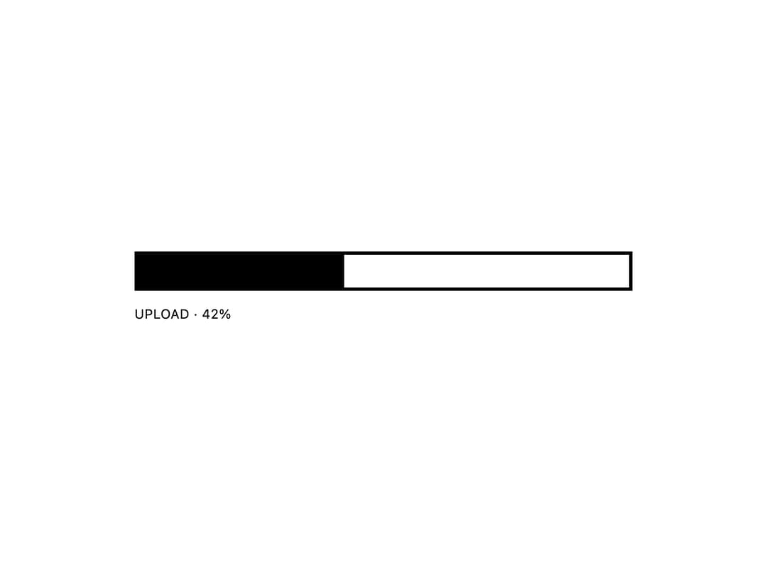
About
A bordered, monochrome progress bar with naked, diagonal-stripe, and discrete step variants for showing task or upload completion.
Built with React and Tailwind. Copy the prompt and paste it into Claude Code, Cursor or Lovable: your agent adds E-Ink Progress Bar to your project and fits it to your theme.
Code
How E-Ink Progress Bar is used: the demo's code. The component's own source comes with a free account.
Usage.tsx
import ProgressBar from "@/components/ui/eink-progress-bar";

export default function ProgressBarDemo() {
  return (
    <div className="flex w-full max-w-sm items-center justify-center bg-white p-10">
      <ProgressBar value={42} label="Upload" />
    </div>
  );
}
More by alexisroe
View all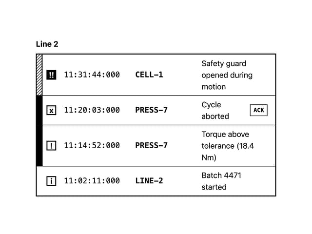
Log
4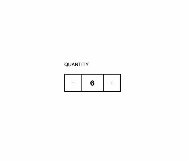
Number Stepper
1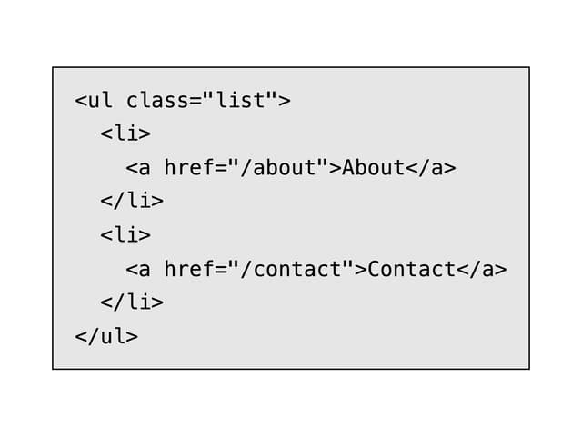
E-Ink Code
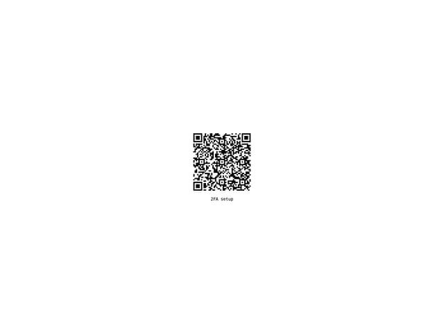
QR Code
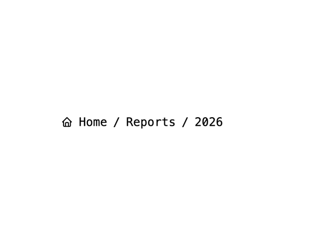
Breadcrumbs
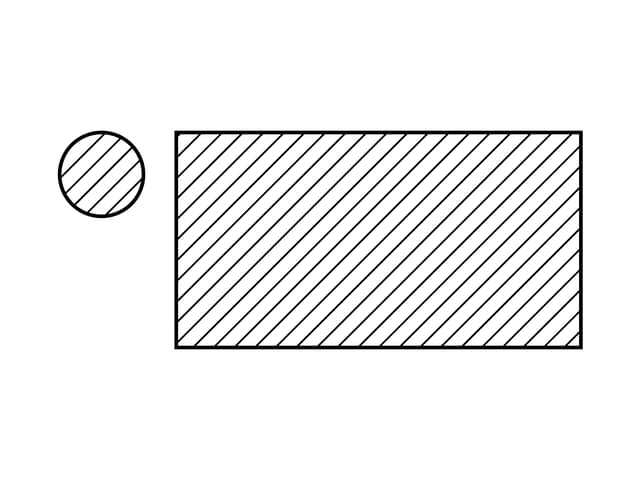
Skeleton
Container
Navigation