
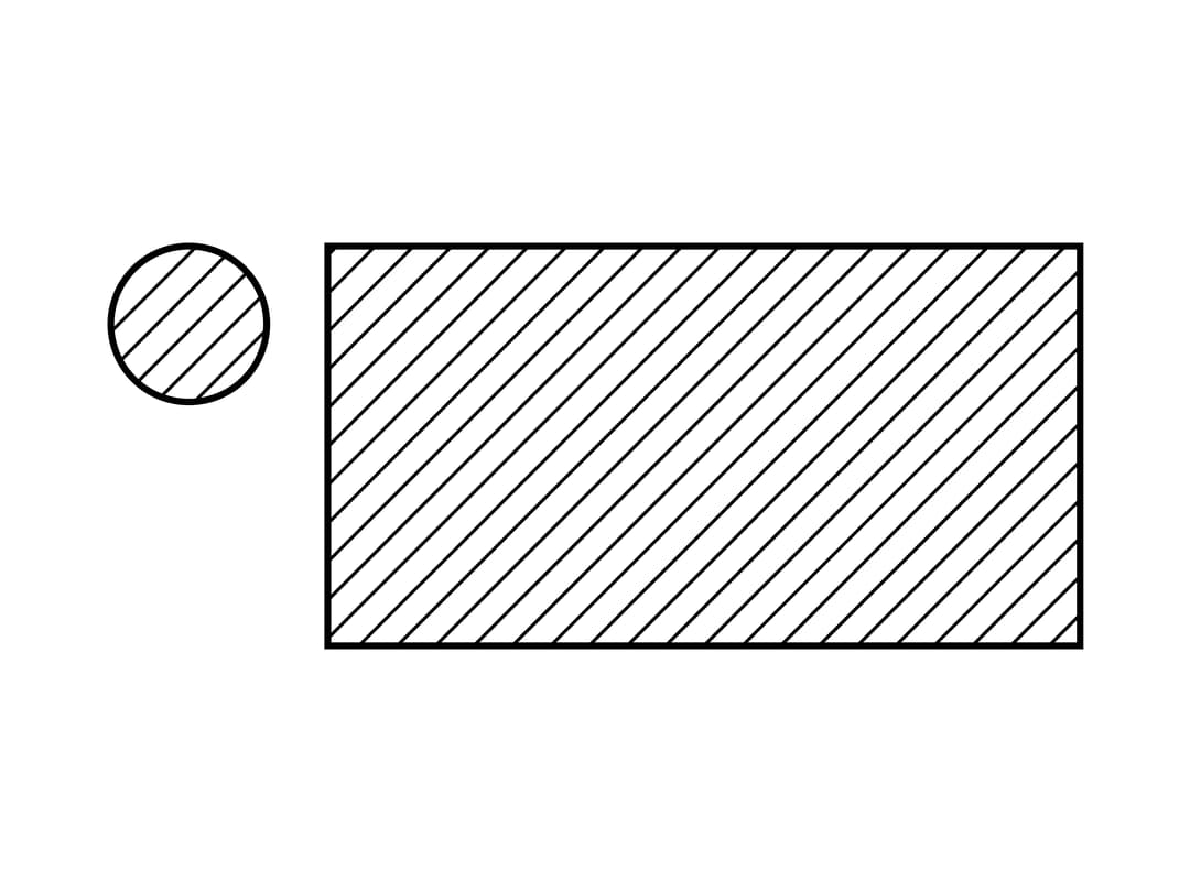
About
A loading placeholder with a solid border and a diagonal-stripe pattern fill, used to mock text, avatars or image blocks while content is loading on monochrome/e-ink style interfaces.
Built with React and Tailwind. Copy the prompt and paste it into Claude Code, Cursor or Lovable: your agent adds Skeleton to your project and fits it to your theme.
Code
How Skeleton is used: the demo's code. The component's own source comes with a free account.
Usage.tsx
import Skeleton from "@/components/ui/skeleton";

export default function SkeletonAvatarWithBlockDemo() {
  return (
    <div className="flex w-72 items-start gap-4">
      <Skeleton variant="round" style={{ height: 48, flexShrink: 0 }} />
      <Skeleton style={{ height: 120, flex: 1 }} />
    </div>
  );
}
More by alexisroe
View all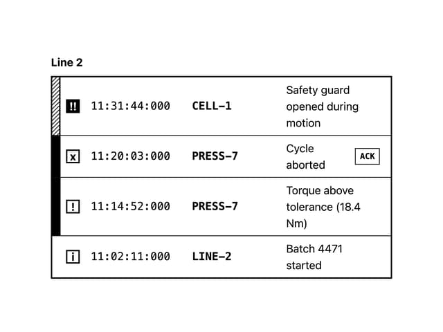
Log
4
Number Stepper
1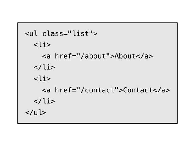
E-Ink Code
QR Code
Breadcrumbs
Container
E-Ink Progress Bar
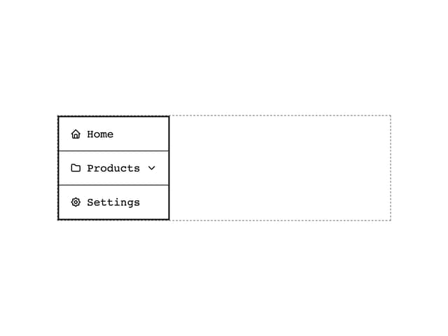
Navigation
More in Cards
View all
Stats cards with links
129

Course Design Cards
1.2K

Card
71
Statistics Card 7
313

Interactive Tech Stack Bento Grid with Hover Effects
454
Statistics Card 2
293
The Item one
3

Card Studio
8
