
About
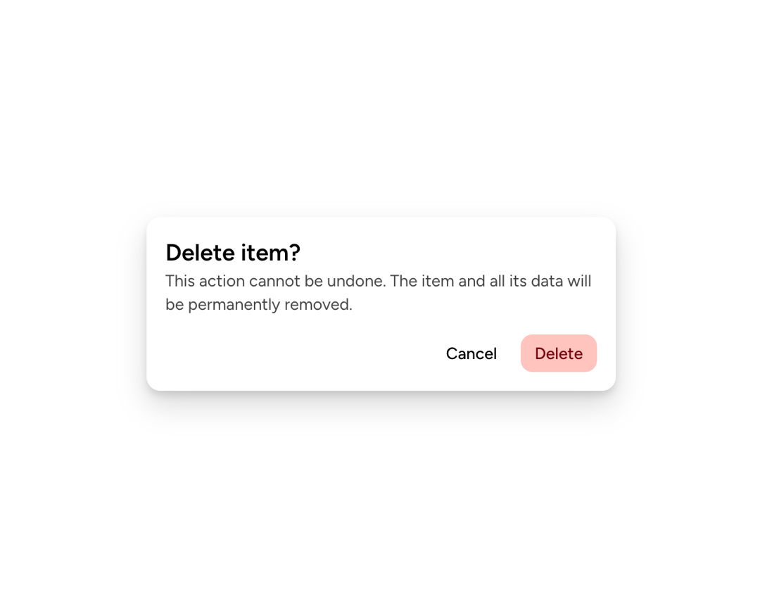
A modal confirmation dialog from Meta's Astryx design system for destructive or high-impact actions.
Built with React and Tailwind. Copy the prompt and paste it into Claude Code, Cursor or Lovable: your agent adds Astryx Alert Dialog to your project and fits it to your theme.
Code
How Astryx Alert Dialog is used: the demo's code. The component's own source comes with a free account.
Usage.tsx
"use client"

import AlertDialog, {
  useImperativeAlertDialog,
} from "@/components/ui/astryx-alert-dialog"

export default function AlertDialogDemo() {
  const alert = useImperativeAlertDialog()

  const alertProps = {
    title: "Delete item?",
    description:
      "This action cannot be undone. The item and all its data will be permanently removed.",
    actionLabel: "Delete",
  } as const

  return (
    <div
      data-astryx-theme="neutral"
      data-theme="light"
      style={{ colorScheme: "light", display: "contents" }}
    >
      <AlertDialog
        isOpen
        isInline
        onOpenChange={() => {}}
        {...alertProps}
        onAction={() =>
          alert.show({ ...alertProps, onAction: () => alert.hide() })
        }
      />
      {alert.element}
    </div>
  )
}
Dependencies
More by Alok Srivastava
View all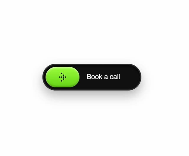
Glossy Slider Call Button
21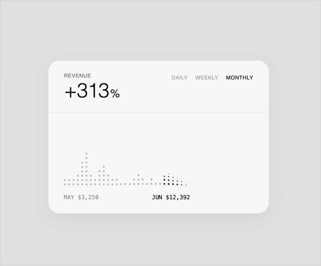
Dot Graph Card
19
Profile Menu Expander
2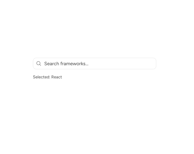
Astryx Base Typeahead
1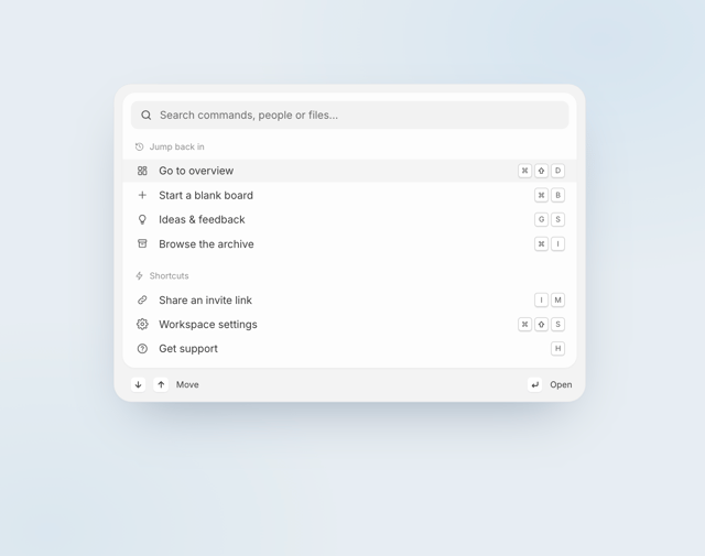
Pixel Perfect Command Palette
1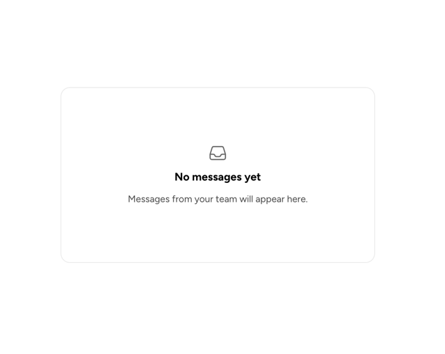
Astryx Center
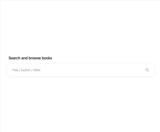
Expandable Book Search Palette
More in Forms
View all

Contact Card
1.1K

Premium Auth
551

Login 1
60

Form
17

Form
16

Book A Demo 1
84

Card Studio
46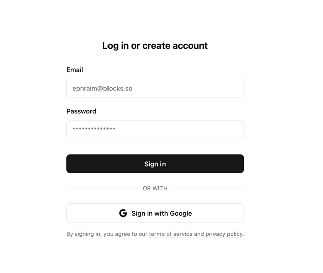

Login 2
10