
About
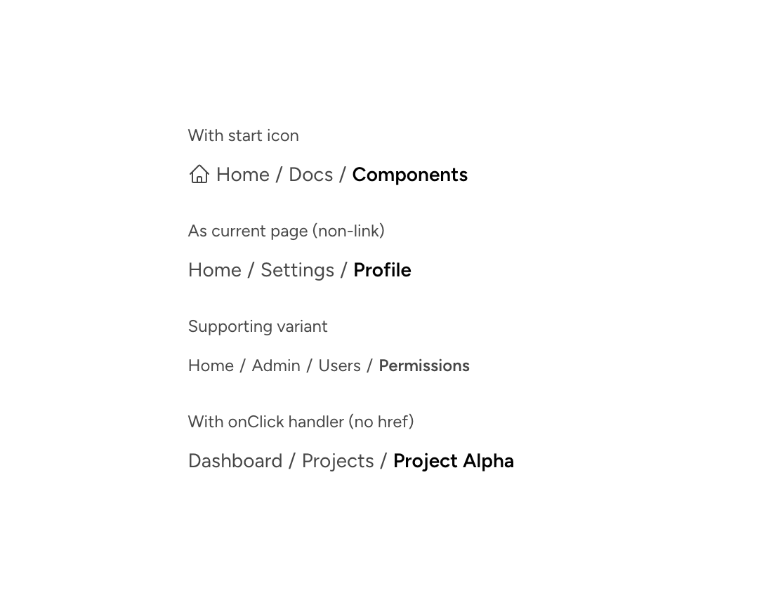
An individual Astryx breadcrumb item supporting links, current-page text, icons, and click handlers.
Built with React and Tailwind. Copy the prompt and paste it into Claude Code, Cursor or Lovable: your agent adds Astryx Breadcrumb Item to your project and fits it to your theme.
Code
How Astryx Breadcrumb Item is used: the demo's code. The component's own source comes with a free account.
Usage.tsx
'use client';

import {Breadcrumbs, BreadcrumbItem} from '@/components/ui/astryx-breadcrumb-item';
import {Icon} from '@astryxdesign/core/Icon';
import {VStack} from '@astryxdesign/core/Layout';
import {Text} from '@astryxdesign/core/Text';
import {HomeIcon} from '@heroicons/react/24/outline';

export default function BreadcrumbItemShowcase() {
  return (
    <VStack
      data-astryx-theme="neutral"
      data-theme="light"
      gap={4}
      style={{colorScheme: 'light'}}>
      <VStack gap={1}>
        <Text type="supporting" color="secondary">
          With start icon
        </Text>
        <Breadcrumbs>
          <BreadcrumbItem
            href="/"
            startIcon={<Icon icon={HomeIcon} size="sm" />}>
            Home
          </BreadcrumbItem>
          <BreadcrumbItem href="/docs">Docs</BreadcrumbItem>
          <BreadcrumbItem isCurrent>Components</BreadcrumbItem>
        </Breadcrumbs>
      </VStack>
      <VStack gap={1}>
        <Text type="supporting" color="secondary">
          As current page (non-link)
        </Text>
        <Breadcrumbs>
          <BreadcrumbItem href="/">Home</BreadcrumbItem>
          <BreadcrumbItem href="/settings">Settings</BreadcrumbItem>
          <BreadcrumbItem isCurrent>Profile</BreadcrumbItem>
        </Breadcrumbs>
      </VStack>
      <VStack gap={1}>
        <Text type="supporting" color="secondary">
          Supporting variant
        </Text>
        <Breadcrumbs variant="supporting">
          <BreadcrumbItem href="/">Home</BreadcrumbItem>
          <BreadcrumbItem href="/admin">Admin</BreadcrumbItem>
          <BreadcrumbItem href="/admin/users">Users</BreadcrumbItem>
          <BreadcrumbItem isCurrent>Permissions</BreadcrumbItem>
        </Breadcrumbs>
      </VStack>
      <VStack gap={1}>
        <Text type="supporting" color="secondary">
          With onClick handler (no href)
        </Text>
        <Breadcrumbs>
          <BreadcrumbItem onClick={() => {}}>Dashboard</BreadcrumbItem>
          <BreadcrumbItem onClick={() => {}}>Projects</BreadcrumbItem>
          <BreadcrumbItem isCurrent>Project Alpha</BreadcrumbItem>
        </Breadcrumbs>
      </VStack>
    </VStack>
  );
}
Dependencies
More by Alok
View all

Glossy Slider Call Button
25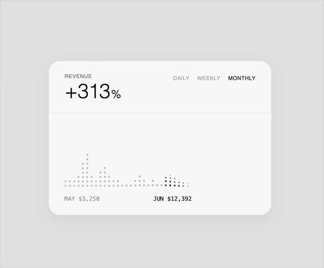
Dot Graph Card
22
Profile Menu Expander
4
Astryx Base Typeahead
2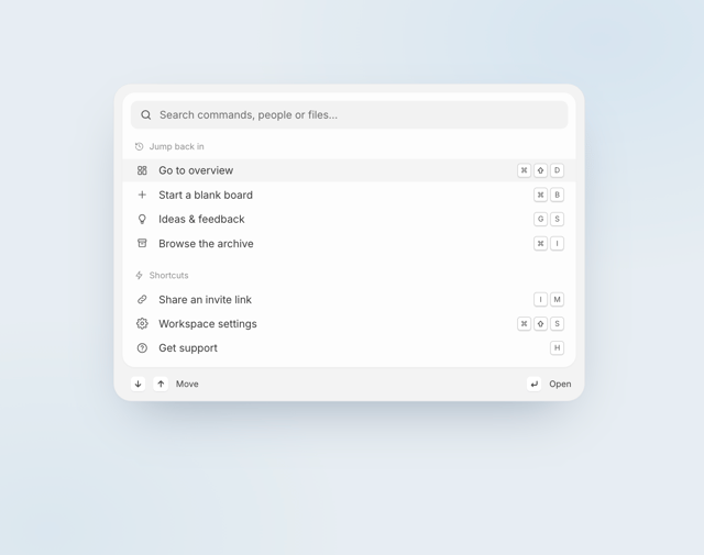
Pixel Perfect Command Palette
2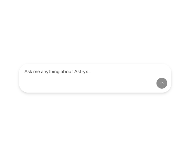
Astryx Chat Composer Input
1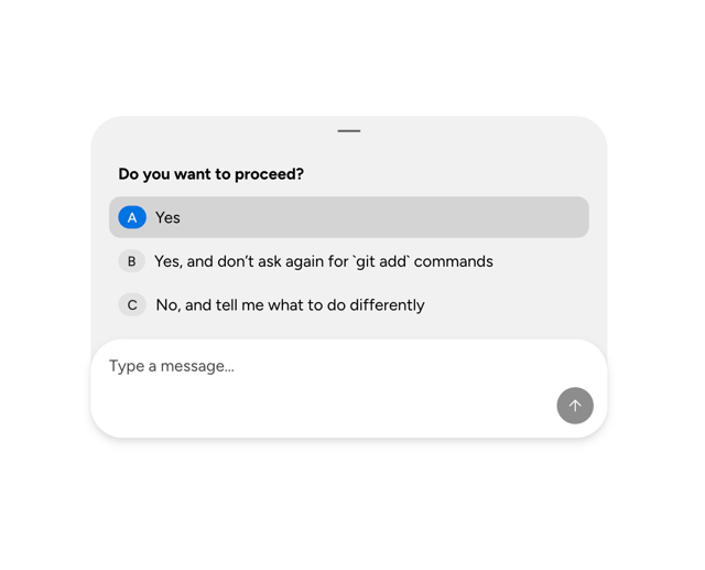
Astryx Chat Composer Drawer
1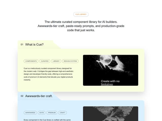
Sticky Cascade Services & Timeline
More in Navigation
View all

Sidebar
354

Oversized 404 Numeral
71
Navbar with Theme Toggle
57
Pagination Ant
3

Breadcramb
93
Navbar
8
Footer
454
Outline Pagination
11


