
About
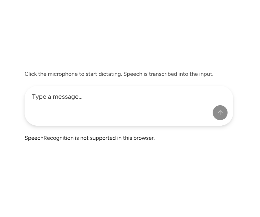
An Astryx toggle button for starting and stopping voice dictation inside a chat composer.
Built with React and Tailwind. Copy the prompt and paste it into Claude Code, Cursor or Lovable: your agent adds Astryx Chat Dictation Button to your project and fits it to your theme.
Code
How Astryx Chat Dictation Button is used: the demo's code. The component's own source comes with a free account.
Usage.tsx
// Copyright (c) Meta Platforms, Inc. and affiliates.

'use client';

import {useRef} from 'react';
import {
  ChatDictationButton,
  ChatComposer,
  ChatComposerInput,
  useChatDictation,
} from '@/components/ui/astryx-chat-dictation-button';
import type {ChatComposerInputHandle} from '@/components/ui/astryx-chat-dictation-button';
import {HStack, VStack} from '@astryxdesign/core/Layout';
import {Text} from '@astryxdesign/core/Text';

export default function ChatDictationButtonShowcase() {
  const inputRef = useRef<ChatComposerInputHandle>(null);

  const dictation = useChatDictation({
    inputRef,
    hasSounds: true,
    onResult: text => {
      console.log('Dictation result:', text);
    },
  });

  return (
    <div
      data-astryx-theme="neutral"
      data-theme="light"
      style={{colorScheme: 'light', display: 'contents'}}>
      <VStack gap={4} width={450} maxWidth="100%">
        <Text type="supporting" color="secondary">
          Click the microphone to start dictating. Speech is transcribed into the
          input.
        </Text>
        <ChatComposer
          onSubmit={v => console.log('Submit:', v)}
          input={<ChatComposerInput handleRef={inputRef} />}
          sendActions={<ChatDictationButton dictation={dictation} />}
        />
        {dictation.isListening && (
          <HStack gap={2} vAlign="center">
            <Text type="supporting" color="secondary">
              {dictation.isSpeaking ? 'Speaking detected' : 'Listening...'}
            </Text>
            <div
              style={{
                width: 80,
                height: 6,
                backgroundColor: 'var(--color-surface-secondary)',
                borderRadius: 3,
                overflow: 'hidden',
              }}>
              <div
                style={{
                  height: '100%',
                  backgroundColor: dictation.isSpeaking
                    ? 'var(--color-accent)'
                    : 'var(--color-text-secondary)',
                  borderRadius: 3,
                  transition: 'width 0.08s ease-out',
                  width: `${Math.min(dictation.volume * 200, 100)}%`,
                }}
              />
            </div>
          </HStack>
        )}
        {!dictation.isSupported && (
          <Text type="supporting" color="accent">
            SpeechRecognition is not supported in this browser.
          </Text>
        )}
      </VStack>
    </div>
  );
}
Dependencies
More by Alok
View all

Glossy Slider Call Button
25
Dot Graph Card
22
Profile Menu Expander
4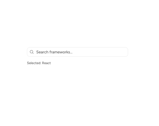
Astryx Base Typeahead
2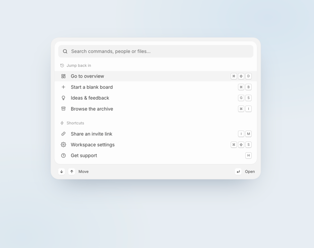
Pixel Perfect Command Palette
2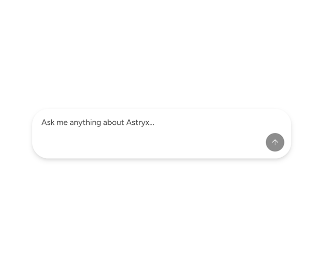
Astryx Chat Composer Input
1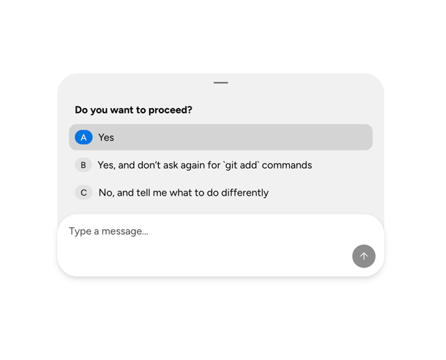
Astryx Chat Composer Drawer
1
Sticky Cascade Services & Timeline
More in Buttons
View all
Button
10

Button
1

Eclipse Button
3
Texture Button
102

App Store Button
472
Native Button
12

HeroUI Button Group
1

Button Group
3


