
About
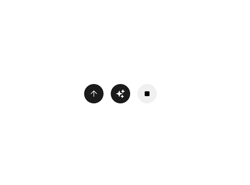
Circular send/stop toggle button for the chat composer. Place it inside ChatComposer where it reads context automatically: no wiring needed. When streaming starts, the button switches from a primary send icon to a secondary stop icon. Override any context value via props for standalone or custom usage.
Built with React and Tailwind. Copy the prompt and paste it into Claude Code, Cursor or Lovable: your agent adds Astryx Chat Send Button to your project and fits it to your theme.
Code
How Astryx Chat Send Button is used: the demo's code. The component's own source comes with a free account.
Usage.tsx
// Copyright (c) Meta Platforms, Inc. and affiliates.

'use client';

import {ChatSendButton} from '@/components/ui/astryx-chat-send-button';
import {Icon} from '@astryxdesign/core/Icon';
import {Stack} from '@astryxdesign/core/Layout';
import {SparklesIcon} from '@heroicons/react/24/solid';

function ChatSendButtonShowcase() {
  return (
    <Stack direction="horizontal" gap={3} vAlign="center">
      <ChatSendButton isDisabled={false} onSend={() => {}} />
      <ChatSendButton
        isDisabled={false}
        onSend={() => {}}
        sendIcon={<Icon icon={SparklesIcon} size="sm" />}
      />
      <ChatSendButton isStopShown onStop={() => {}} />
    </Stack>
  );
}

export default function ChatSendButtonShowcaseDemo() {
  return (
    <div
      data-astryx-theme="neutral"
      data-theme="light"
      style={{colorScheme: 'light', display: 'contents'}}>
      <ChatSendButtonShowcase />
    </div>
  );
}
Dependencies
More by Alok
View all

Glossy Slider Call Button
25
Dot Graph Card
22
Profile Menu Expander
4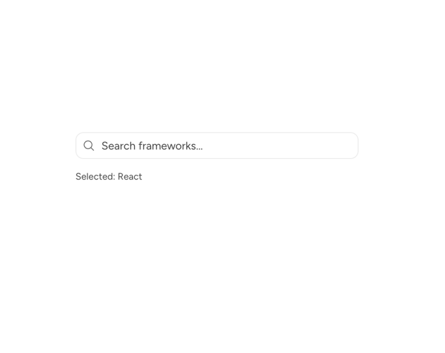
Astryx Base Typeahead
2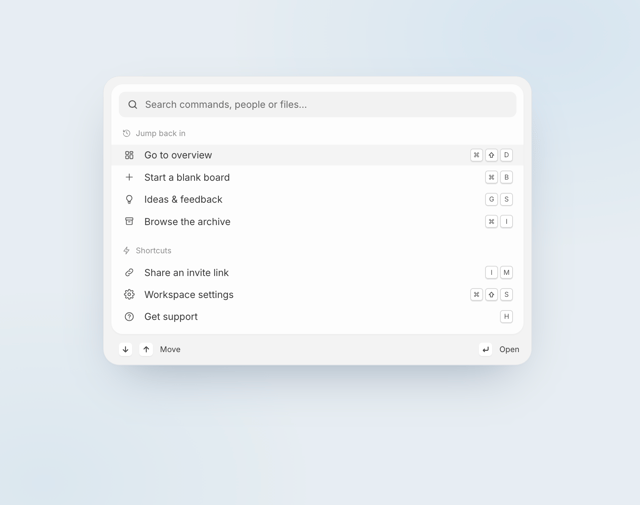
Pixel Perfect Command Palette
2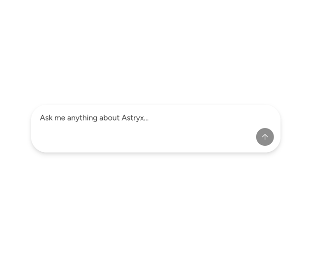
Astryx Chat Composer Input
1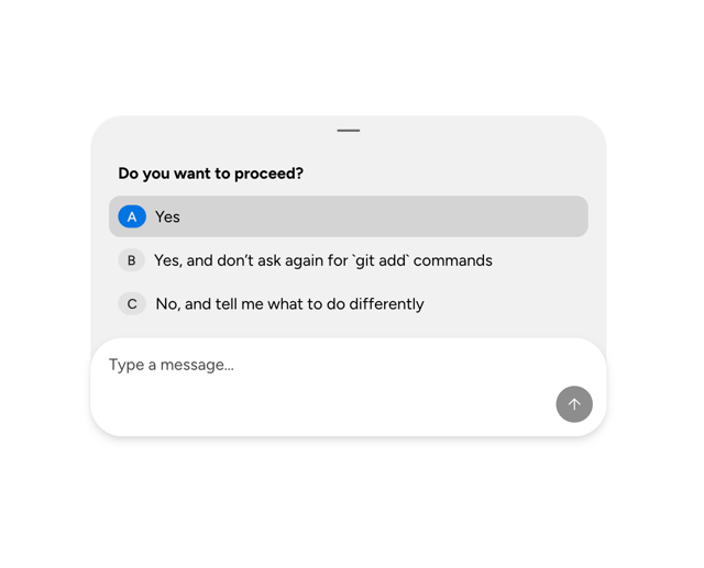
Astryx Chat Composer Drawer
1
Sticky Cascade Services & Timeline
More in Buttons
View all
Button
10

Button
1

Eclipse Button
3
Texture Button
102

App Store Button
472
Native Button
12

HeroUI Button Group
1

Button Group
3


