
About
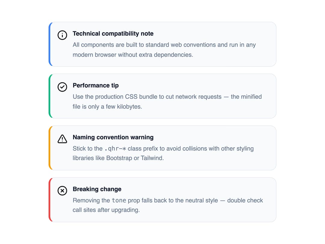
A left-accented note box for highlighting an editorial tip, warning, or informational aside inside article or docs content.
Built with React and Tailwind. Copy the prompt and paste it into Claude Code, Cursor or Lovable: your agent adds Callout to your project and fits it to your theme.
Code
How Callout is used: the demo's code. The component's own source comes with a free account.
Usage.tsx
import Callout from "@/components/ui/callout";
import { Info, CheckCircle2, AlertTriangle, XCircle } from "lucide-react";

export default function CalloutDemo() {
  return (
    <div className="flex w-full max-w-xl flex-col gap-4 p-6">
      <Callout tone="info" title="Technical compatibility note" icon={<Info />}>
        All components are built to standard web conventions and run in any
        modern browser without extra dependencies.
      </Callout>

      <Callout tone="success" title="Performance tip" icon={<CheckCircle2 />}>
        Use the production CSS bundle to cut network requests — the minified
        file is only a few kilobytes.
      </Callout>

      <Callout
        tone="warning"
        title="Naming convention warning"
        icon={<AlertTriangle />}
      >
        Stick to the <code>.qhr-*</code> class prefix to avoid collisions with
        other styling libraries like Bootstrap or Tailwind.
      </Callout>

      <Callout tone="danger" title="Breaking change" icon={<XCircle />}>
        Removing the <code>tone</code> prop falls back to the neutral style —
        double check call sites after upgrading.
      </Callout>
    </div>
  );
}