About
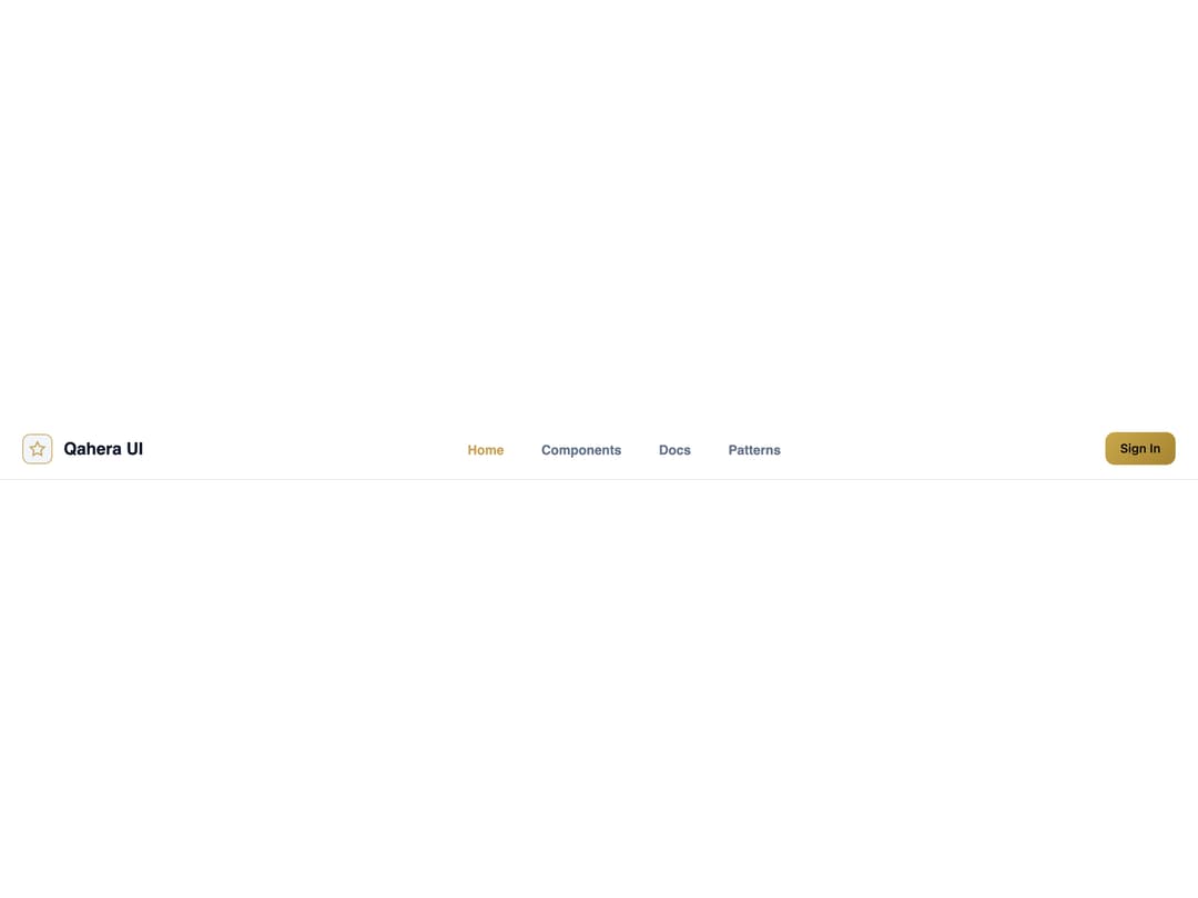
A sticky site header with a brand logo, nav links, and action buttons, for use as the top navigation bar of a page.
Built with React and Tailwind. Copy the prompt and paste it into Claude Code, Cursor or Lovable: your agent adds Navbar to your project and fits it to your theme.
Code
How Navbar is used: the demo's code. The component's own source comes with a free account.
Usage.tsx
import {
  Navbar,
  NavbarBrand,
  NavbarLinks,
  NavbarLink,
  NavbarActions,
} from "@/components/ui/navbar";

export default function NavbarDemo() {
  return (
    <div className="w-full">
      <Navbar variant="default" className="qhr-navbar--glass">
        <NavbarBrand href="#">
          <span
            style={{
              width: 32,
              height: 32,
              borderRadius: 8,
              background: "#f1f5f9",
              border: "1px solid #c7a35a",
              display: "flex",
              alignItems: "center",
              justifyContent: "center",
              color: "#c7a35a",
              flexShrink: 0,
            }}
          >
            <svg
              width="18"
              height="18"
              viewBox="0 0 24 24"
              fill="none"
              stroke="currentColor"
              strokeWidth={2}
            >
              <polygon points="12 2 15.09 8.26 22 9.27 17 14.14 18.18 21.02 12 17.77 5.82 21.02 7 14.14 2 9.27 8.91 8.26 12 2" />
            </svg>
          </span>
          <span>Qahera UI</span>
        </NavbarBrand>
        <NavbarLinks>
          <NavbarLink href="#" active>
            Home
          </NavbarLink>
          <NavbarLink href="#">Components</NavbarLink>
          <NavbarLink href="#">Docs</NavbarLink>
          <NavbarLink href="#">Patterns</NavbarLink>
        </NavbarLinks>
        <NavbarActions>
          <button
            type="button"
            style={{
              background: "linear-gradient(135deg, #c9a84c 0%, #a68430 100%)",
              color: "#121008",
              border: "none",
              borderRadius: 10,
              padding: "8px 16px",
              fontWeight: 600,
              fontSize: 13,
              cursor: "pointer",
            }}
          >
            Sign In
          </button>
        </NavbarActions>
      </Navbar>
    </div>
  );
}
More by alwkala
View all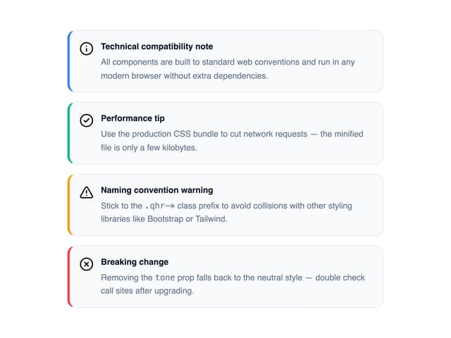

Callout
7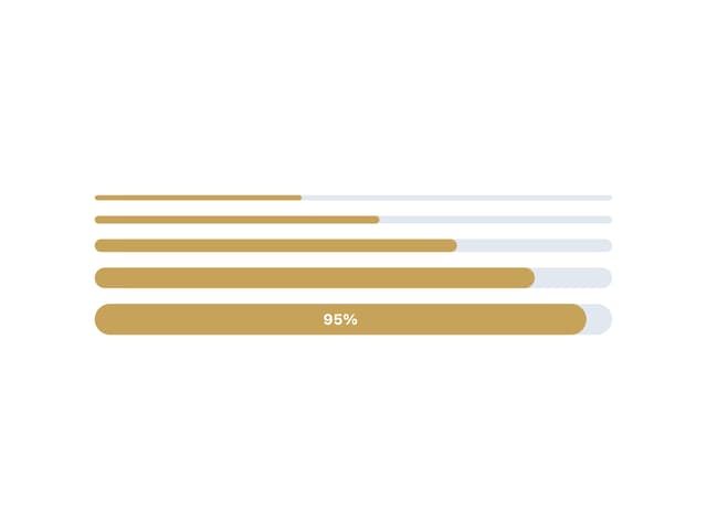
Progress Bar
1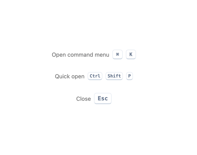
Kbd
Pagination
Checkbox
Ribbon
Rating
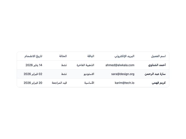
Data Table
More in Navigation
View all

Liquid Glass Expandable Sidebar
43

Footer with Big Wordmark
33

Sidebar
390

Oversized 404 Numeral
77

Pagination
108

Footer
89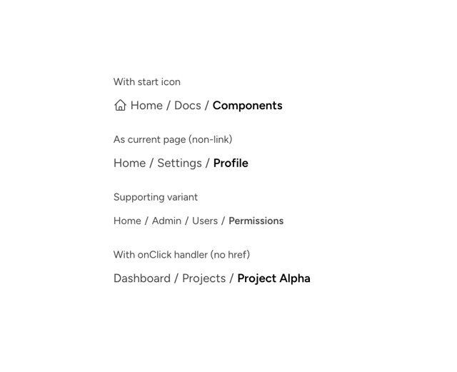

Astryx Breadcrumb Item
3
Menu
23
