About
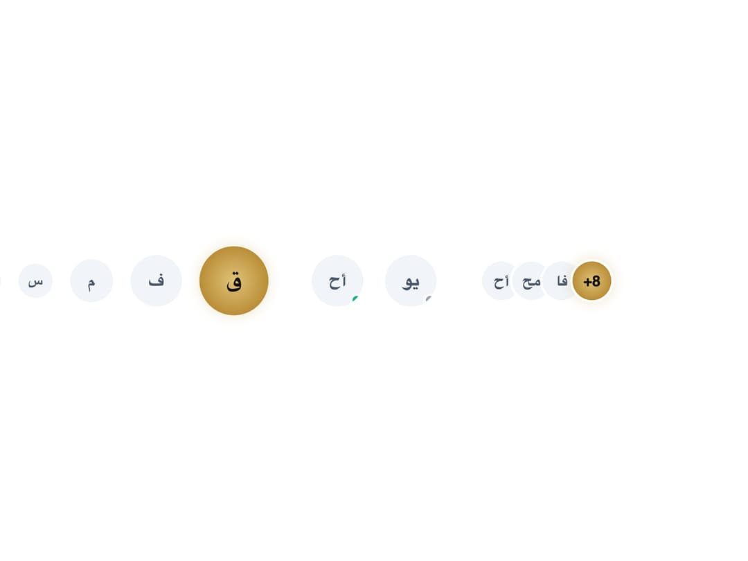
A user avatar that renders a profile image or initials in a circle, rounded, or square shape with size variants, an optional online/offline status dot, and stacked avatar groups.
Built with React and Tailwind. Copy the prompt and paste it into Claude Code, Cursor or Lovable: your agent adds Qahera Avatar to your project and fits it to your theme.
Code
How Qahera Avatar is used: the demo's code. The component's own source comes with a free account.
Usage.tsx
import Avatar from "@/components/ui/qahera-avatar";

export default function QaheraAvatarDemo() {
  return (
    <div className="flex flex-wrap items-center gap-10 w-full max-w-3xl">
      <div className="flex items-center gap-4">
        <Avatar size="xs" initials="ع" />
        <Avatar size="sm" initials="س" />
        <Avatar size="md" initials="م" />
        <Avatar size="lg" initials="ف" />
        <Avatar size="xl" initials="ق" className="qhr-avatar--luxury" />
      </div>

      <div className="flex items-center gap-5">
        <Avatar size="lg" shape="circle">
          <span>أح</span>
          <span className="qhr-avatar-status qhr-avatar-status--online" />
        </Avatar>
        <Avatar size="lg" shape="circle">
          <span>يو</span>
          <span className="qhr-avatar-status qhr-avatar-status--offline" />
        </Avatar>
      </div>

      <div className="qhr-avatar-group">
        <Avatar size="md" initials="أح" />
        <Avatar size="md" initials="مح" />
        <Avatar size="md" initials="فا" />
        <Avatar size="md" initials="+8" className="qhr-avatar--luxury" />
      </div>
    </div>
  );
}
More by alwkala
View all

Callout
7
Progress Bar
1
Kbd
Pagination
Checkbox
Ribbon
Rating
Data Table