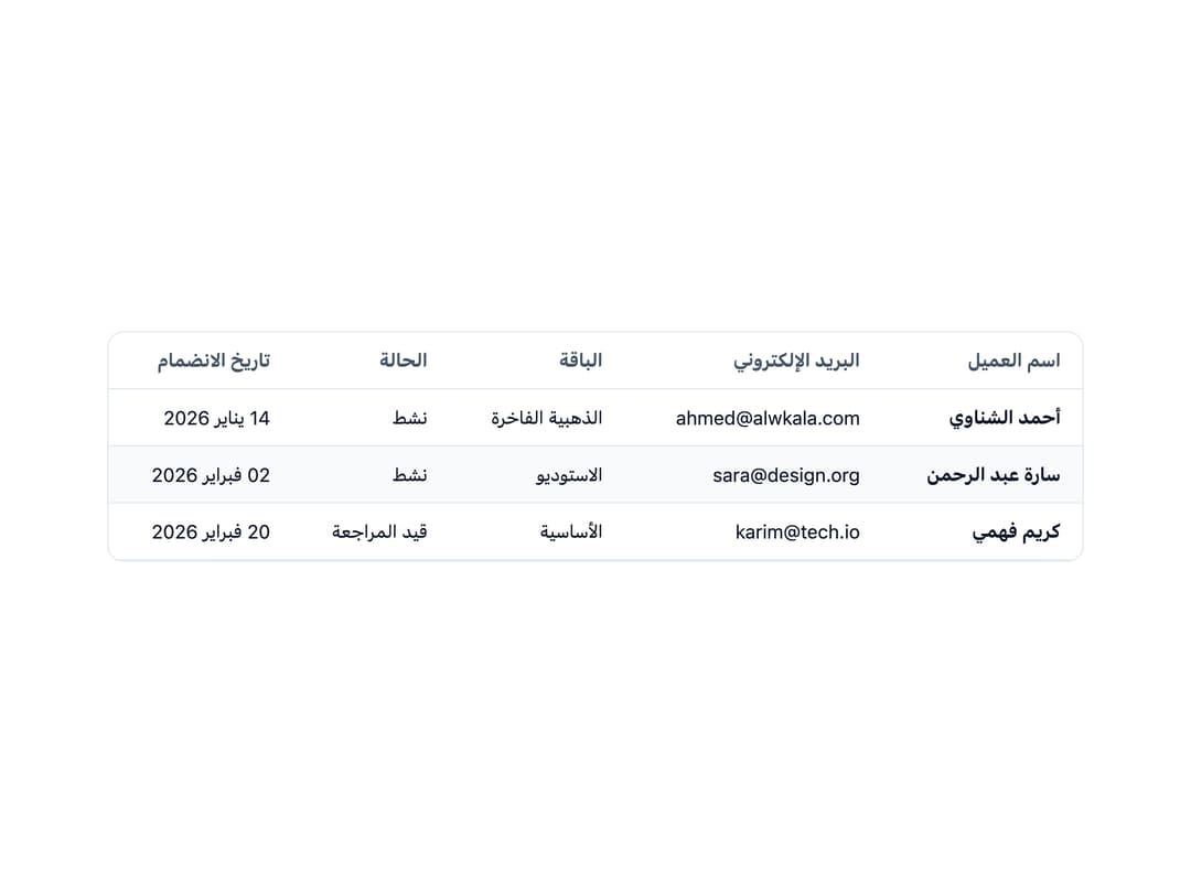
About
A styled HTML table with header, row, and cell sub-components plus an optional striped-rows variant for displaying tabular data.
Built with React and Tailwind. Copy the prompt and paste it into Claude Code, Cursor or Lovable: your agent adds Data Table to your project and fits it to your theme.
Code
How Data Table is used: the demo's code. The component's own source comes with a free account.
Usage.tsx
import {
  Table,
  TableHeader,
  TableBody,
  TableRow,
  TableHead,
  TableCell,
} from "@/components/ui/table";

const customers = [
  {
    name: "أحمد الشناوي",
    email: "ahmed@alwkala.com",
    plan: "الذهبية الفاخرة",
    status: "نشط",
    joined: "14 يناير 2026",
  },
  {
    name: "سارة عبد الرحمن",
    email: "sara@design.org",
    plan: "الاستوديو",
    status: "نشط",
    joined: "02 فبراير 2026",
  },
  {
    name: "كريم فهمي",
    email: "karim@tech.io",
    plan: "الأساسية",
    status: "قيد المراجعة",
    joined: "20 فبراير 2026",
  },
];

export default function TableDemo() {
  return (
    <div className="w-full max-w-3xl p-6" dir="rtl">
      <Table striped>
        <TableHeader>
          <TableRow>
            <TableHead>اسم العميل</TableHead>
            <TableHead>البريد الإلكتروني</TableHead>
            <TableHead>الباقة</TableHead>
            <TableHead>الحالة</TableHead>
            <TableHead>تاريخ الانضمام</TableHead>
          </TableRow>
        </TableHeader>
        <TableBody>
          {customers.map((c) => (
            <TableRow key={c.email}>
              <TableCell style={{ fontWeight: 700 }}>{c.name}</TableCell>
              <TableCell>{c.email}</TableCell>
              <TableCell>{c.plan}</TableCell>
              <TableCell>{c.status}</TableCell>
              <TableCell>{c.joined}</TableCell>
            </TableRow>
          ))}
        </TableBody>
      </Table>
    </div>
  );
}
More by alwkala
View all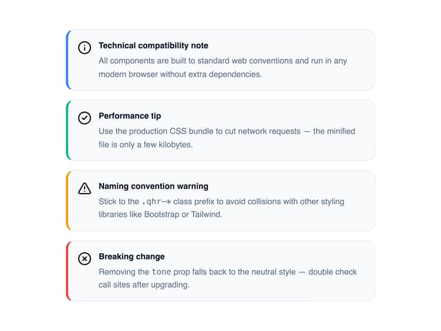

Callout
7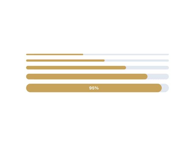
Progress Bar
1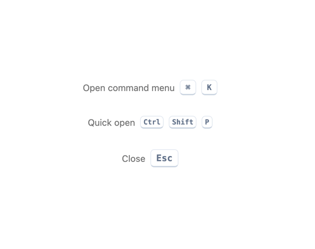
Kbd
Pagination
Checkbox
Ribbon
Rating
Navbar