
About
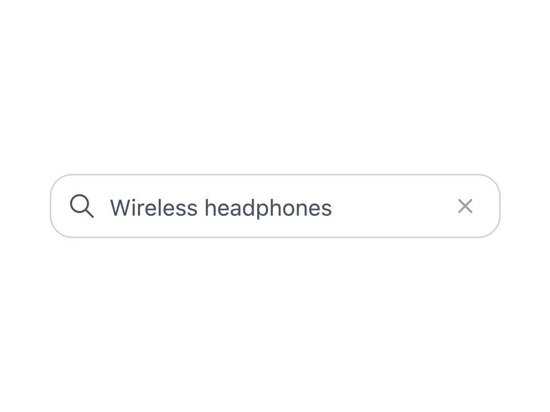
A styled single-line text field with size and variant options, optional leading/trailing icon slots, and a built-in clear button for clearing its value.
Built with React and Tailwind. Copy the prompt and paste it into Claude Code, Cursor or Lovable: your agent adds Input to your project and fits it to your theme.
Code
How Input is used: the demo's code. The component's own source comes with a free account.
Usage.tsx
import { Input } from "@/components/ui/input";
import { Search } from "@appica/icons-react";

export default function InputClearable() {
  return (
    <Input
      className="max-w-70"
      clearable
      startSlot={<Search />}
      defaultValue="Wireless headphones"
      aria-label="Search products"
    />
  );
}
Dependencies
More by appica-dev
View all
Border Beam
63
Text Animate
21
Carousel
19
Avatar
15
Sparkline
8
Table of Contents
7
Background Pattern
7
Color Area
6
More in Forms
View all

Premium Auth
551

Contact Card
1.1K

Login 2
10

Form
17

Form
20

Book A Demo 3
96

Login 1
59
SignInPage
721
