
About
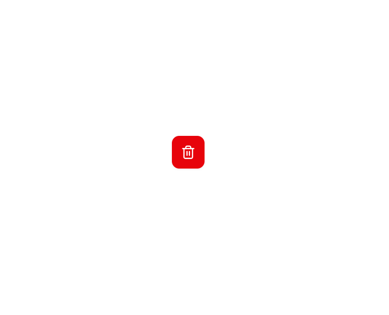
Here is Button component
Built with React and Tailwind. Copy the prompt and paste it into Claude Code, Cursor or Lovable: your agent adds Base Button to your project and fits it to your theme.
Code
How Base Button is used: the demo's code. The component's own source comes with a free account.
Usage.tsx
import { Button } from "@/components/ui/button-1";
import { Trash2Icon } from "lucide-react";
import { Tooltip, TooltipContent, TooltipProvider, TooltipTrigger } from "@/components/ui/tooltip";

export default function Component() {
  return (
    <TooltipProvider>
      <Tooltip>
        <TooltipTrigger asChild>
          <Button variant="destructive" size="icon">
            <Trash2Icon />
          </Button>
        </TooltipTrigger>
        <TooltipContent>
          <div>Delete</div>
        </TooltipContent>
      </Tooltip>
    </TooltipProvider>
  );
}
Dependencies
More by Arihant jain
View all
Footer section
1.9K
Multistep Form
727
Animated Drawer
696
Status Badge
541
Stacked Circular Footer
439
Input Modal
344
Profile Dropdown
201
Large Name Footer
201
More in Buttons
View all

Button
4

Eclipse Button
8
Button
5
Button
73

Button
9
Texture Button
101
Base Button
1
Native Button
27


