
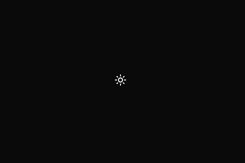
AnimatedThemeToggler — React Theme Toggle Button with Smooth Icon Transitions A lightweight React component that toggles between light and dark modes with animated sun and moon icons using Framer Motion. It detects and syncs the current theme state with the DOM, supports persistent theme preference via localStorage, and uses the new View Transitions API to animate smooth page background transitions based on the toggle button's position. Features: Clean React hooks-based logic Animated icon transitions using framer-motion Theme persistence and live updates View Transitions API clip-path reveal animation Tailwind CSS compatible styling with customizable classes Accessible button with ARIA labels Perfect for modern React/Next.js projects looking to add a polished theme toggle with smooth UI and excellent UX.
Built with React and Tailwind. Copy the prompt and paste it into Claude Code, Cursor or Lovable: your agent adds Animated Theme Toggler to your project and fits it to your theme.
Code
How Animated Theme Toggler is used: the demo's code. The component's own source comes with a free account.
Usage.tsx
import { AnimatedThemeToggler } from "@/components/ui/animated-theme-toggler"

export default function ThemeSwitchDemo() {
  return (
    <div className="min-h-screen flex items-center justify-center bg-background transition-colors">
      <AnimatedThemeToggler />
    </div>
  );
}
Dependencies
More by Arunachalam
View all
Scroll media expansion hero
10.7K
Profile Card Testimonial Carousel
1.2K
Modern Animated Sign In
1.1K
Bottom Nav Bar
805
Adaptive Notch Navigation Bar
663
Toast
659
Connected Carousel
383
Animated File Tree
337
More in Buttons
View all
Button Save
46

Button
20

Eclipse Button
5

Button
6

Button
14

Button Group
37

Button
32
Split Button
32

