
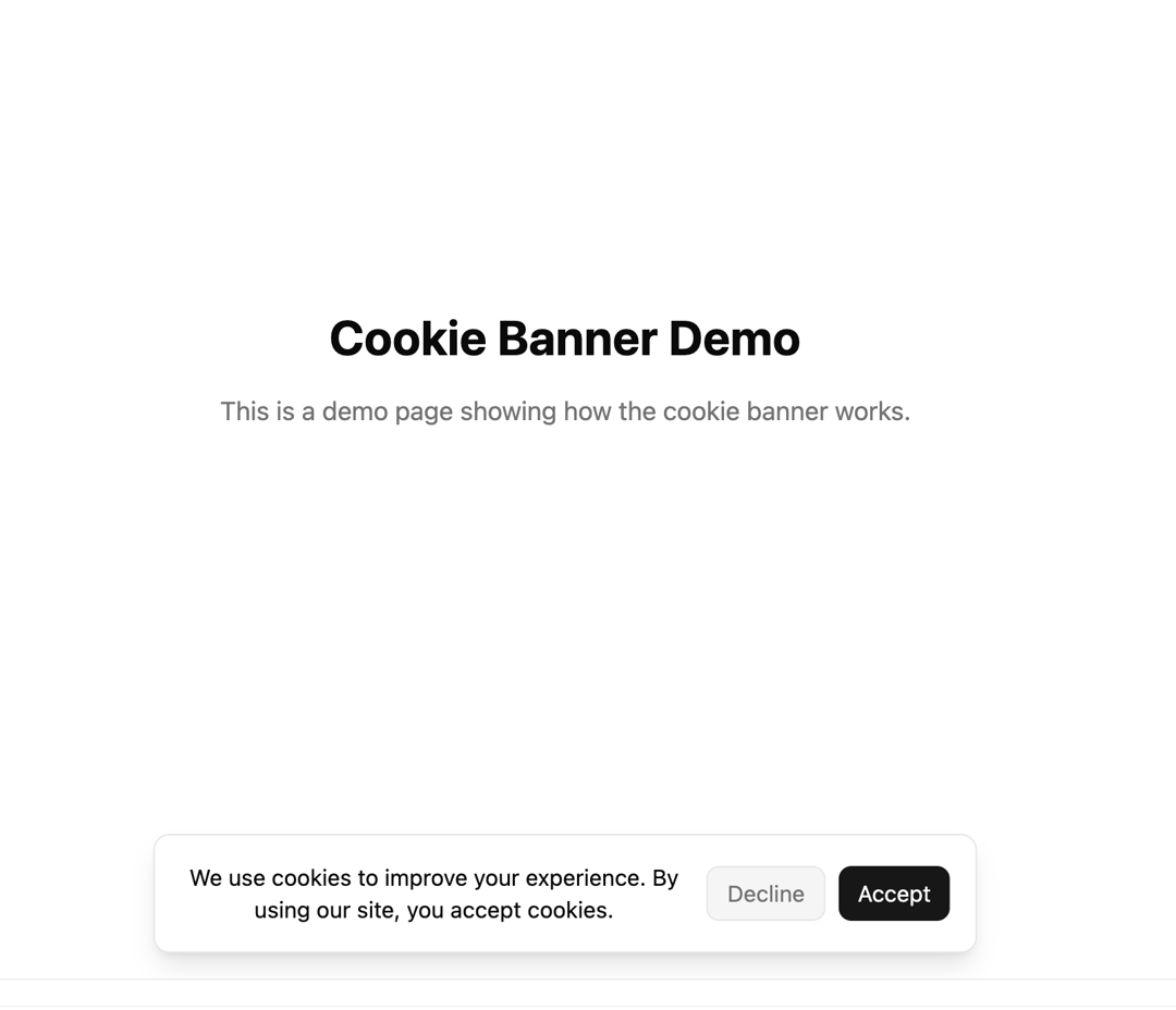
CookieBanner is a lightweight, responsive cookie consent component for Next.js built with TypeScript and TailwindCSS v4. It displays a customizable message with Accept and Decline actions, remembers the user’s choice in localStorage, and supports light/dark themes. Smooth slide-and-fade animations are powered entirely by Tailwind’s tw-animate-css utilities, ensuring no extra animation libraries are needed. This banner is fully accessible, adapts its layout across screen sizes, and can appear at the top or bottom of the viewport based on your preference — making it easy to integrate into any modern web app.
Built with React and Tailwind. Copy the prompt and paste it into Claude Code, Cursor or Lovable: your agent adds Cookie Banner to your project and fits it to your theme.
Code
How Cookie Banner is used: the demo's code. The component's own source comes with a free account.
Usage.tsx
import { CookieBanner } from "@/components/ui/cookie-banner";

export default function DemoPage() {
  return (
    <main className="flex min-h-screen items-center justify-center bg-background text-foreground p-8">
      <div className="text-center max-w-md">
        <h1 className="text-3xl font-bold mb-4">Cookie Banner Demo</h1>

        <p className="mb-6 text-muted-foreground">
          This is a demo page showing how the cookie banner works.
        </p>

        <CookieBanner />
      </div>
    </main>
  );
}
More by Arunachalam
View all
Scroll media expansion hero
11.1K
Profile Card Testimonial Carousel
1.3K
Modern Animated Sign In
1.2K
Bottom Nav Bar
917
Adaptive Notch Navigation Bar
754
Toast
673
Connected Carousel
505
Animated File Tree
352
More in Buttons
View all
Button
10

Button
4
Texture Button
102
Native Button
12

Button Group
38
Button
76

HeroUI Button Group
11
Split Button
36


