
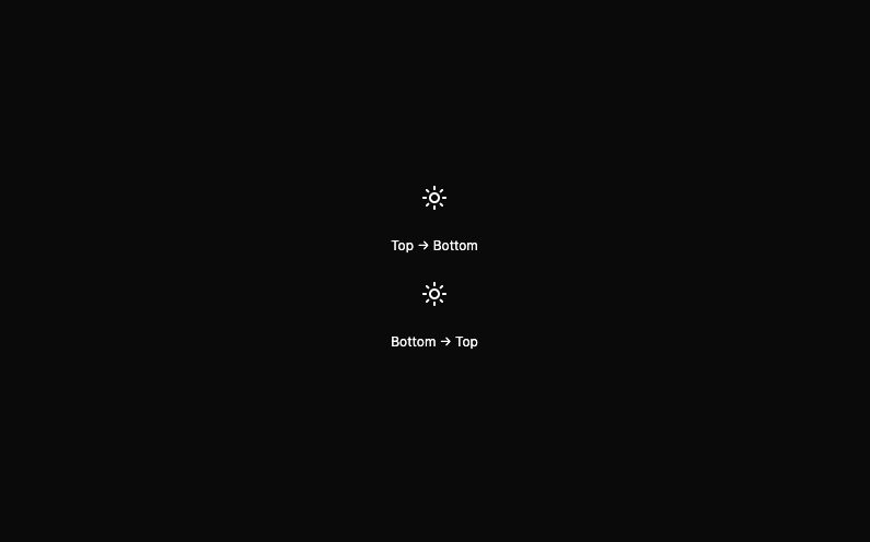
VerticalThemeWipeToggle — Top/Bottom Reveal Animated Theme Switch A modern React theme toggle button offering a visually dramatic full-page transition using the View Transitions API. Seamlessly reveal your dark or light mode with a vertical wipe animation that moves from either the top or bottom of the screen, creating a cinematic experience for users. No theme context or extra dependencies needed—this pure DOM implementation plugs into any Tailwind or Framer Motion app with ease. Features: Directional vertical animation: top→bottom or bottom→top with a simple prop Hardware-accelerated, native-page transitions (View Transitions API) Compatible with React, Tailwind CSS, and motion UI No next-themes or global context required—just DOM and localStorage Accessible, fast, and flicker-free Easily extendable for line/diagonal/horizontal effects Use Cases: Perfect for dashboards, admin panels, landing pages, or any web app wanting a premium-feeling, full-screen theme swap effect.
Built with React and Tailwind. Copy the prompt and paste it into Claude Code, Cursor or Lovable: your agent adds Vertical Theme Wipe Toggle to your project and fits it to your theme.
Code
How Vertical Theme Wipe Toggle is used: the demo's code. The component's own source comes with a free account.
Usage.tsx
import { VerticalThemeWipeToggle } from "@/components/ui/vertical-theme-wipe-toggle";

export default function ThemeSwitchDemo() {
  return (
    <div className="flex flex-col gap-4 items-center">
      <VerticalThemeWipeToggle direction="top" />
      <span className="text-xs">Top → Bottom</span>
      <VerticalThemeWipeToggle direction="bottom" />
      <span className="text-xs">Bottom → Top</span>
    </div>
  );
}
Dependencies
More by Arunachalam
View all
Scroll media expansion hero
10.6K
Profile Card Testimonial Carousel
1.2K
Modern Animated Sign In
1.1K
Bottom Nav Bar
800
Toast
659
Adaptive Notch Navigation Bar
654
Connected Carousel
378
Animated File Tree
336
More in Buttons
View all

Button
14
Texture Button
92

Button
63
Button
34
Button Save
46

Button


App Store Button
453

Notification Button
103

